York University: YU Eats
York University needed a campus dining brand that could win a competitive RFP and then work at scale across two campuses. I designed it in four weeks as the sole creative, and it won. In 2026 I came back for the refresh: four entrance directions for the CSQ food hall, a family of station brands, and new names for the Osgoode Hall café.
- Client
- York University, through Chartwells
- Year
- 2022, refresh in 2026
- Role
- Sole creative
- Outcome
- Won the RFP, live across 70+ locations
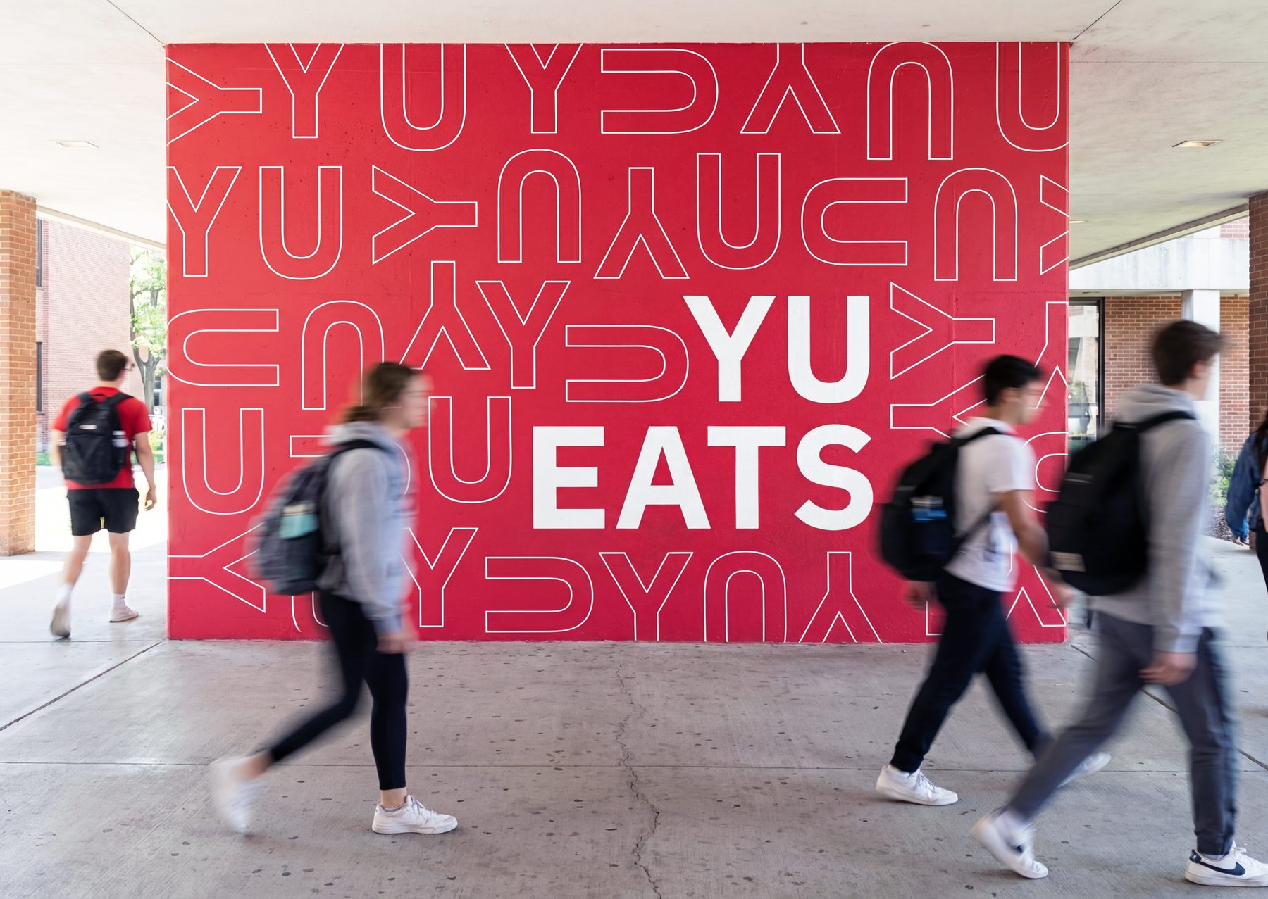
YU, as in you
The wordmark plays on York University and "you eat." The repeating YU pattern scales from an app icon to a building-sized mural.
The bold red was already York's. I did not reinvent it. I gave it a system to live in.

The 2026 refresh: four ways in
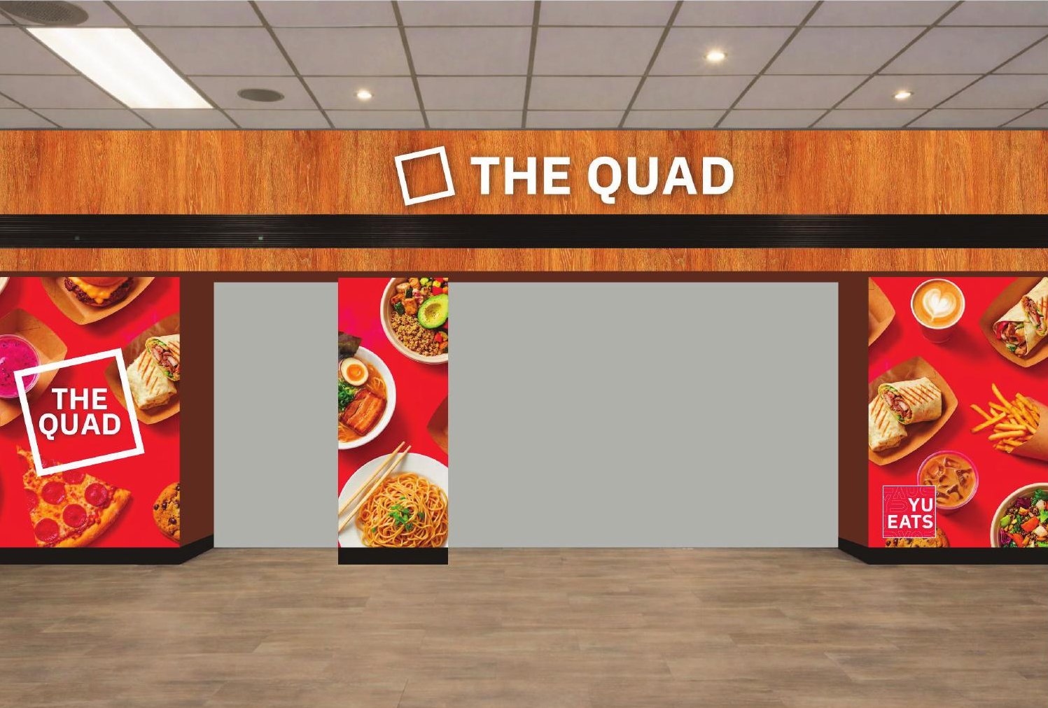
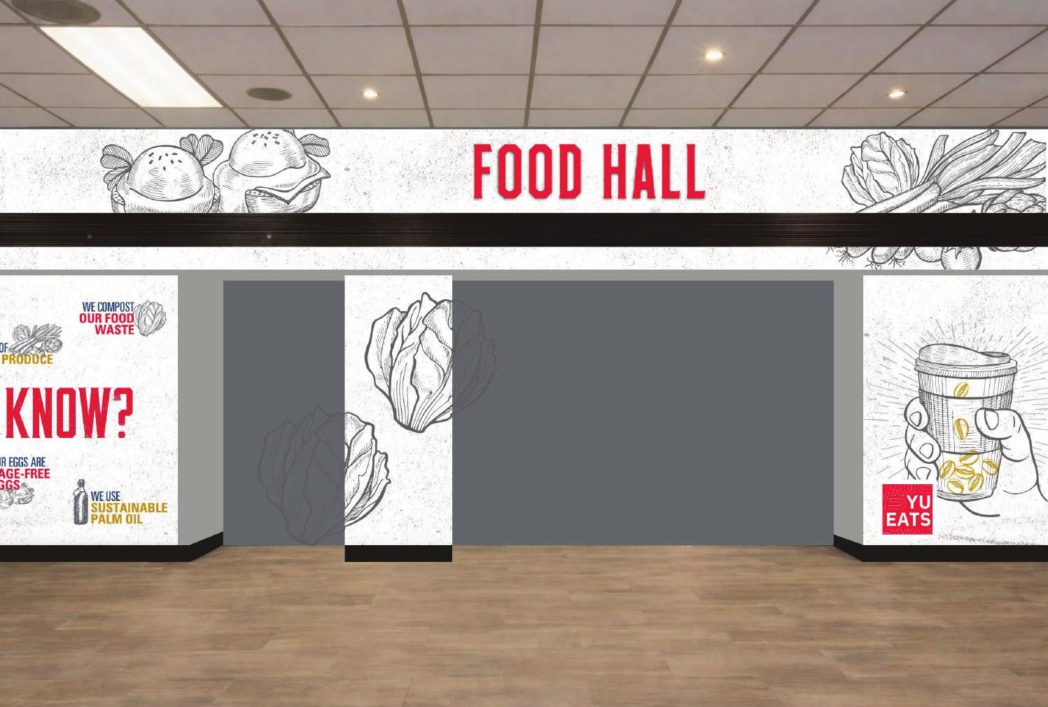
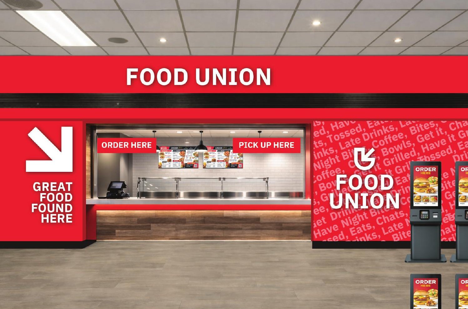
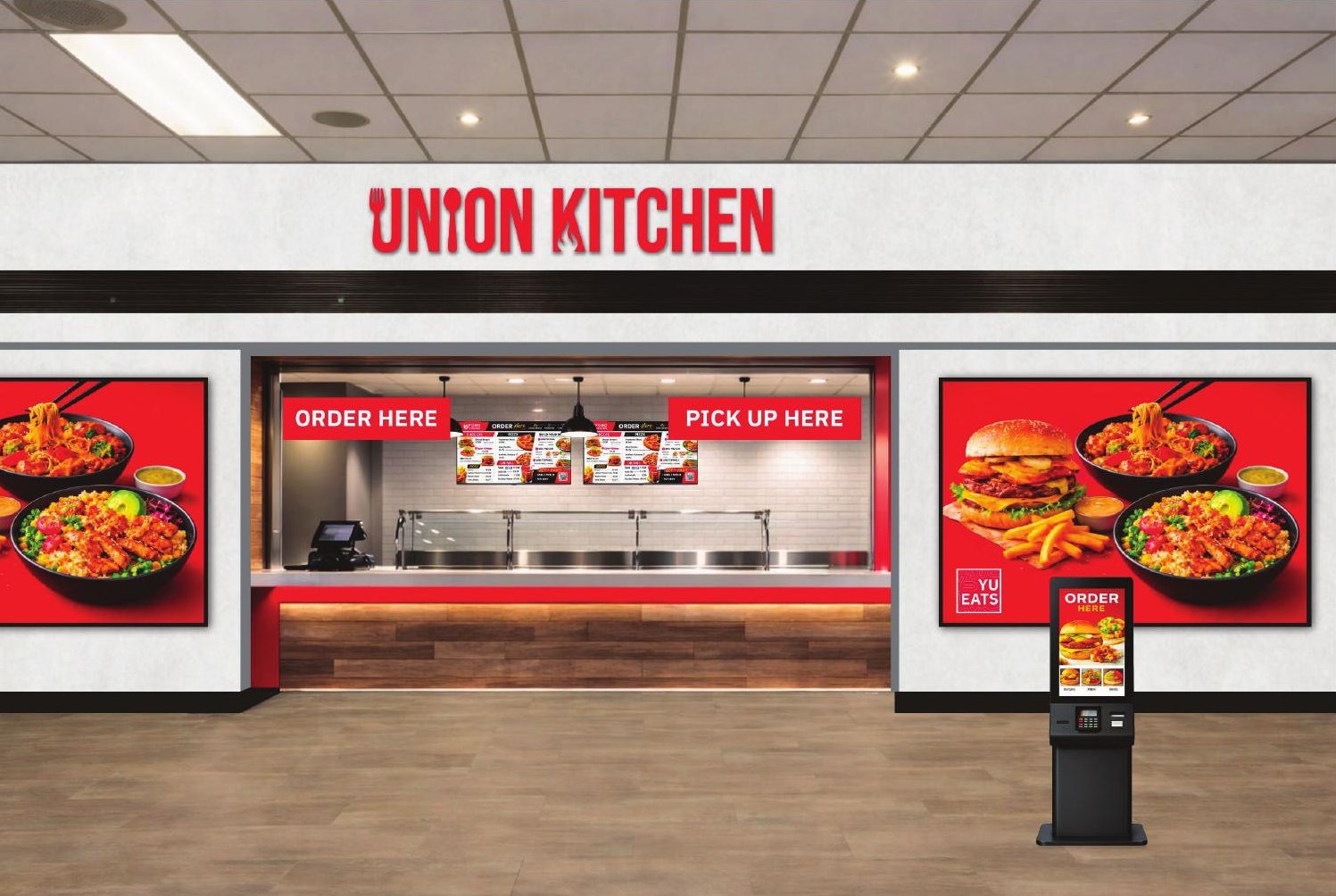
In 2026 I came back to the program with a full concept portfolio for the CSQ food hall and its stations. It started with four directions for the entrance.
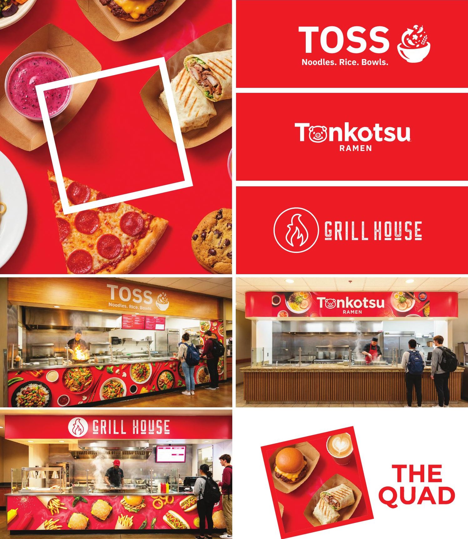
The Quad uses IBM Plex Sans, York's own typeface, so the signage reads as part of campus. Food Hall turns the hand-drawn "Did you know?" panels already in the space into the whole identity. Food Union is the operational pitch: fewer stations, kiosk ordering and one pickup window. Union Kitchen is the same model with more restaurant credibility.
Stations that flex
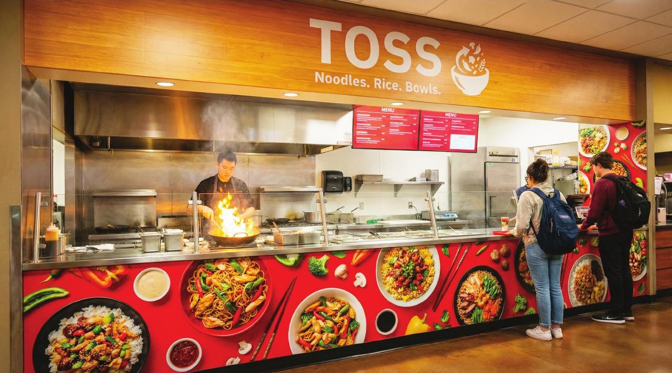
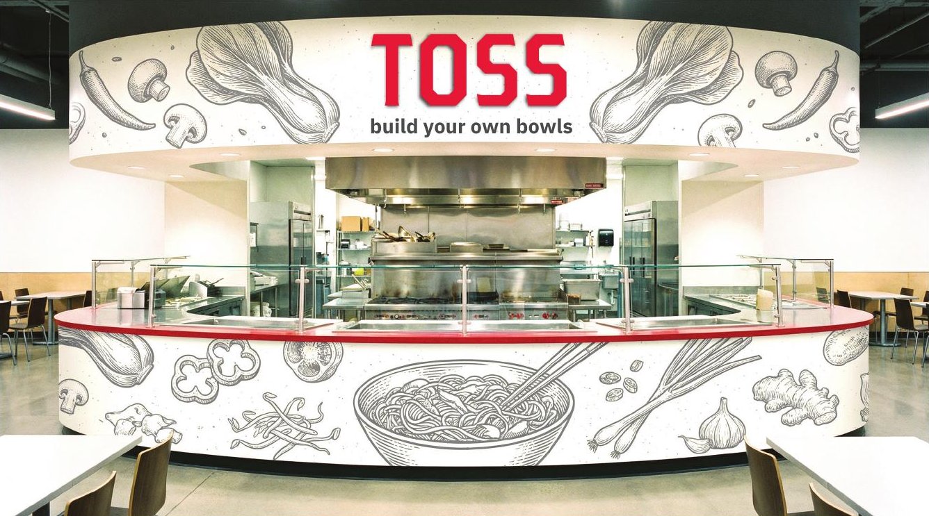
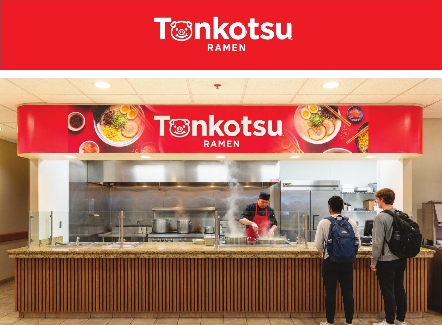
"Create" failed because nobody walking past knew it meant build-your-own bowls. I renamed it Toss, an action word for what actually happens at the counter.
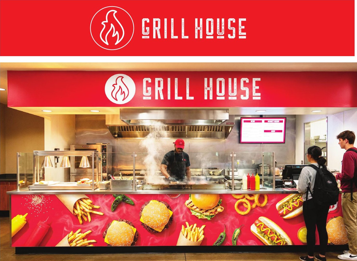
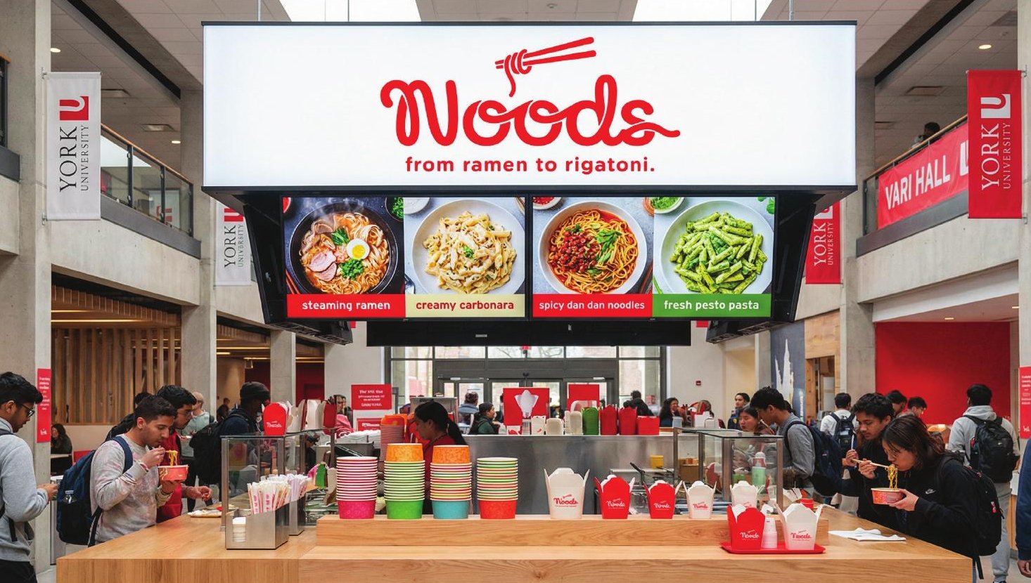
The station brands are built as a system. The name and mark stay the same, and the environment flexes to match whichever entrance direction is chosen. One decision at the top cascades through every station below it.
Naming the Osgoode café
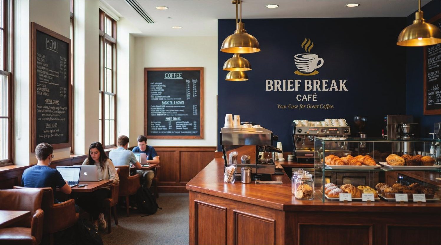
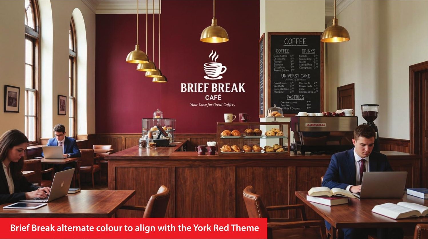
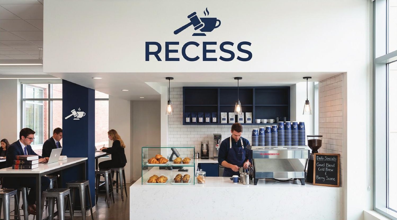
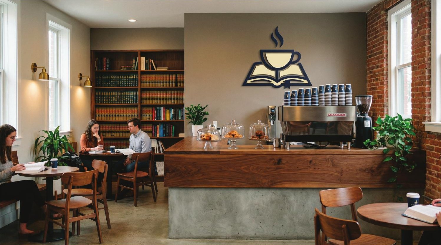
Three names for the café in York's law school, each built on the setting. Brief Break is a double legal pun, with the line "Your case for great coffee." Recess turns a courtroom break into a study break. The Sidebar borrows the term for an off-the-record talk between peers.
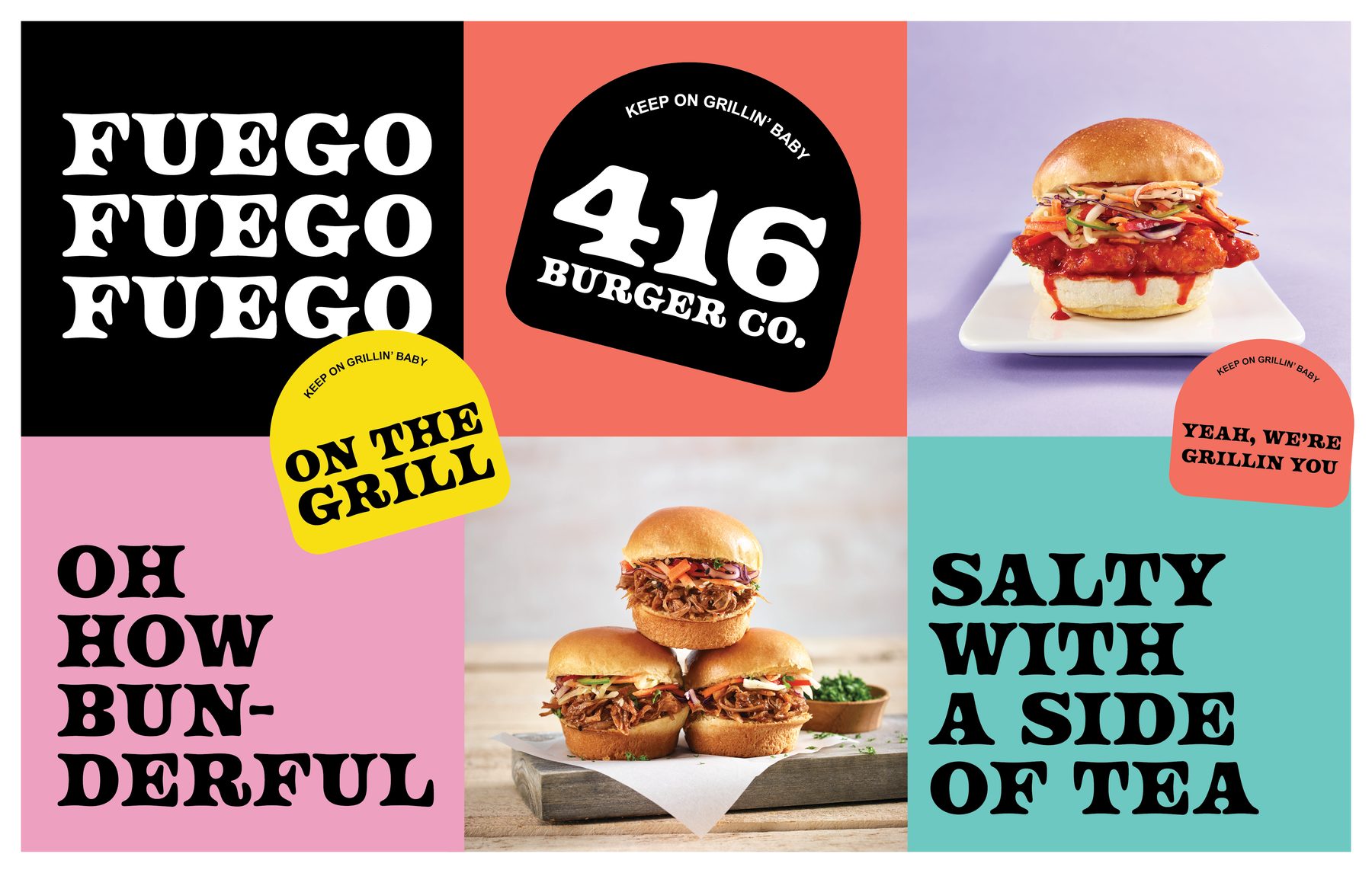
416 Burger Co. and the photo shoot
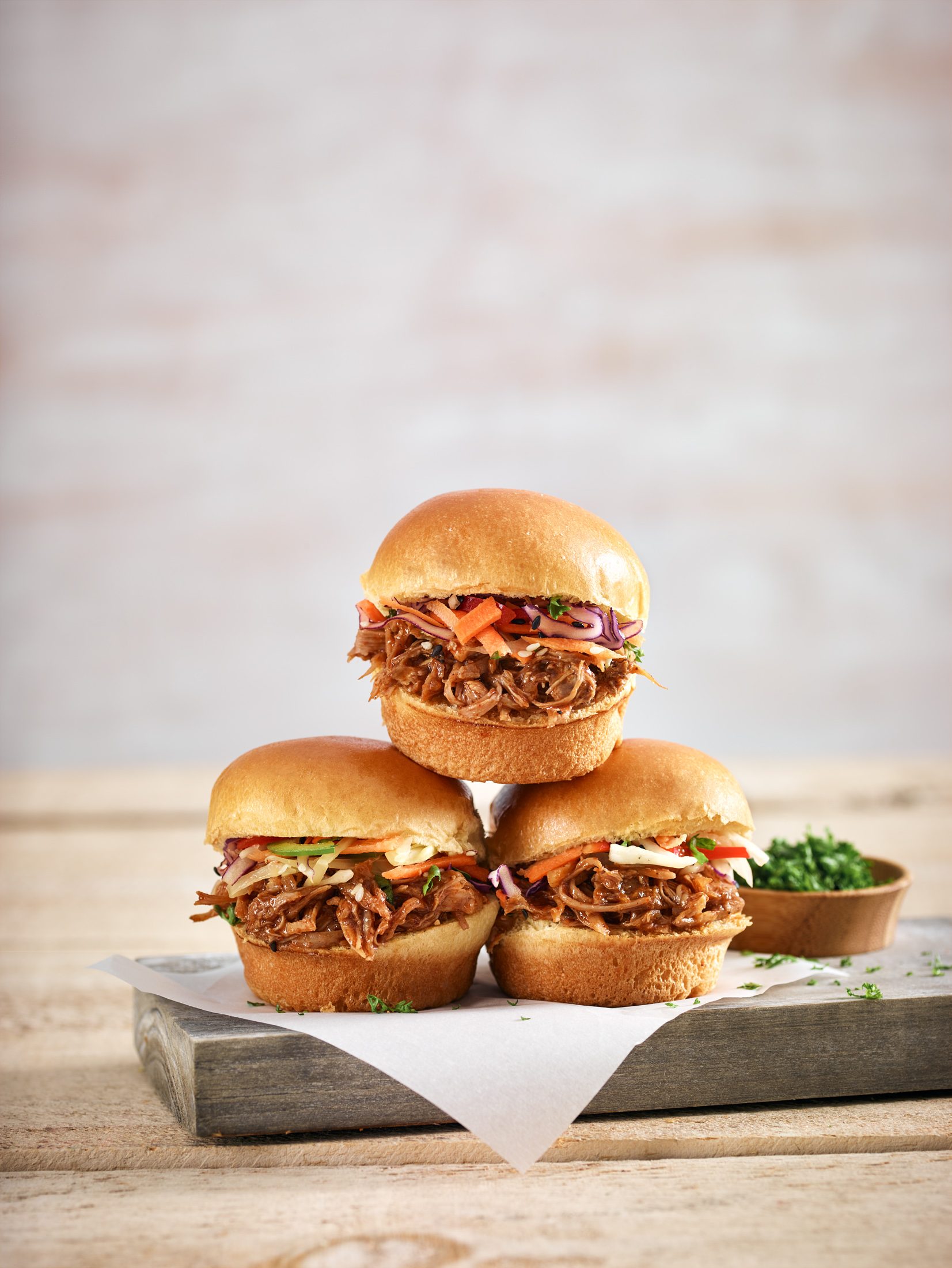
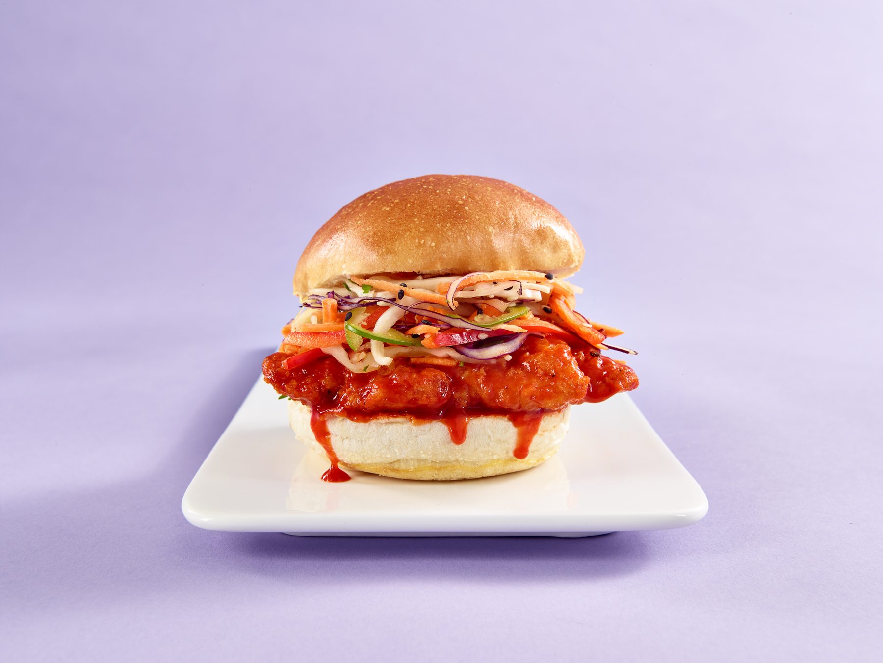
416 Burger Co. is a sub-brand inside the same system, built for a different crowd. I art directed the product photo shoot: the angles, the backgrounds and the way each burger is styled, so the photos could carry the menu boards on their own.
A system that sells itself
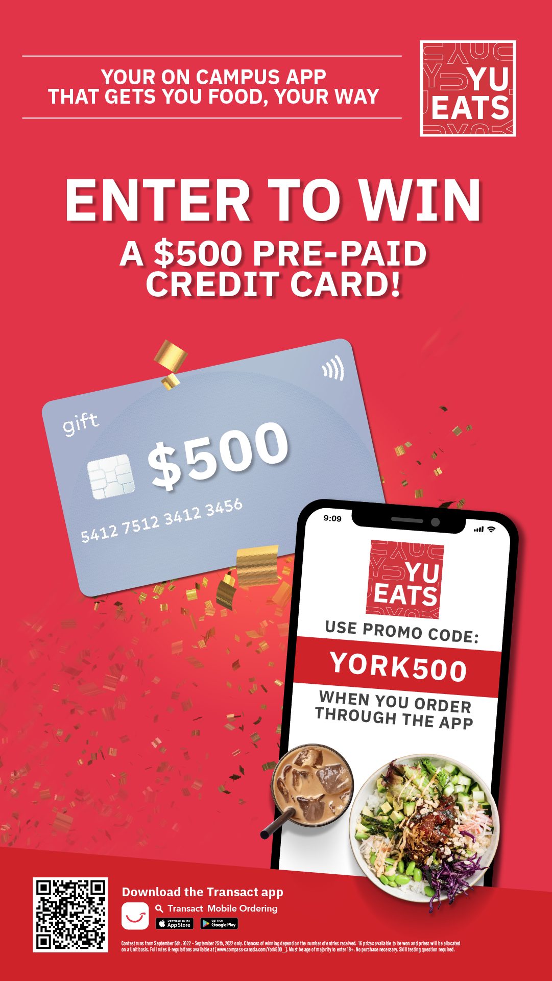
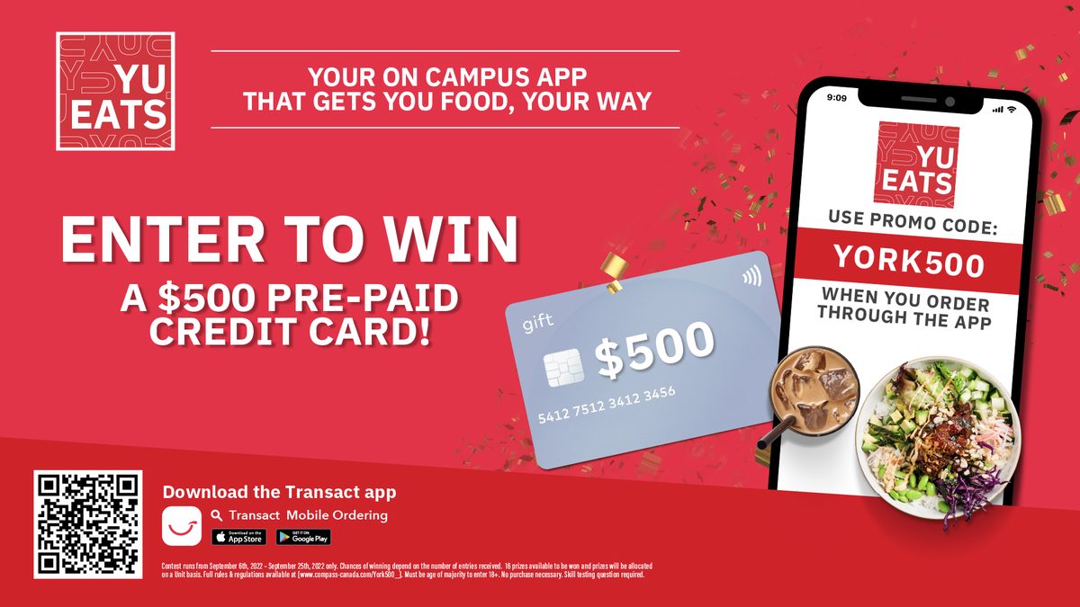
Posters, social, digital screens and launch pieces all come from the same parts: red, white, the YU pattern and a confident voice.


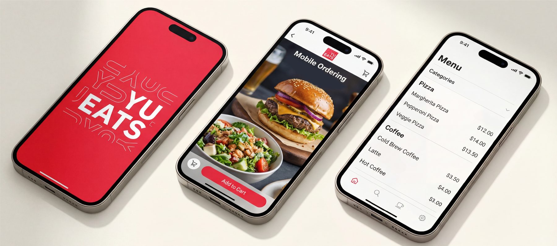
Ordering between classes
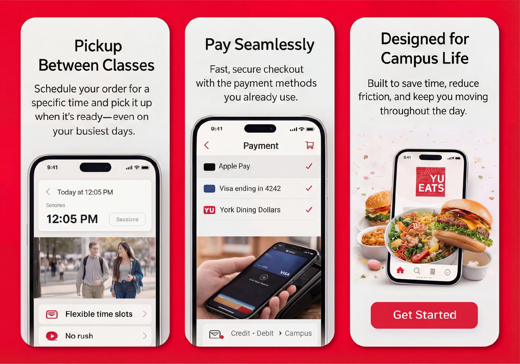
Students have about ten minutes between lectures. The app is built to browse, order, pay and pick up fast, with every screen designed to cut steps.
Next project
Stella's Games