Algonquin College
A new campus dining program for Algonquin College. I built a family of station brands that look like they belong to the college, not to an outside vendor. It was the largest education award in that year's pipeline.
- Client
- Algonquin College, through Compass Group Canada
- Year
- 2026
- Role
- Creative lead
- Outcome
- Awarded, $9.0M a year
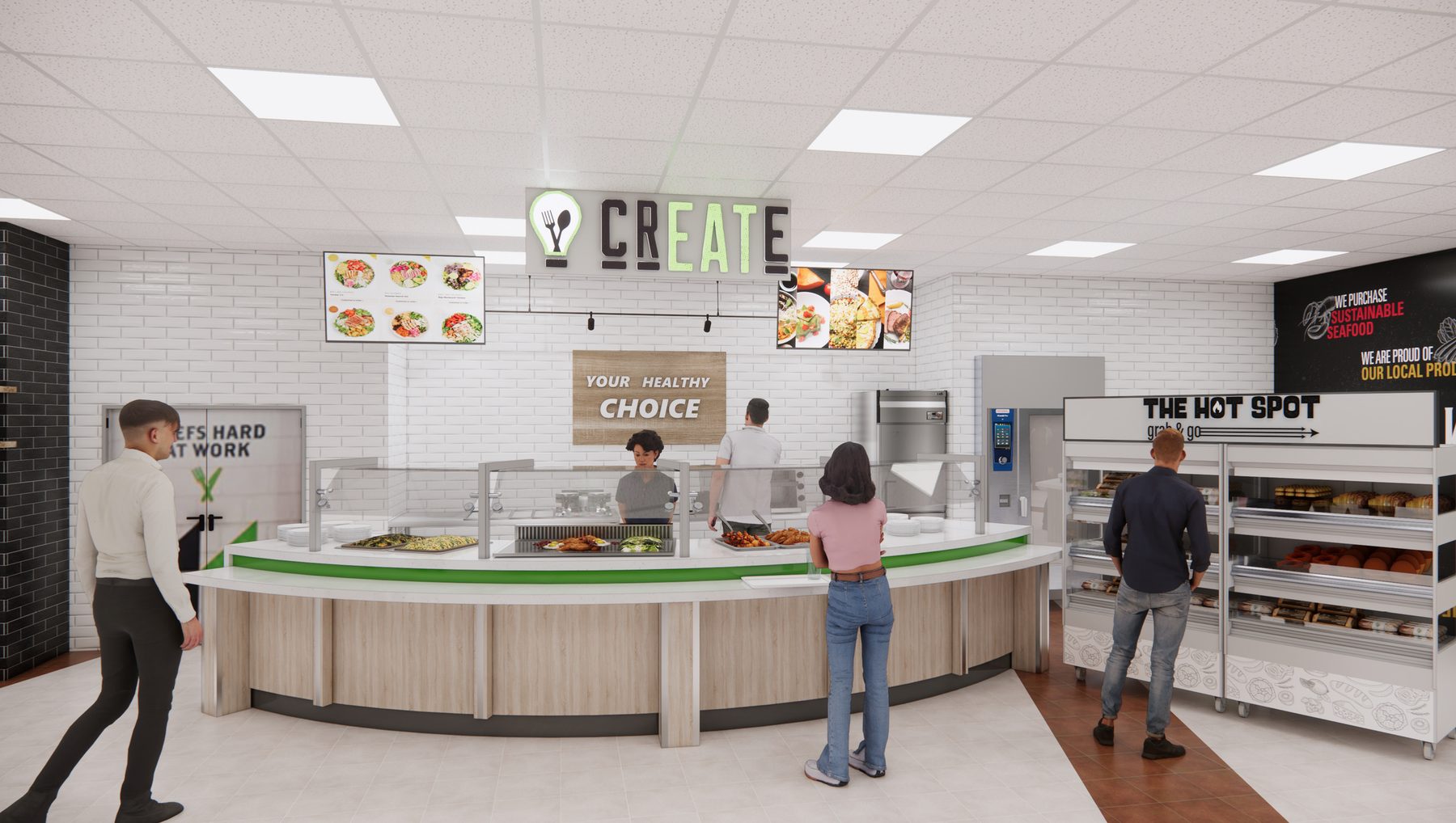
Borrowed from the college
The program draws on Algonquin green, the college's institutional typography and cues from its logo. Each station gets its own personality, but every one of them still reads as Algonquin.
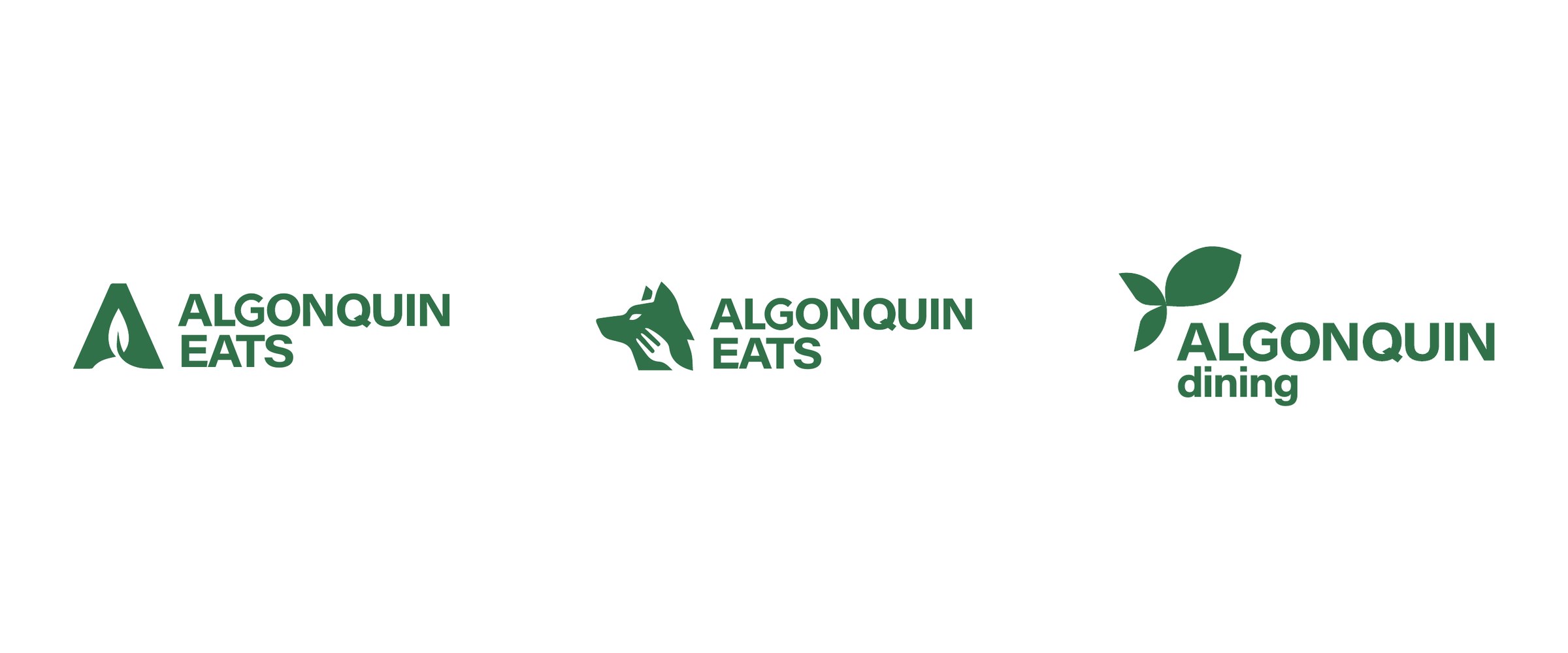
The RFP showed three master marks. A-Leaf builds a leaf into the college's A. Wolf & Fork uses the Algonquin Wolves mascot with a hand and fork. Leaf-Fish is a shape that reads as a sprouting leaf and a fish swimming upstream, a nod to the region's rivers. Leaf-Fish became Algonquin Dining.
Brand boards
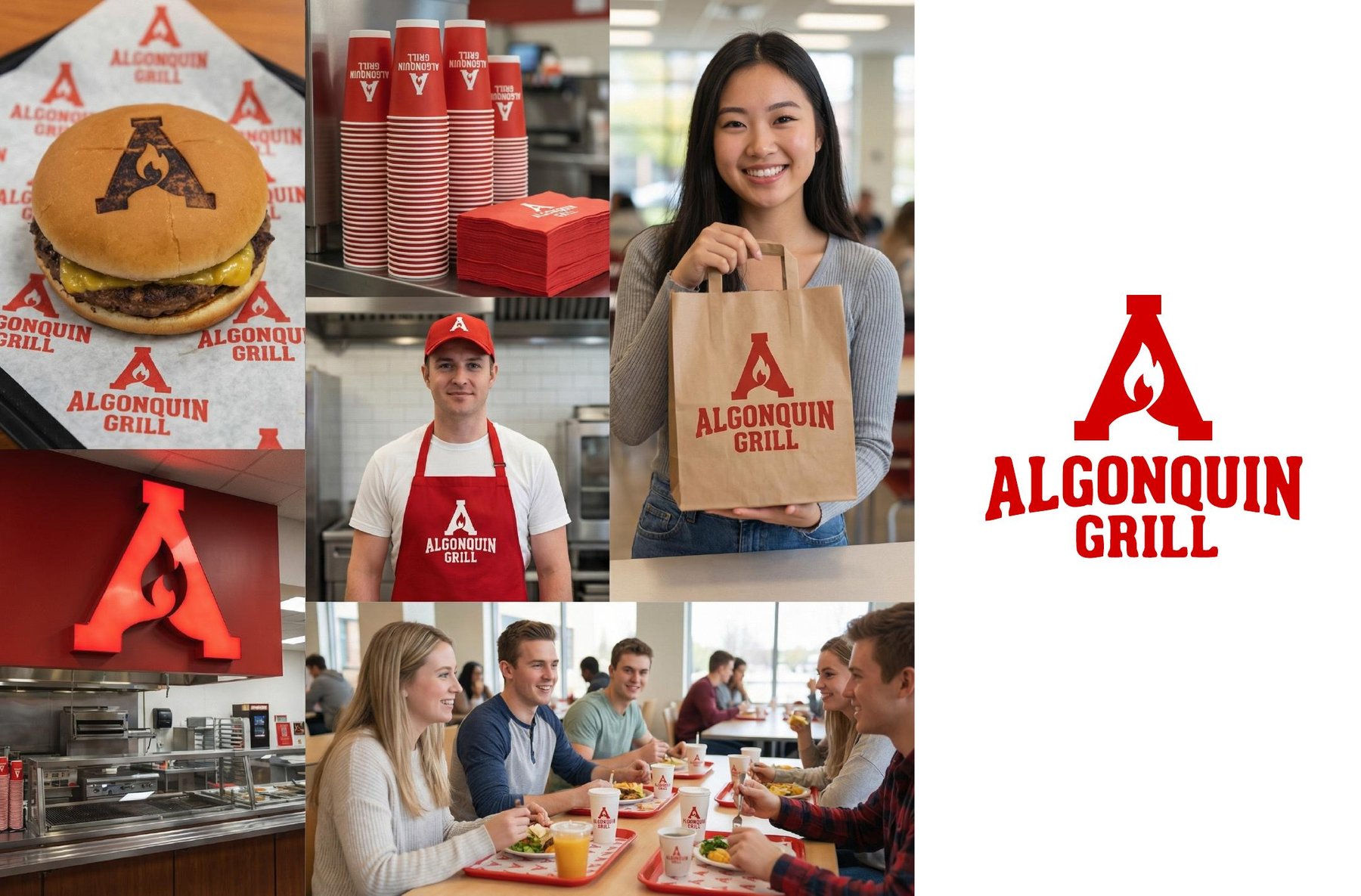
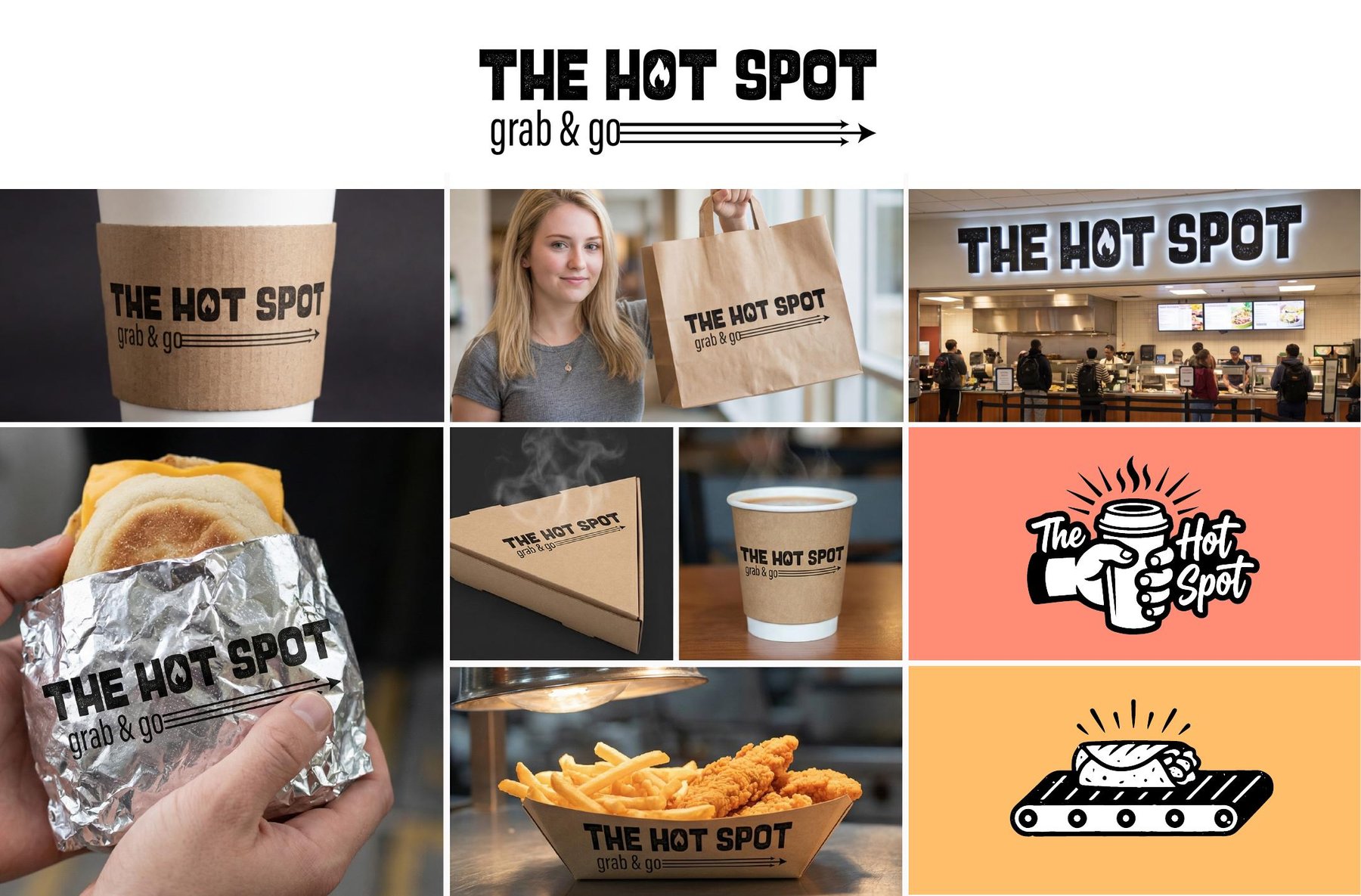
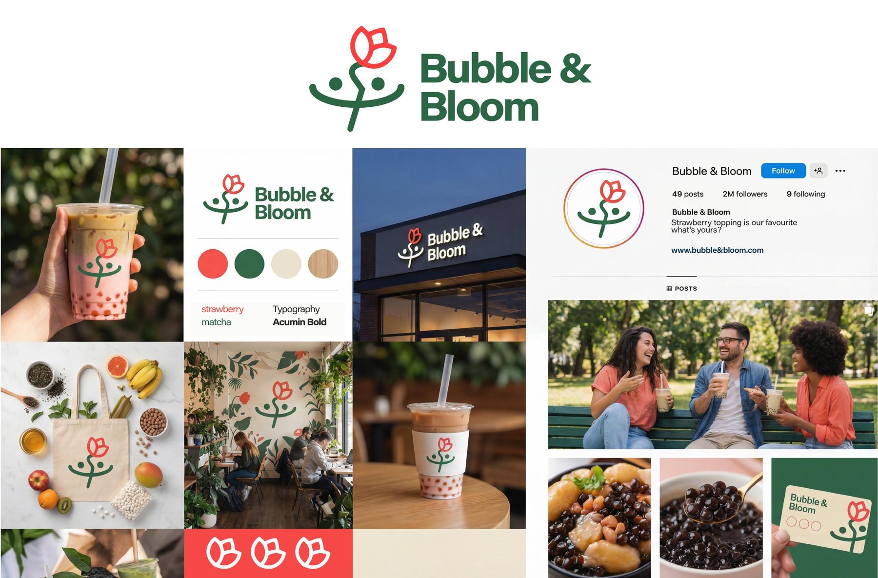
Each station concept was pitched as a brand board: the mark, the packaging and the feel of the space on one page.

A family of stations
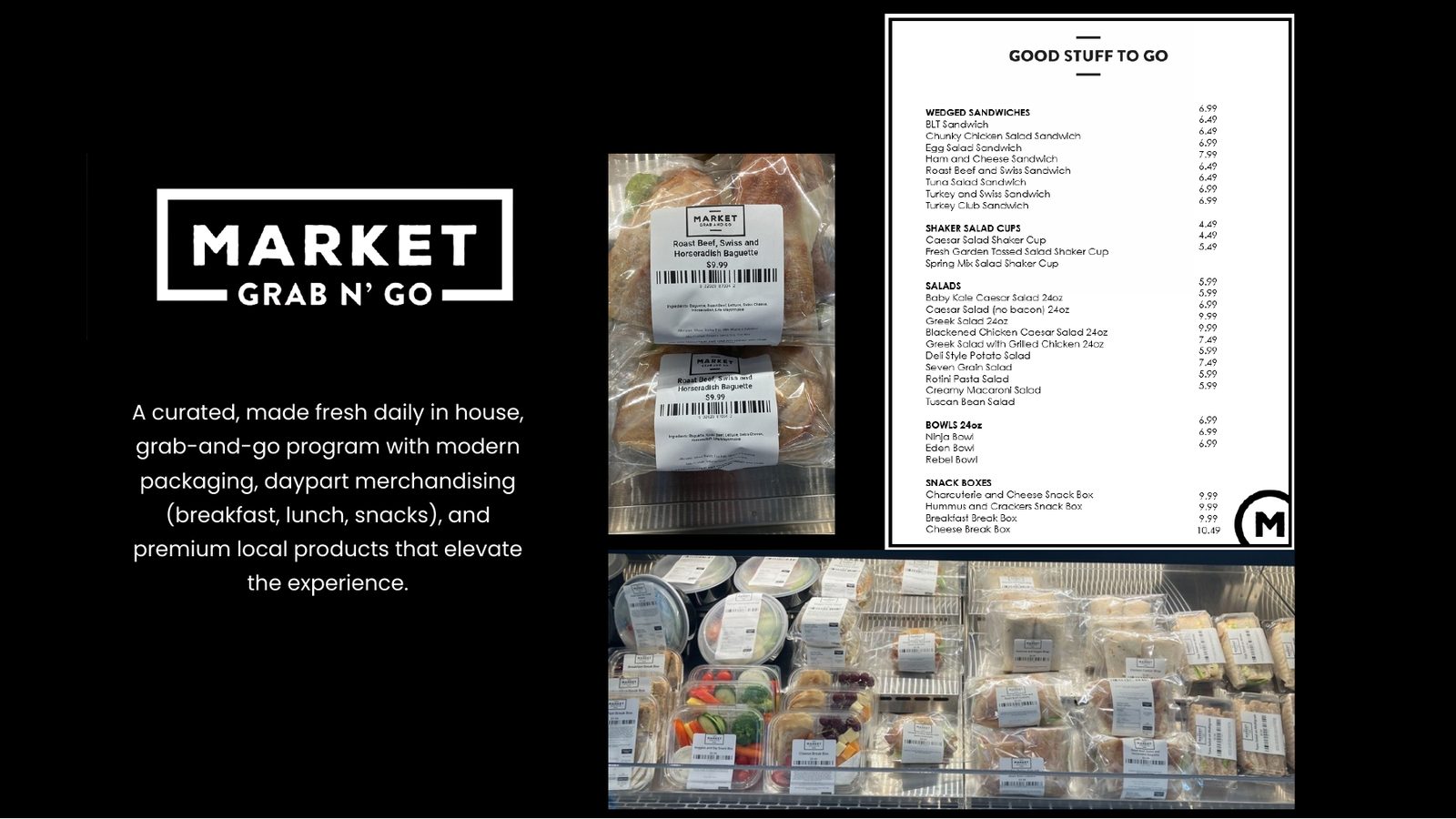
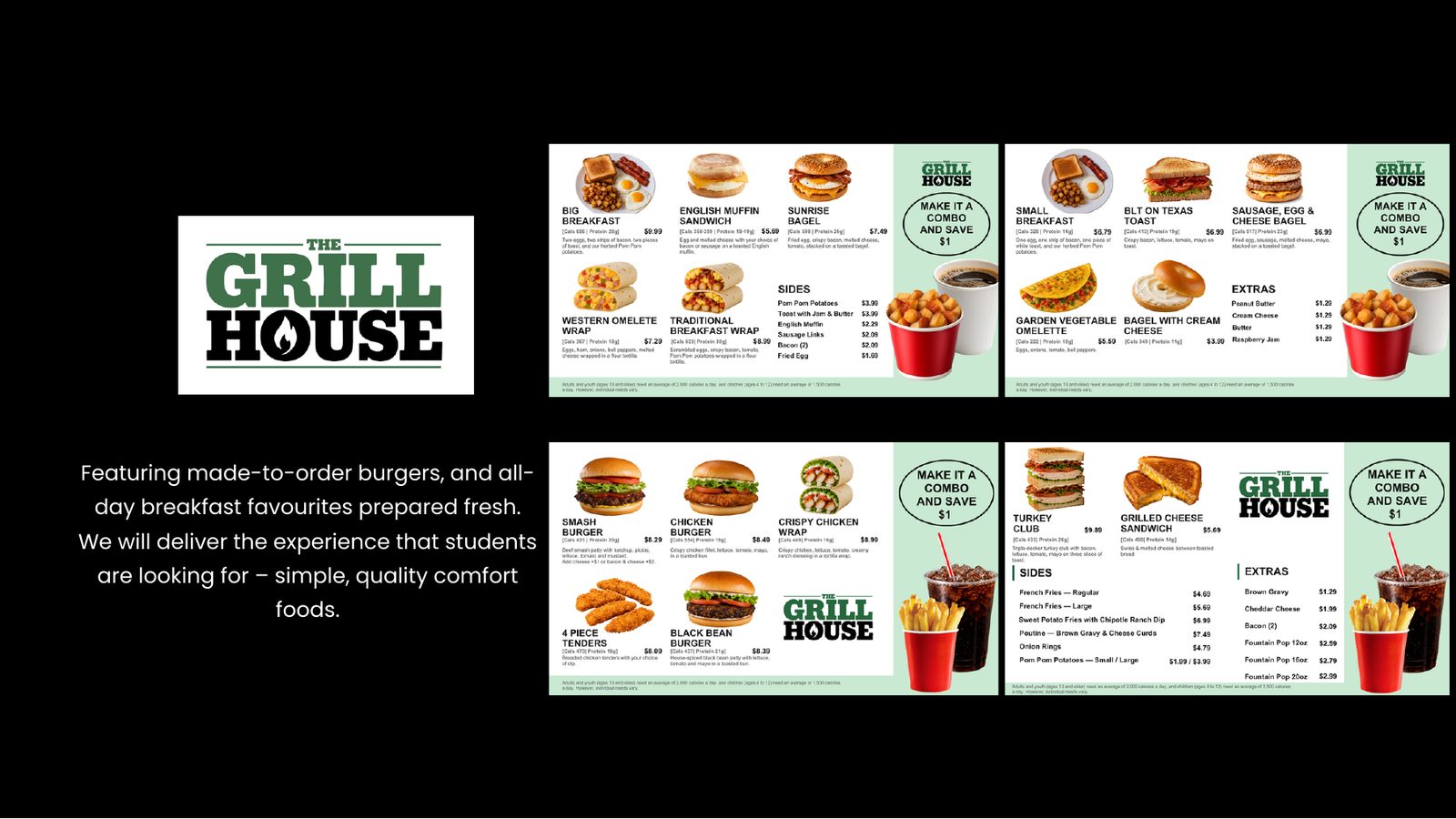
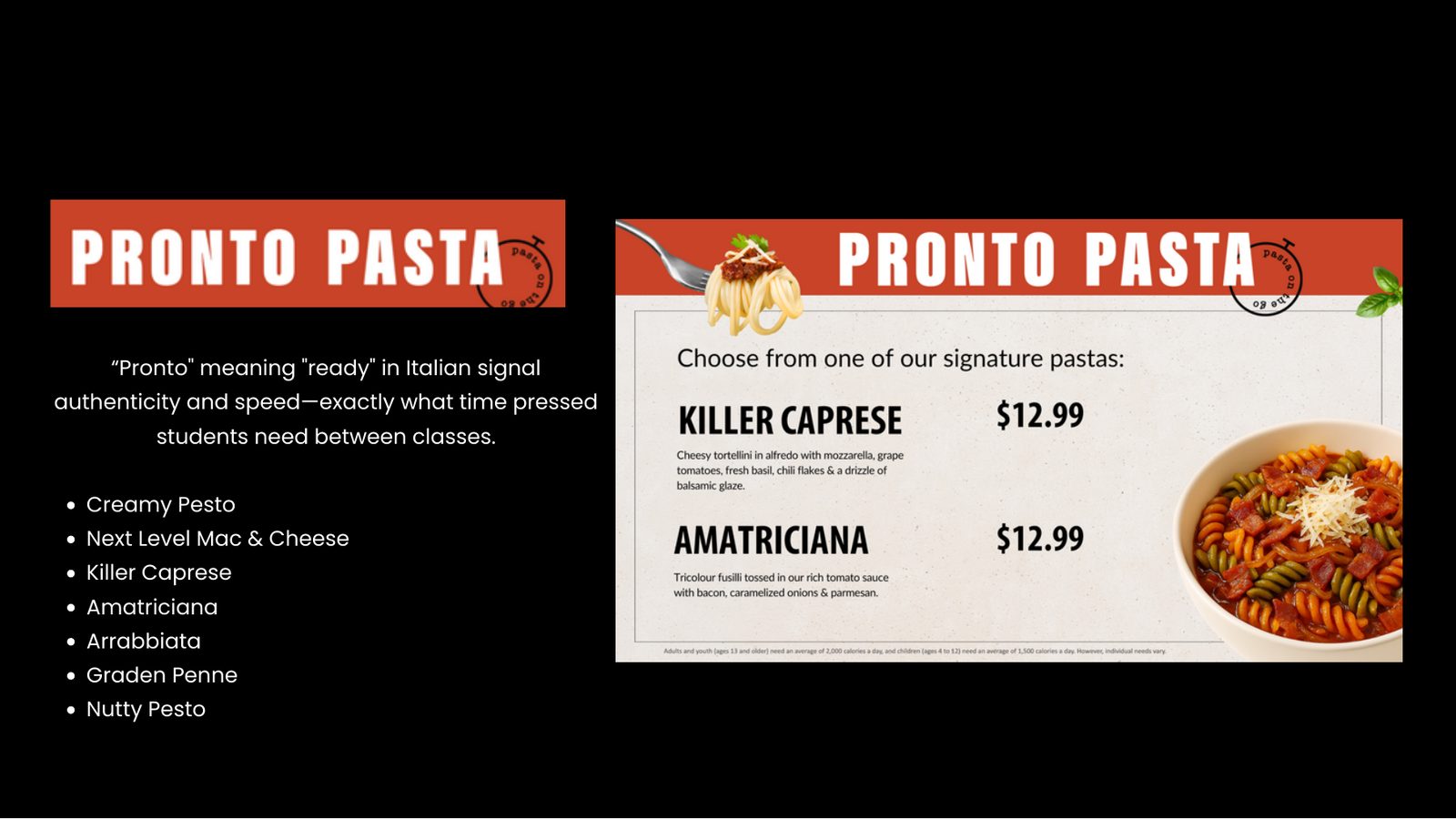
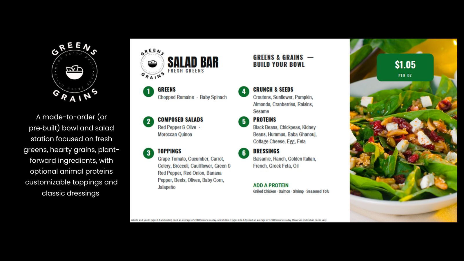
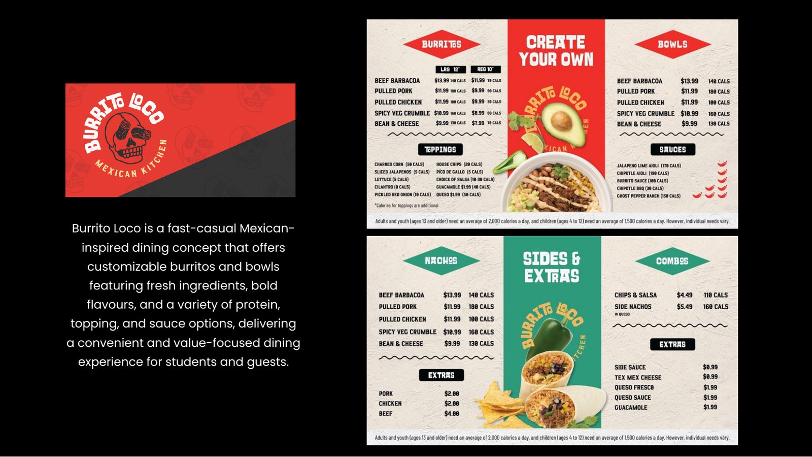
Market Grab n Go for made-fresh daily packaged food. Grill House for burgers and all-day breakfast. Pronto Pasta, named for what students need between classes: food that is ready. Plus Greens & Grains, Burrito Loco, Create, Bubbz, The Hot Spot and Spoons & Ladles.
Naming the residence café
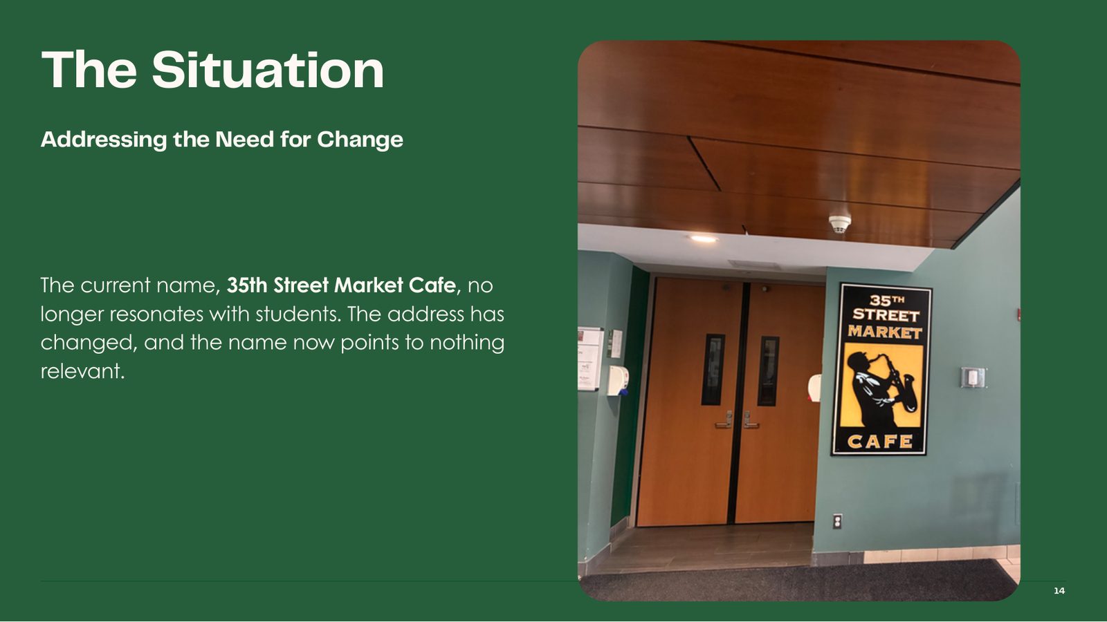
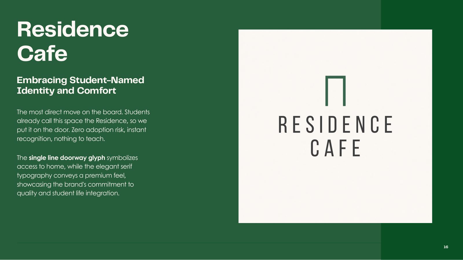
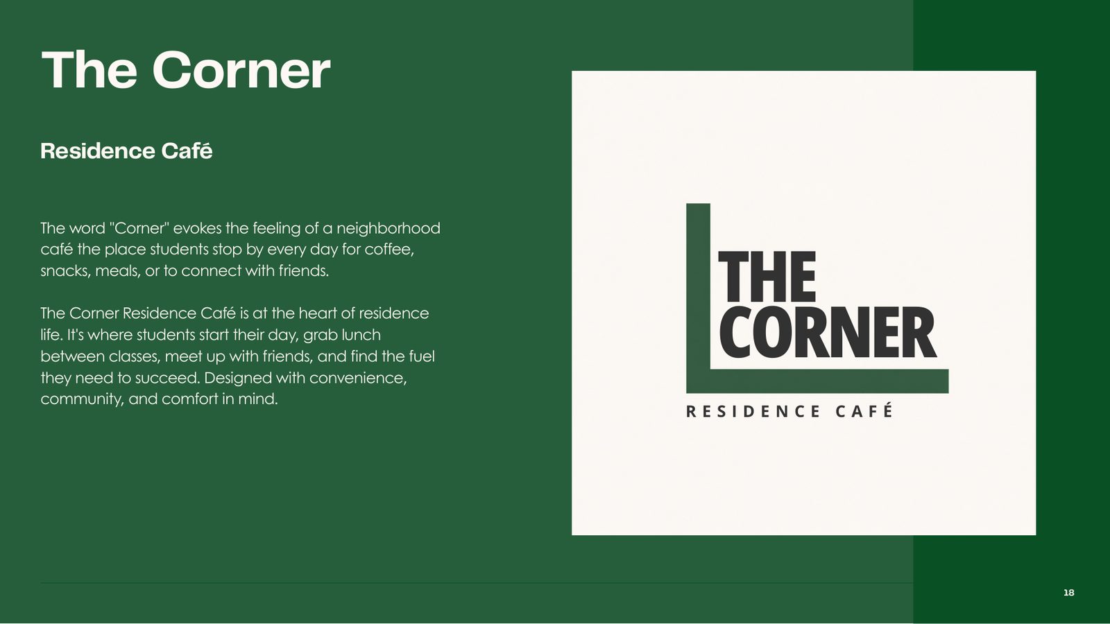
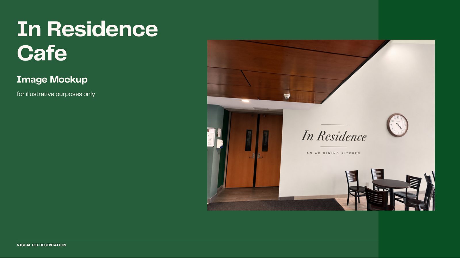
The residence café was called the 35th Street Market Café. The address had changed, so the name pointed to nothing. I proposed four names built on how students already talk about the space: Residence Café, In Residence Café, The Corner and The Spot. Each one was mocked up on the real door.

In the space
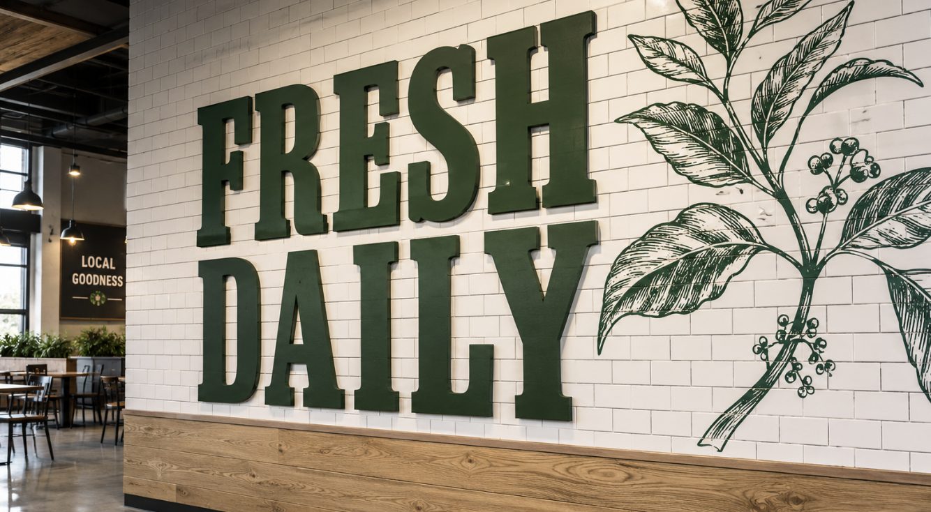
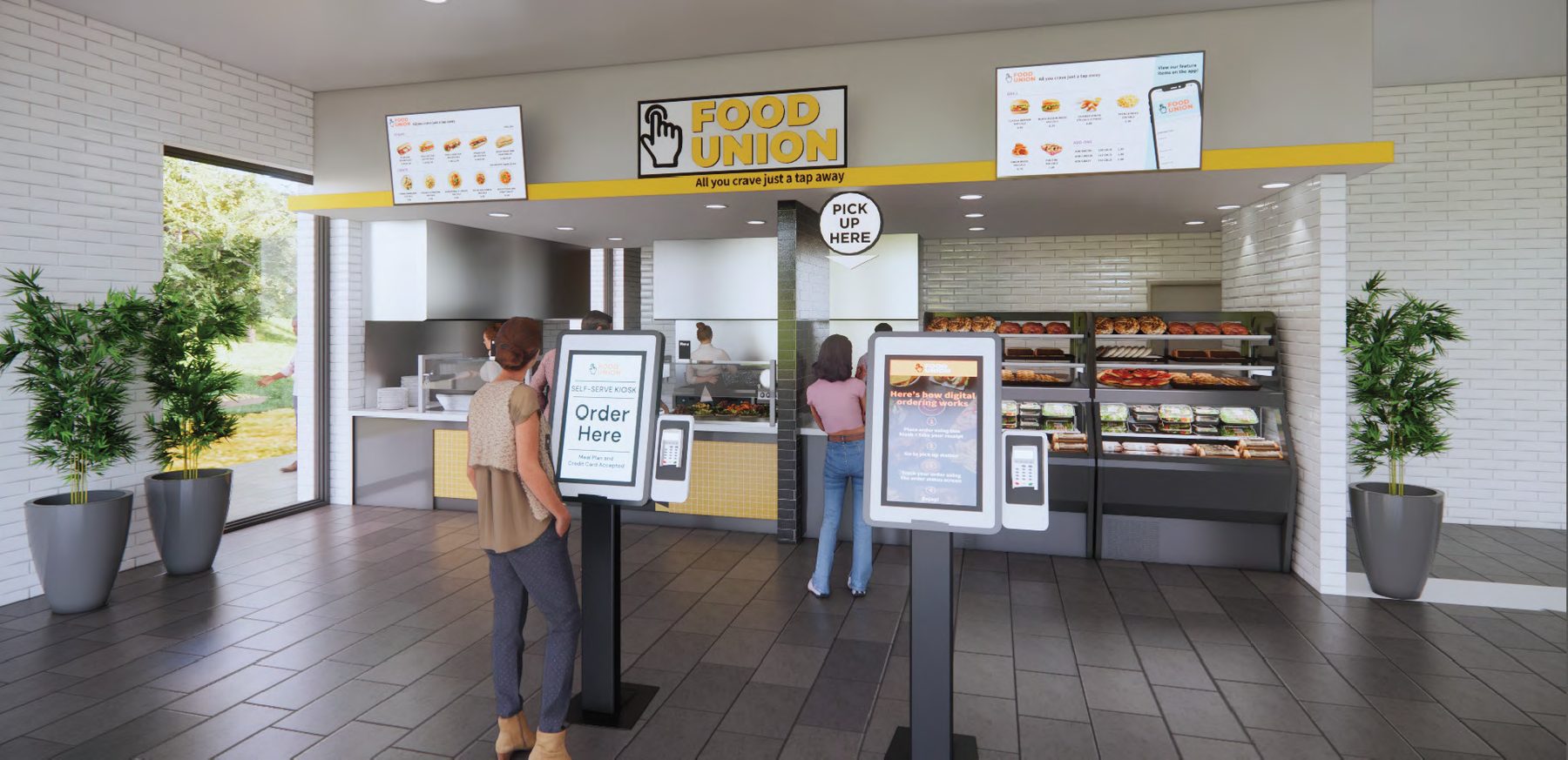
Concept renders for the servery and wall graphics, used to plan the graphic installation.
Next project
York University: YU Eats