Fort Edmonton Park
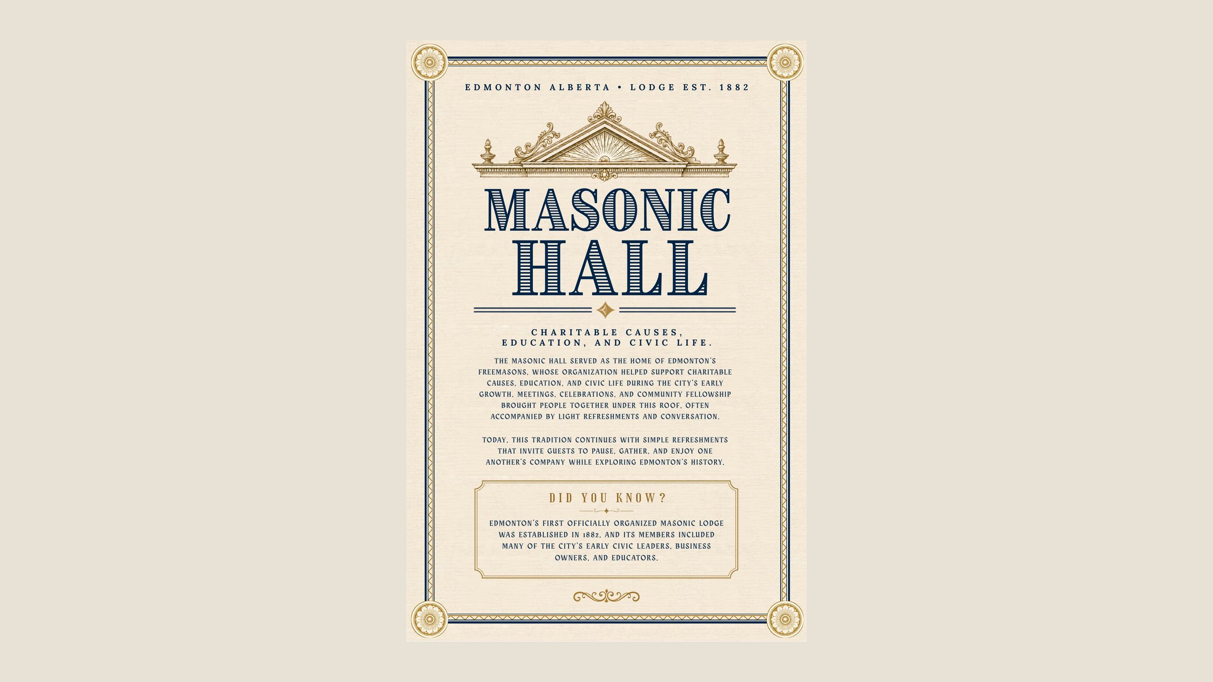
Interpretive posters and a full menu family for the food and drink venues at Fort Edmonton Park, a living history museum in Edmonton. The park walks visitors through different eras, so each poster is set in the type and ornament of its own street and year, and the menus carry that into something staff can actually update.
- Client
- Fort Edmonton Park, through Compass Group Canada
- Year
- 2026
- Role
- Designer
- Scope
- Posters, menu family, menu marks
- Outcome
- Submitted to the park, 2026
"Justin really just took it and ran and did a great job on these."
Consistency lives in the writing
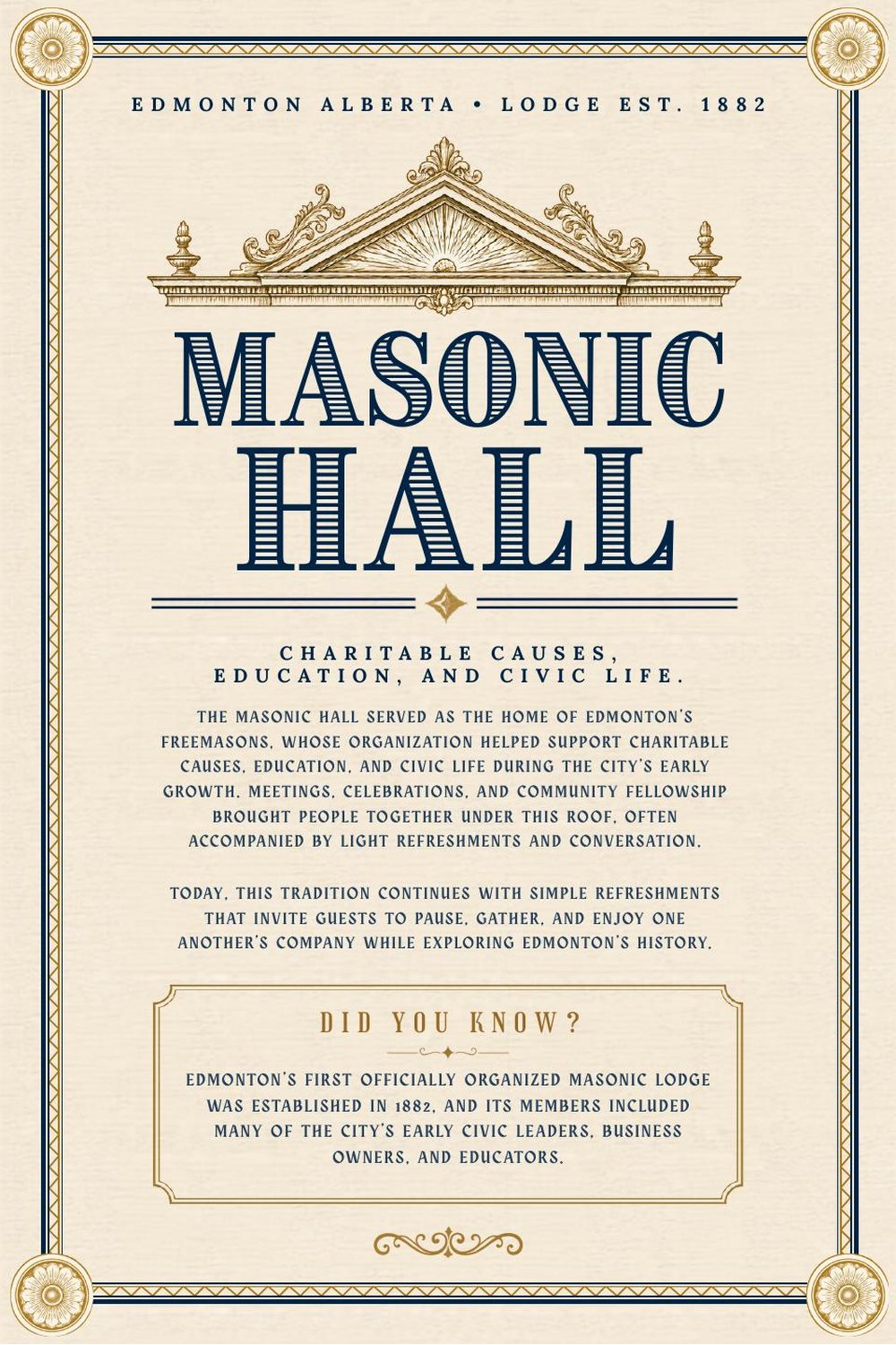
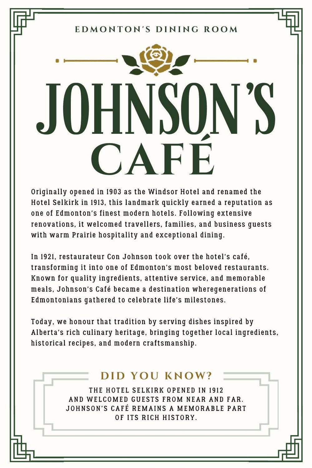
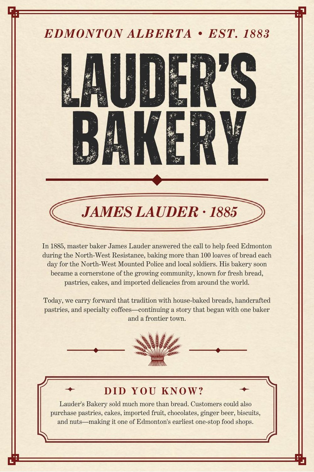
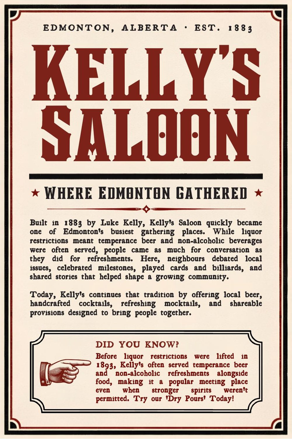
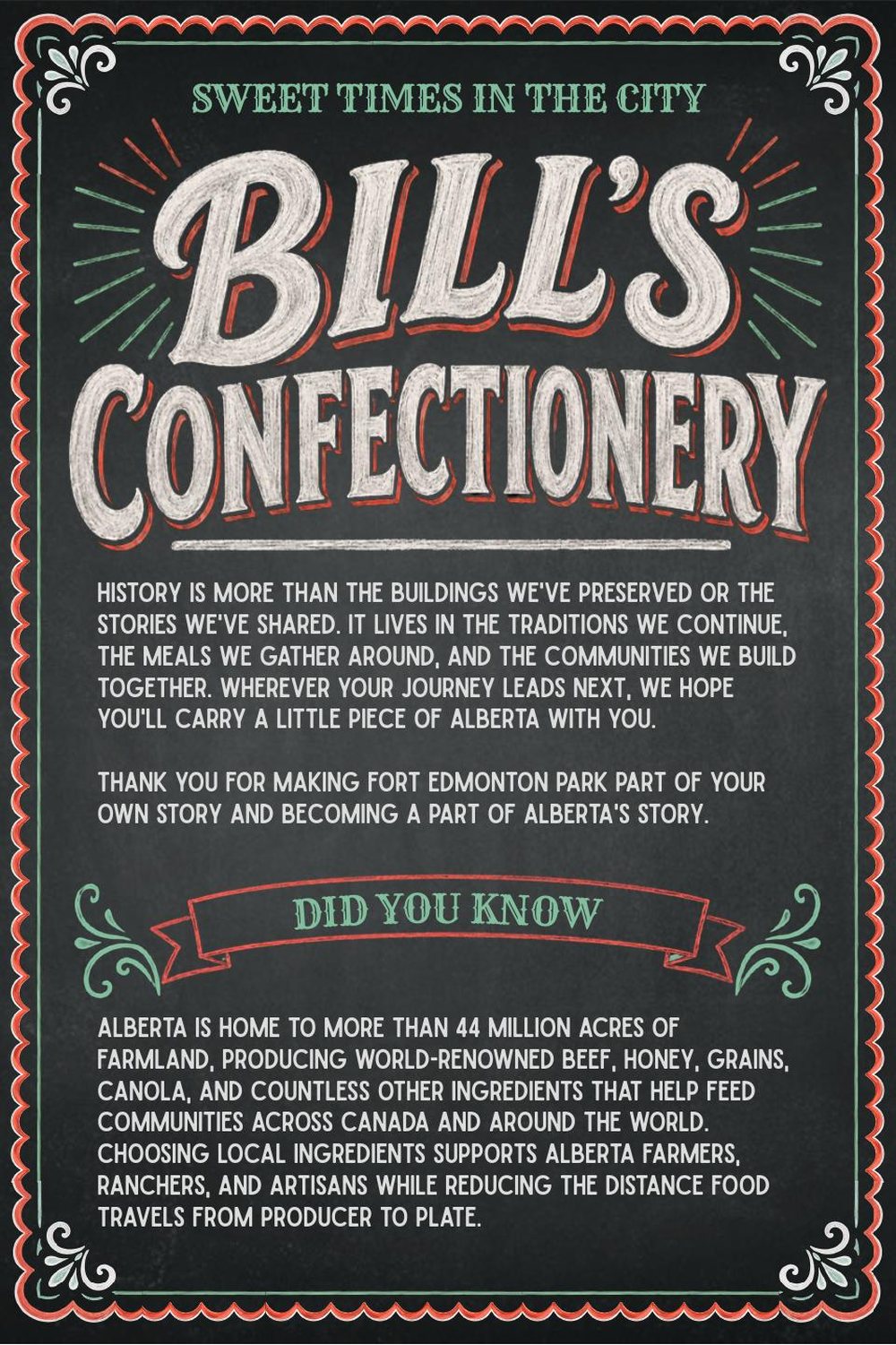
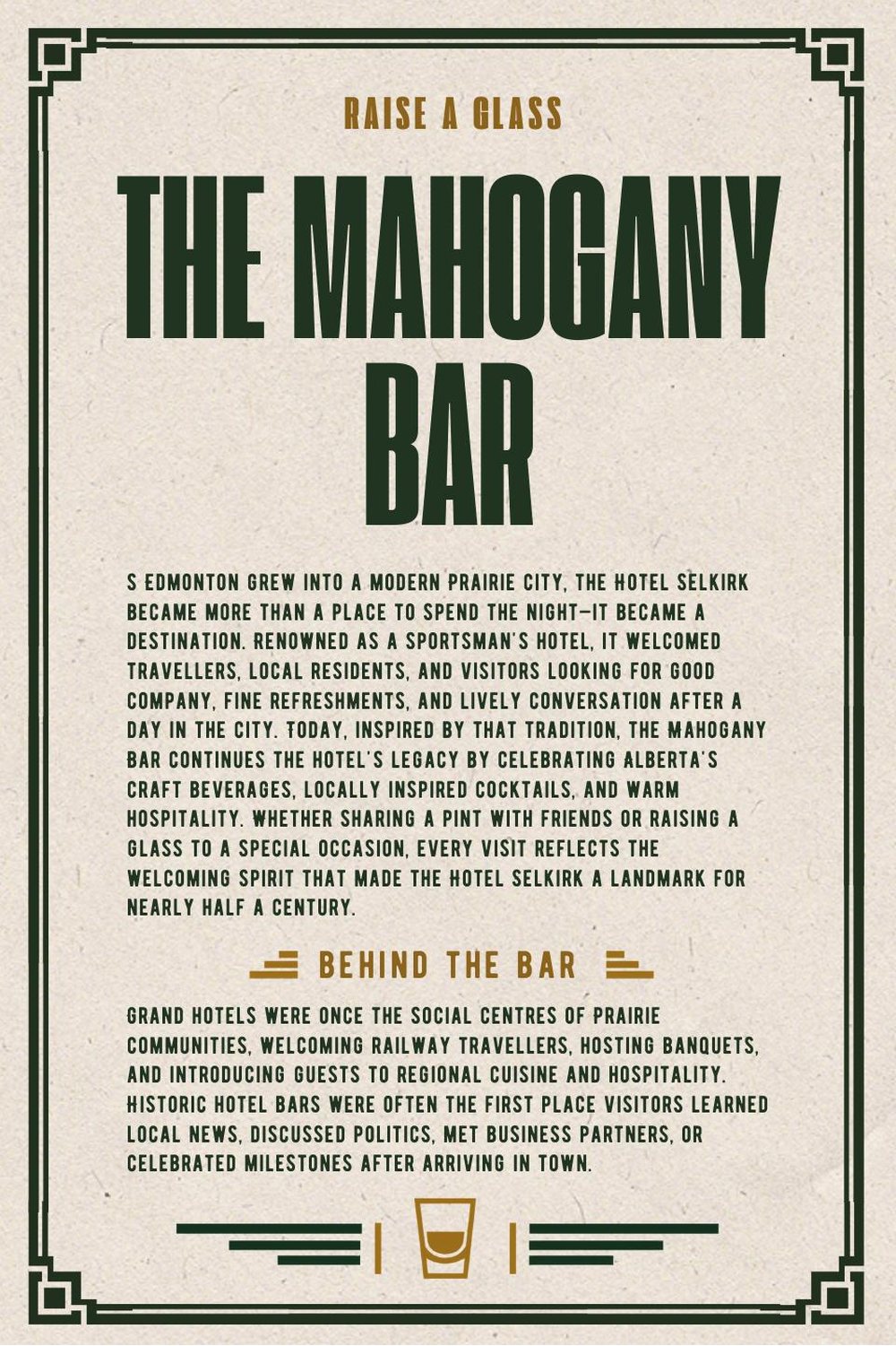
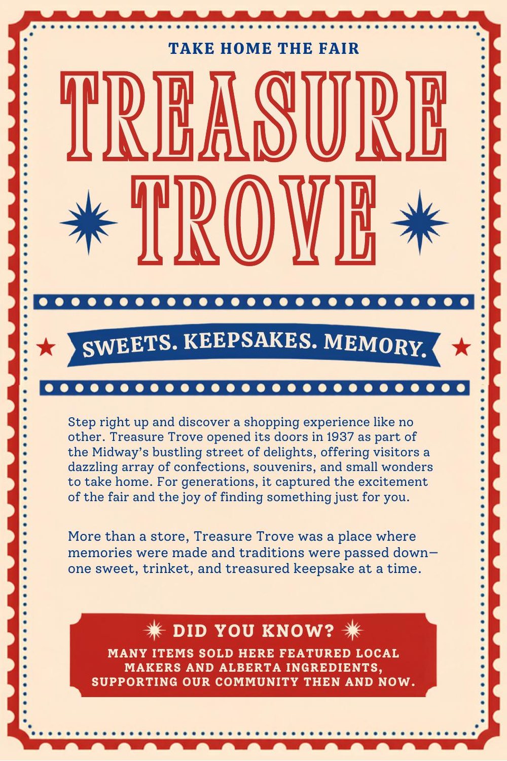
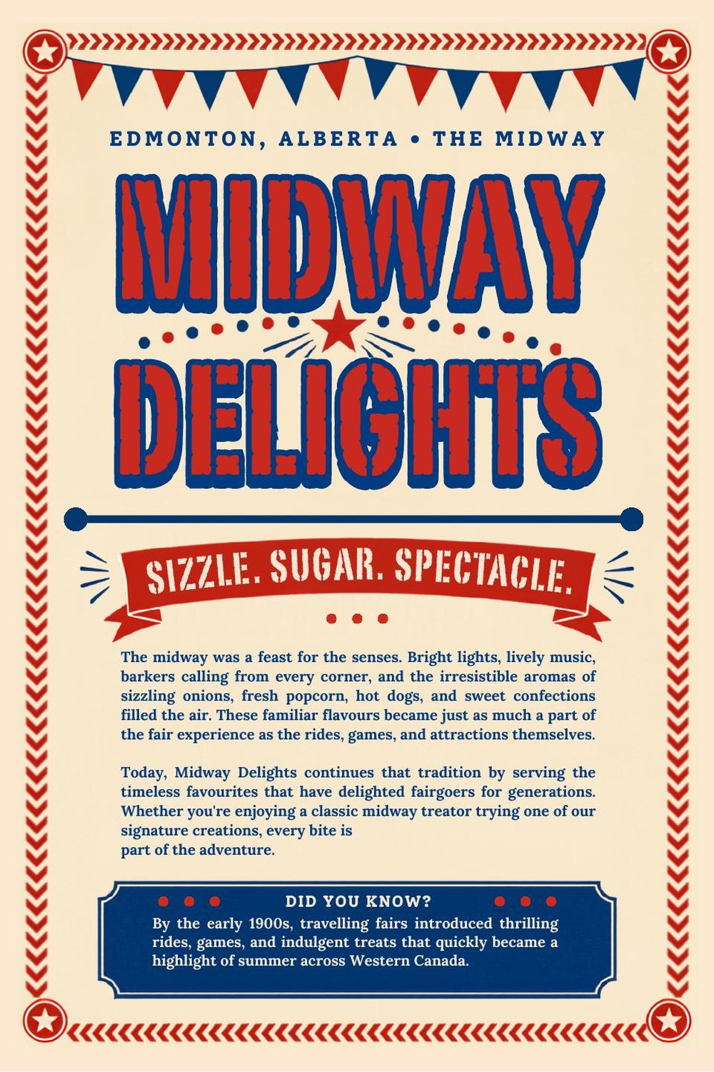
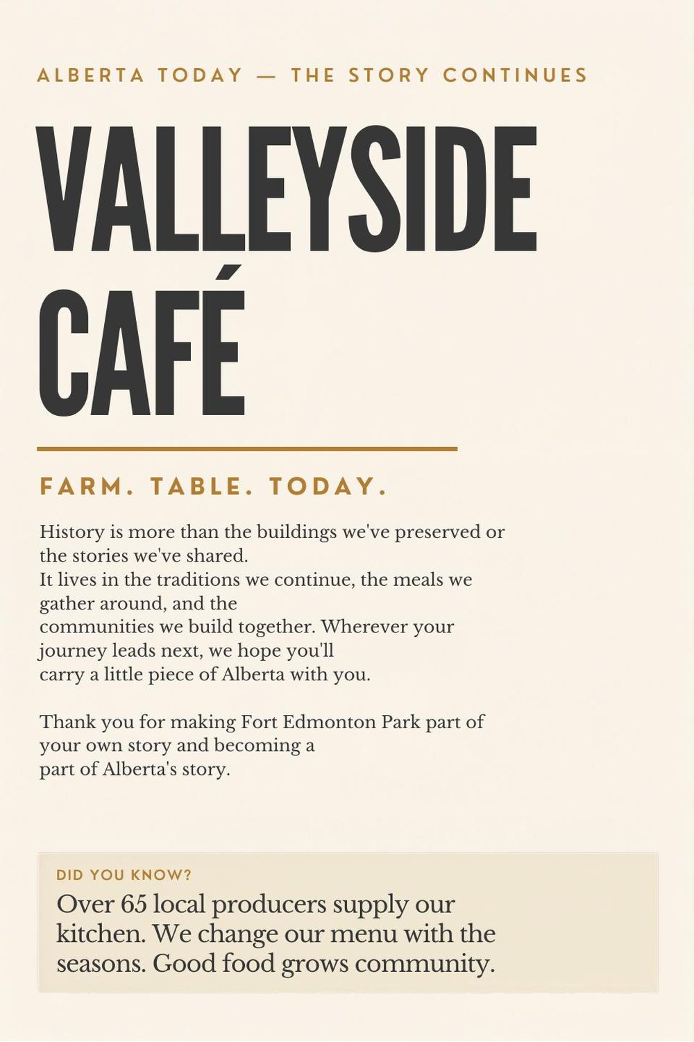
Every panel follows the same structure: the venue and its year, a short history in the same voice, and a "Did you know?" box in the same position near the bottom.
Because the structure never changes, the surface can change completely. A visitor learns how to read one panel and can read all nine.
Nine eras
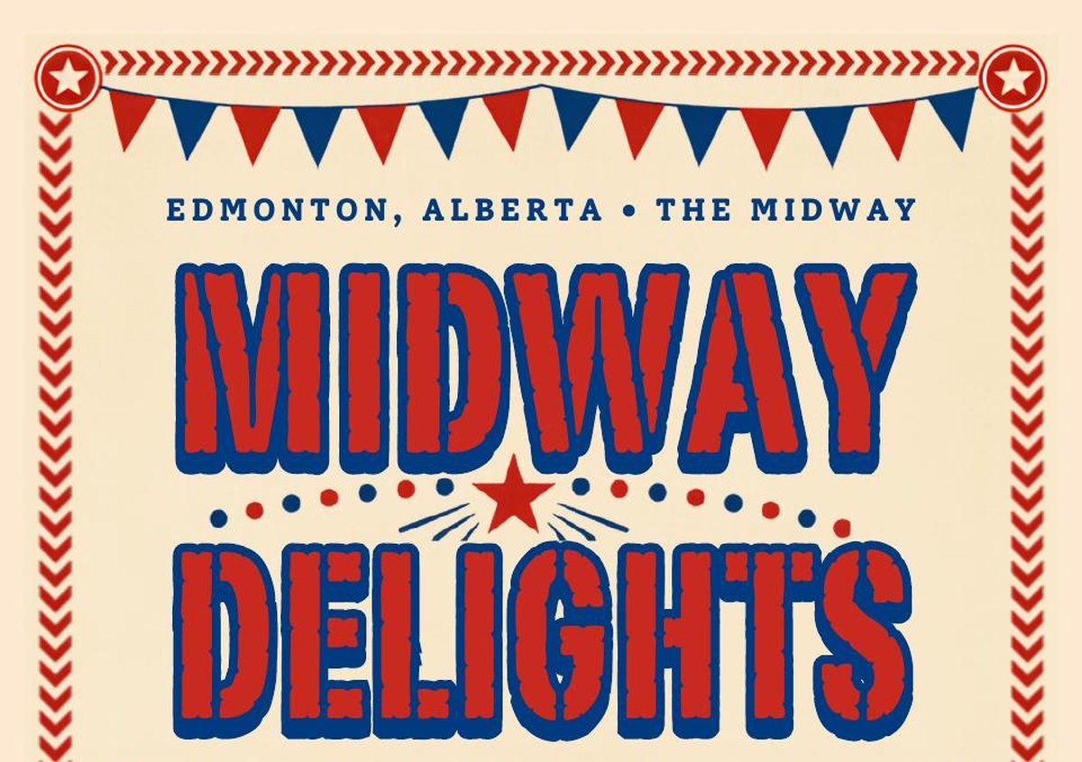
From an 1880s lodge and bakery to a 1920s café and the Midway. Each panel's type, border and ornament come from its period.
The menus
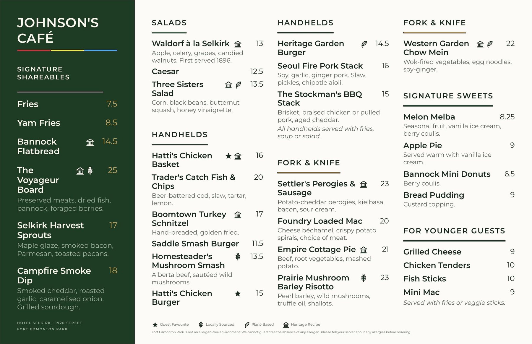
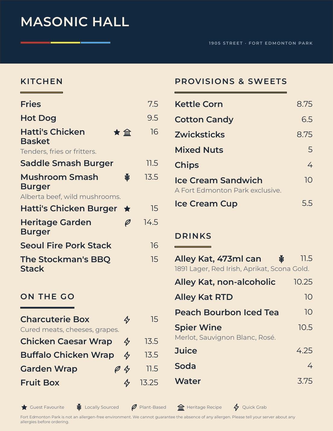
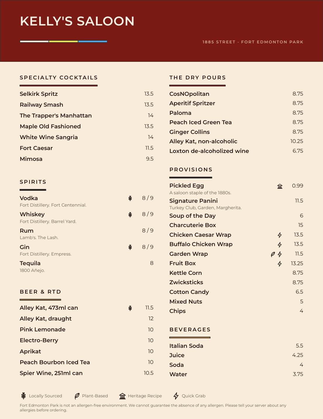
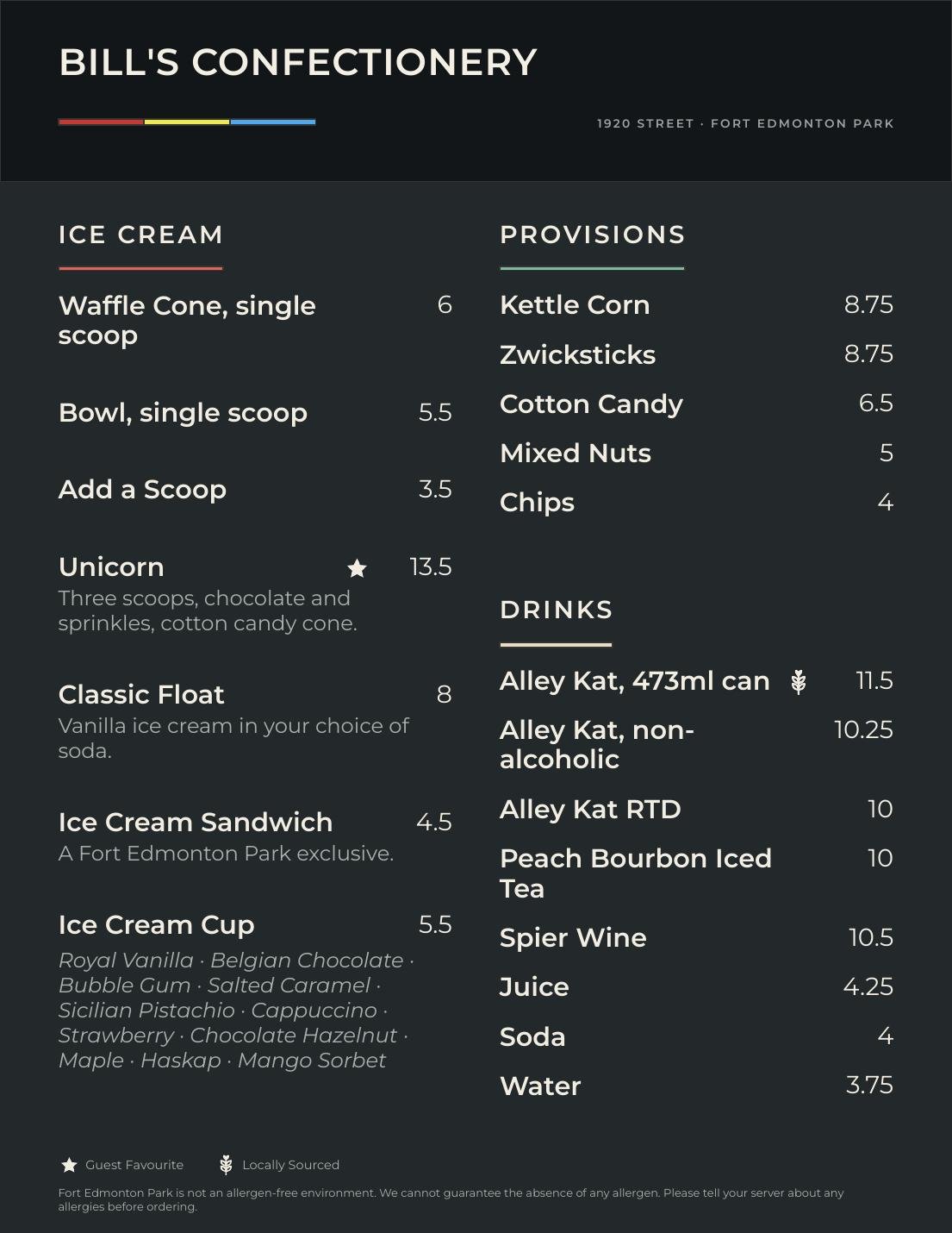
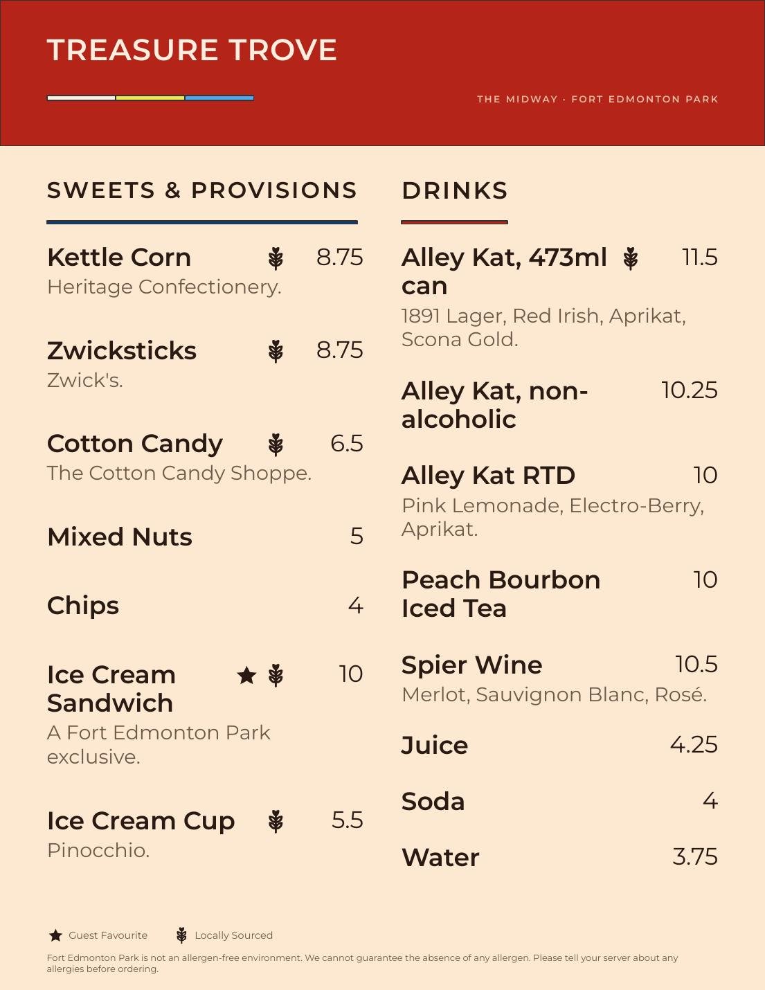
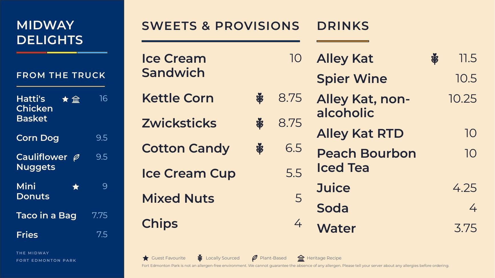
Every venue got a menu in three formats: letter, ledger and a 16:9 screen. Each one borrows its colour and type from the venue's poster, so the two read as a pair. The structure underneath stays the same, so prices and items can change without breaking the design.
Menu marks
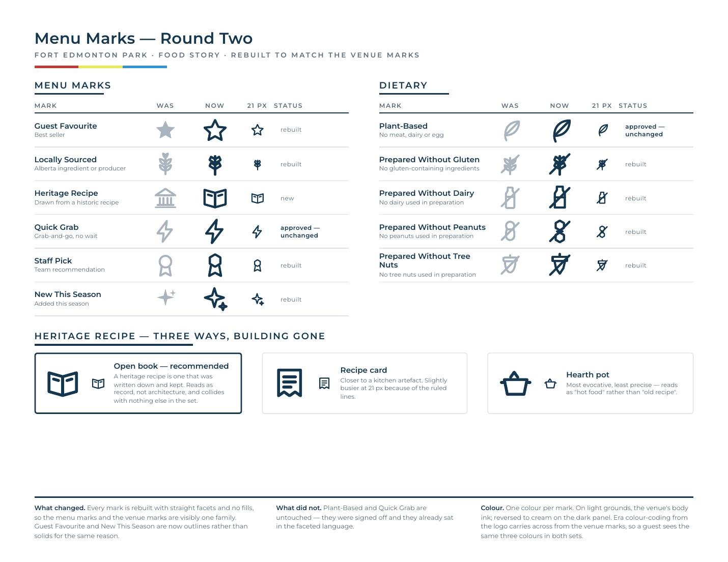
A small set of icons marks guest favourites, local items, heritage recipes and plant-based dishes. They were redrawn to match the venue marks: straight facets, no fills, one colour per mark, and reversible on dark panels. I tested them at real menu size so they hold up at 21 pixels.
Up close
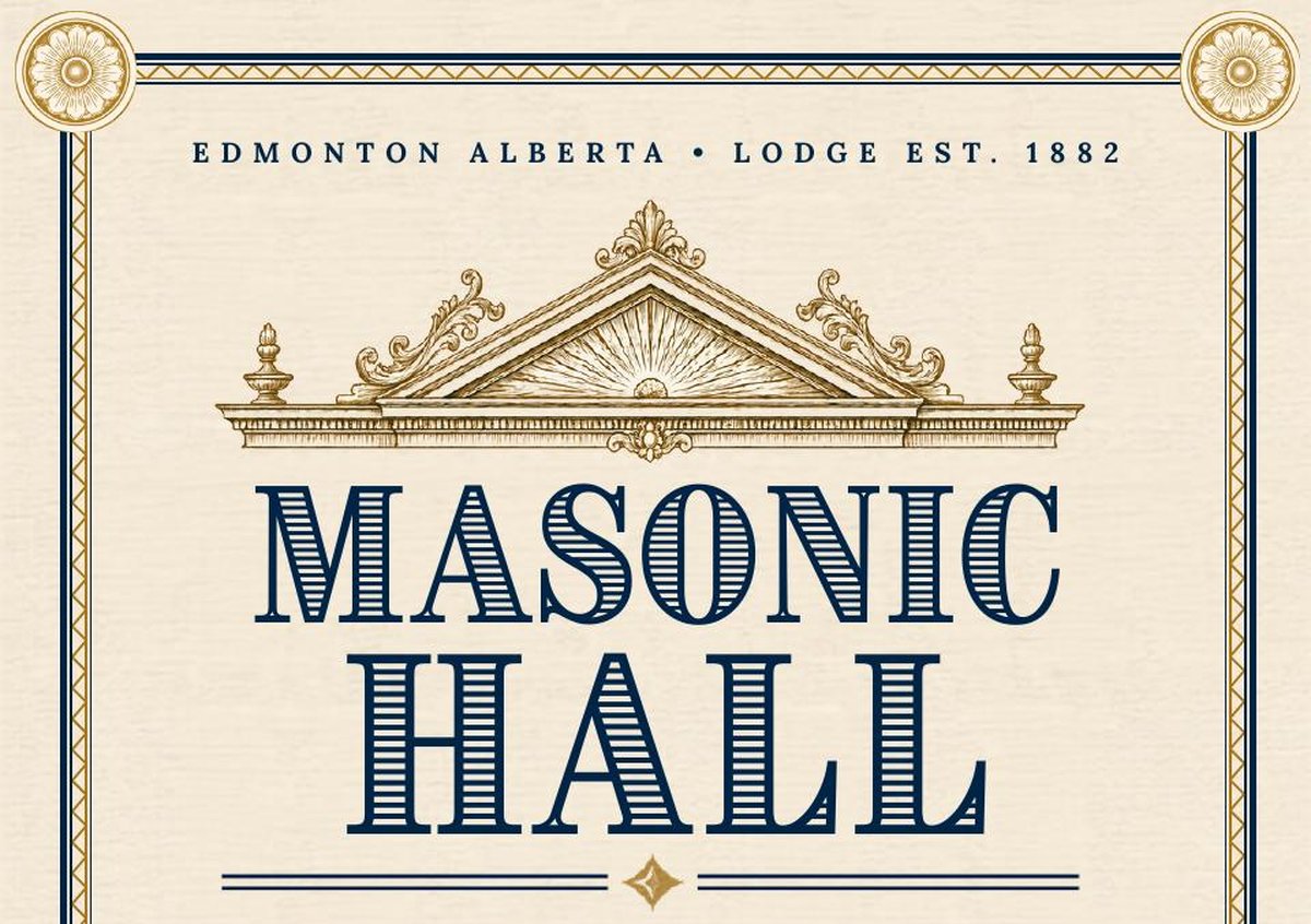
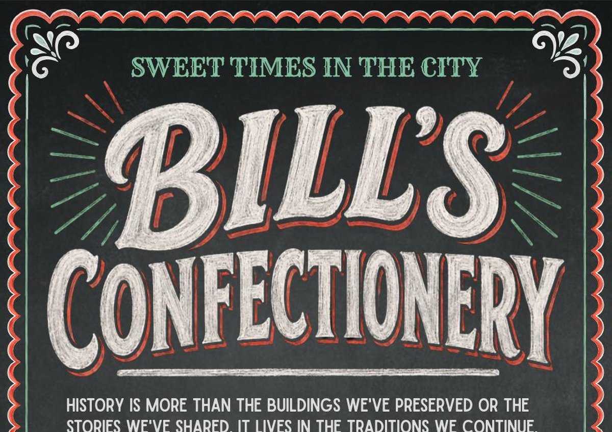
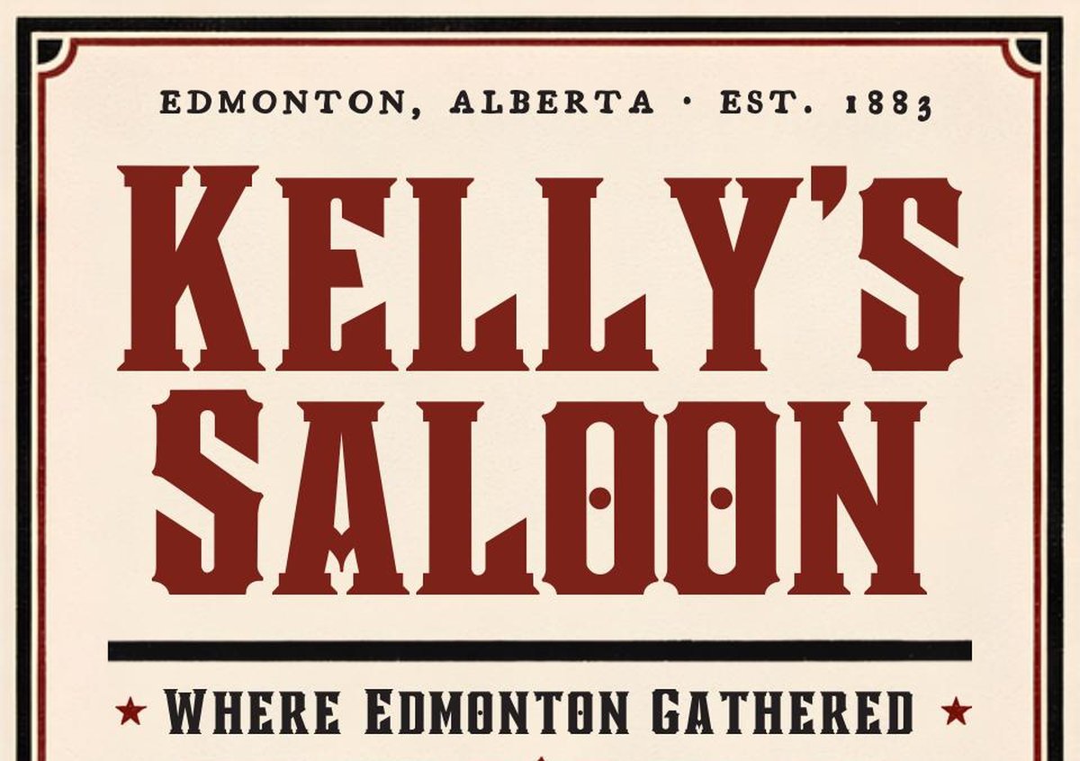
The mastheads carry most of the period character: engraved ornament, inline and shaded letters, and chalkboard script.
Next project
Dalhousie University