
Dalhousie University Hospitality Brand System
Project
Dalhousie University Hospitality Brand
Complete Brand Architecture & Identity System
Role & Timeline
Lead Designer (Sole Creative)
4 weeks · 2024
Deliverables
- Complete brand architecture strategy
- 5 dining hall sub-brands
- 8+ retail café identities
- Environmental design mockups
Outcomes
- $180M RFP submission
- 2 complete concept directions
- 13+ unified location brands
- Enterprise-scale system
Scale & Scope
5 dining halls + 8+ cafés across 2 campuses
A three-tier brand architecture that unifies all dining touchpoints under a master brand while giving each location its own distinct personality.
Tools & Process
Adobe Creative Suite, AI (Midjourney)
AI-accelerated concept visualization and environmental mockups enabled rapid iteration across 13+ location brands — compressing a typical 3–4 month agency timeline into 4 weeks.
The Challenge
Dalhousie University needed a unified hospitality brand system spanning 5 dining halls and 8+ retail cafés across multiple campuses—while honoring the institution's 200-year heritage and connecting with today's students.
This was part of Compass Group Canada's $180 million RFP response to Dalhousie University. The timeline: 4 weeks to develop a comprehensive brand strategy that could transform campus dining into a cohesive, branded experience. For context, an enterprise-scale brand architecture of this complexity — 13+ distinct location brands with environmental design mockups — would typically require 3–4 months at a traditional agency.
The existing dining program lacked cohesive visual identity. Each location operated with inconsistent branding, making wayfinding difficult and diluting the overall campus dining experience. The solution needed to be implementable at scale—from signage to digital menu boards to environmental graphics—while respecting Dalhousie's established visual identity.
This wasn't just logo design. It was creating an entire brand ecosystem that could flex across vastly different contexts: from traditional dining halls serving hundreds to intimate coffee shops, from quick-service retail to specialty concepts like boba tea.
Strategic Approach: Three-Tier Brand Architecture
I developed a hierarchical brand system with three distinct levels, each serving a specific strategic purpose:
Level 1: Master Brand
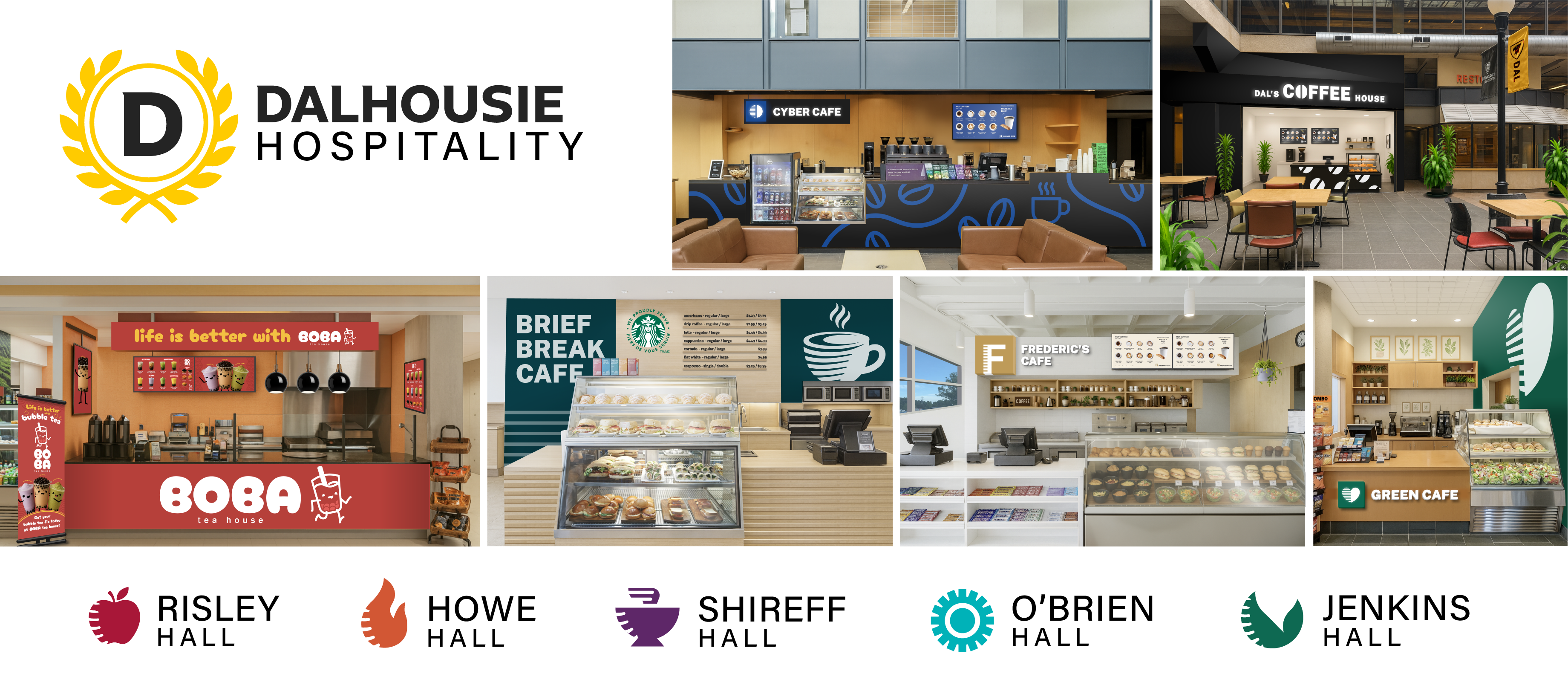
Dalhousie Hospitality — The umbrella identity anchoring the entire system, connecting every dining experience back to the university's values and heritage.
Level 2: Dining Halls
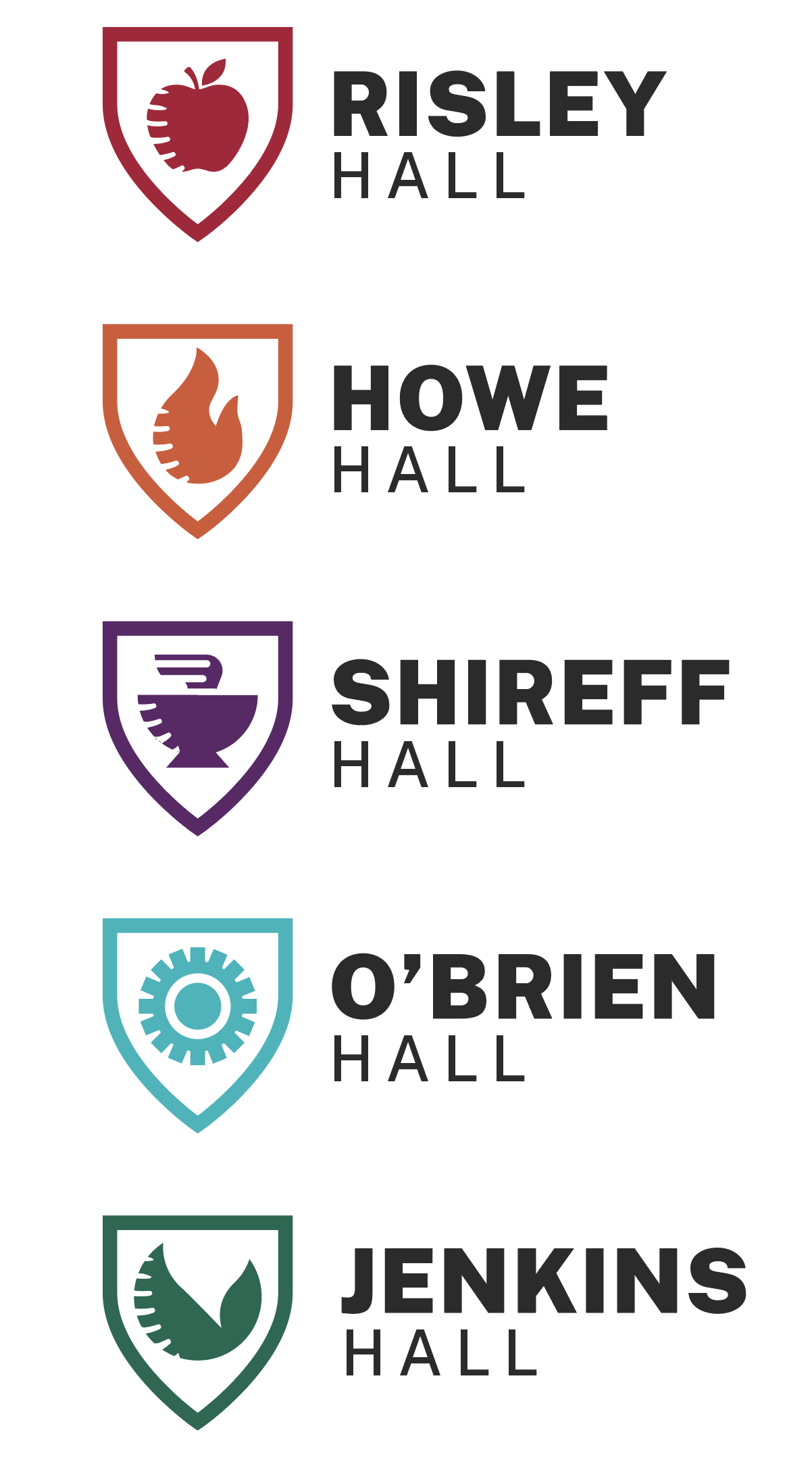
Risley, Howe, Shireff, O'Brien, Jenkins — Each with a unique identity reflecting its location, history, and student community. These are destinations, not just cafeterias.
Level 3: Retail Cafés
Ground Zero, Green Café, Topio's, Cox, Brief Break, Frederic's, and more — Quick-service and specialty concepts, each with distinct personalities while maintaining family resemblance.
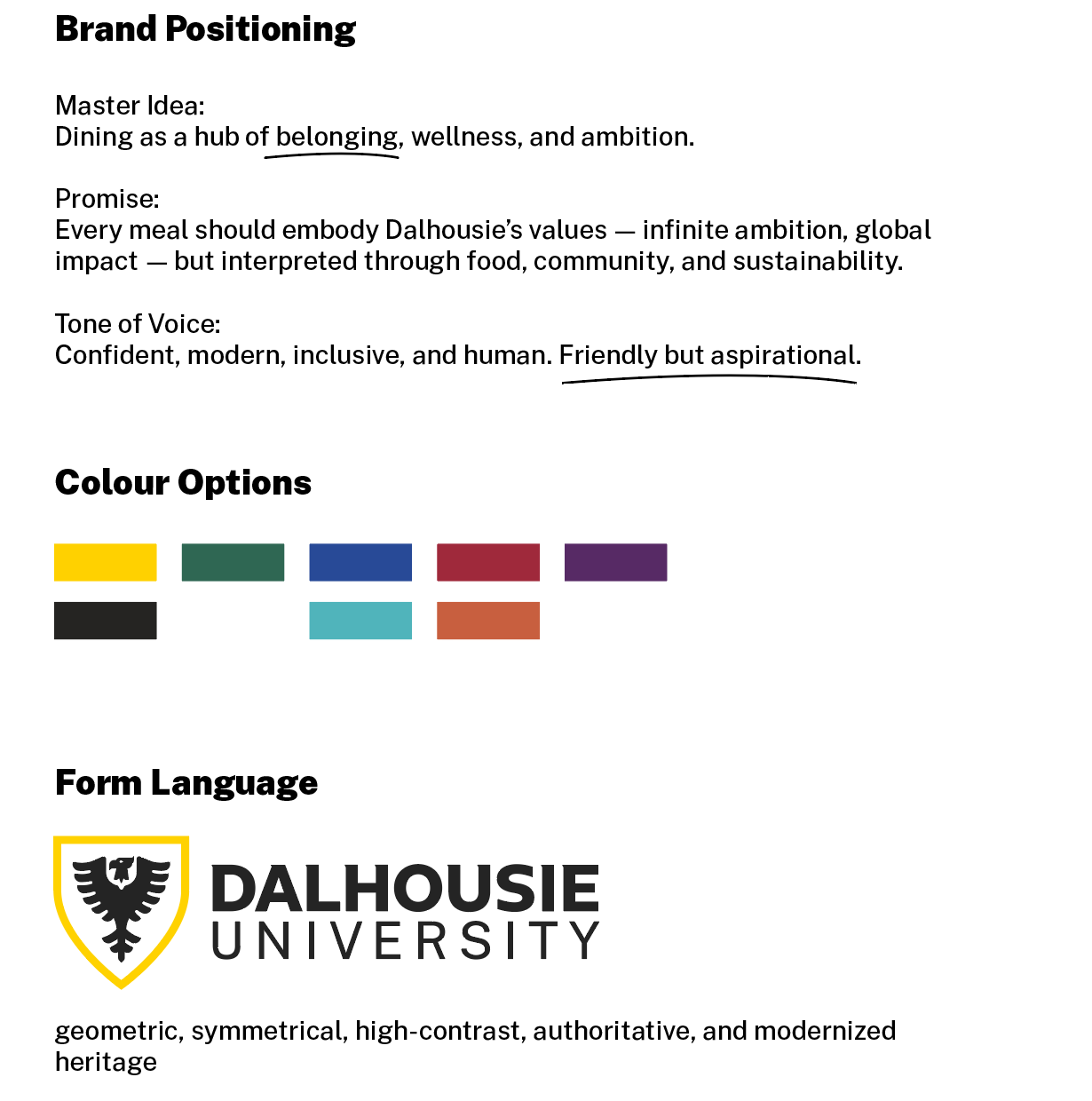
Design Principles: Geometric, symmetrical, high-contrast, authoritative—modernized heritage that speaks to students while respecting tradition. The tone is confident, modern, inclusive, and human. Friendly but aspirational.
Research & Brand DNA
Before designing a single logo, I conducted deep research into Dalhousie's existing brand system. The goal: create a hospitality identity that feels like a natural extension of the university, not an external addition.
I deconstructed Dalhousie's visual language—the typography, the color palette (black and gold), the iconic eagle crest. I identified a distinctive design element in the crest—an abstracted beak/wing form I termed the "Dalcon." This shape became a unifying motif throughout my brand system, creating subtle visual connections back to the university's heritage.
Research Phase: Deconstructing Dalhousie's visual DNA to identify design elements that could unify the hospitality brand
Exploration & Ideation
I explored multiple concept territories—from laurel wreaths to shield systems to typographic solutions—testing which visual language could best scale across the entire hospitality ecosystem.
Why laurels? Laurels are deeply embedded in academic tradition—the word "laureate" comes from this symbolism. A wreath made of leaves/grain also ties naturally to harvest, abundance, and community. The central circle is flexible: it can symbolize the table, the plate, the sun, or unity.
Beyond the master brand, I explored how iconography, color systems, and naming conventions could work together to differentiate locations while maintaining family resemblance. Coffee cups, wheat stalks, leaves, and geometric forms were tested as potential icon systems.
Testing different visual systems for dining hall sub-brands
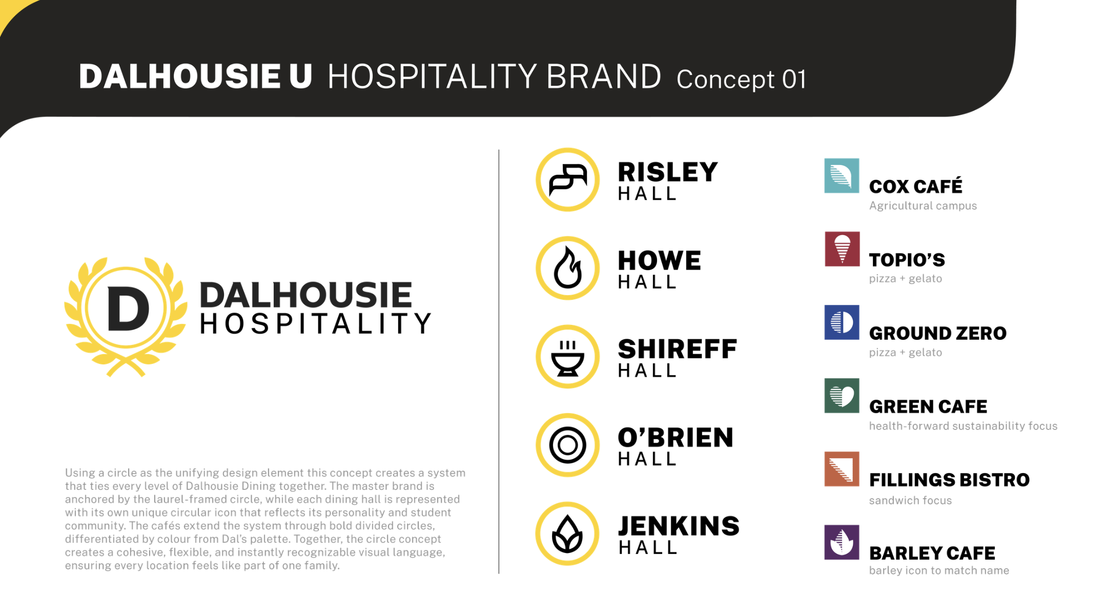
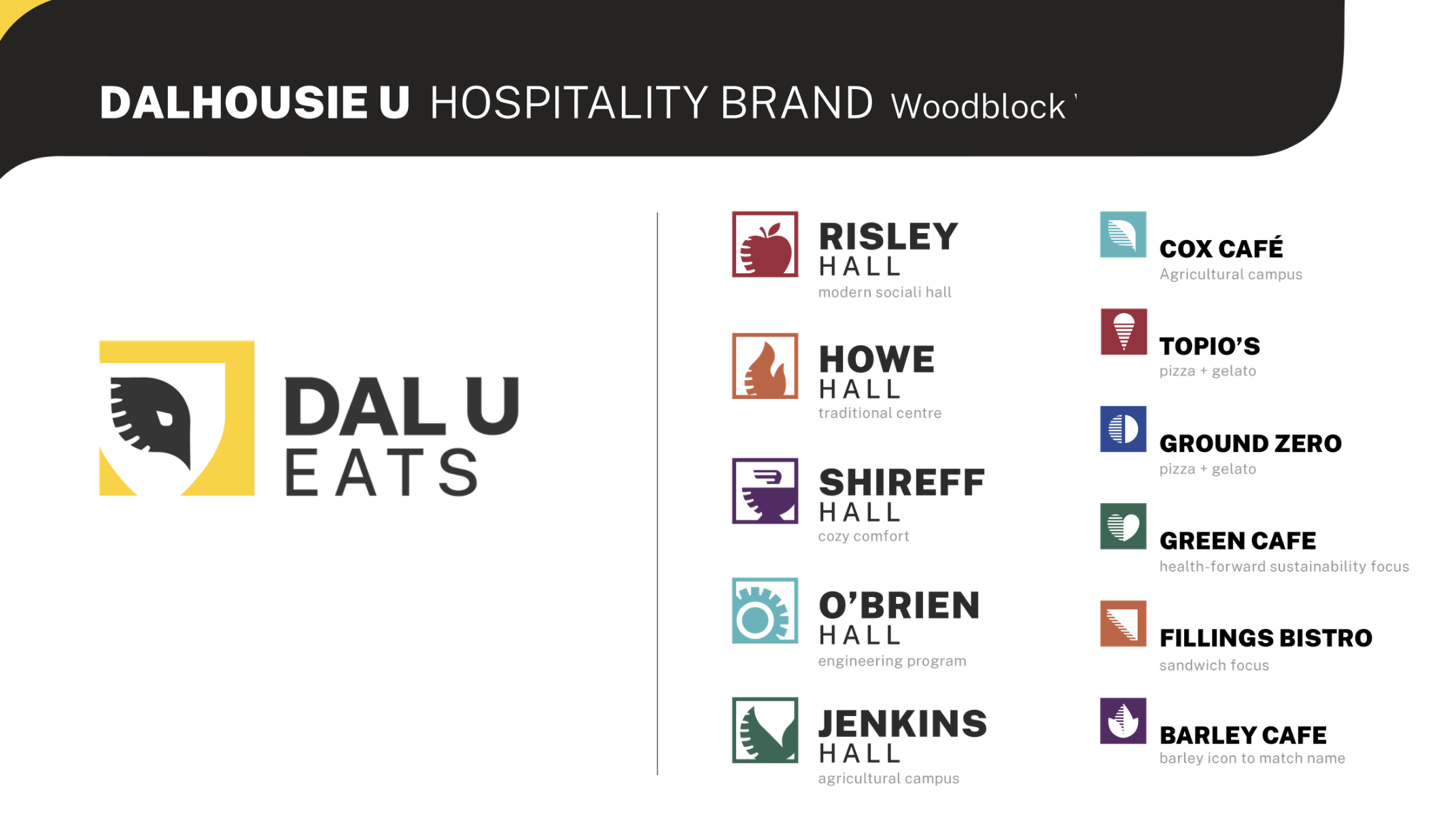
Concept 01: The Circle System
The recommended direction uses the circle as the unifying design element—a laurel-framed "D" anchors the master brand while each dining hall receives a unique circular icon reflecting its personality.
System Logic: The master brand uses a laurel-framed circle with the "D" monogram. Dining halls each get a distinctive circular icon within a yellow ring. Cafés extend the system through color-coded divided circles for easy wayfinding.
Strategic Icon Selection: Each icon was chosen to reflect the hall's unique character:
- • Risley: Coffee cup signals social energy
- • Howe: Flame represents tradition and gathering
- • Jenkins: Seed sprout connects to the Agricultural Campus
- • Shireff: Bowl evokes comfort and home cooking
- • O'Brien: Concentric circles speak to engineering precision
Environmental Design & Real-World Application
The brand system extends to physical environments—from interior signage to digital menu boards to retail kiosk design. Each touchpoint reinforces the cohesive identity while respecting the unique character of each space.
I developed complete environmental mockups showing how the brand would appear in real dining hall settings. The system needed to work at every scale: from small wayfinding signs to building-scale exterior signage to digital menu animations.
Retail Café Identities: Distinct Personalities, Unified System
Beyond the core dining program, I developed complete environmental identities for retail café locations—each with distinct personality while remaining part of the Dalhousie family.
Each café concept received full branding: logo lockups, color palettes, typography systems, and environmental mockups. The designs needed to appeal to different student demographics while maintaining visual cohesion with the master brand.
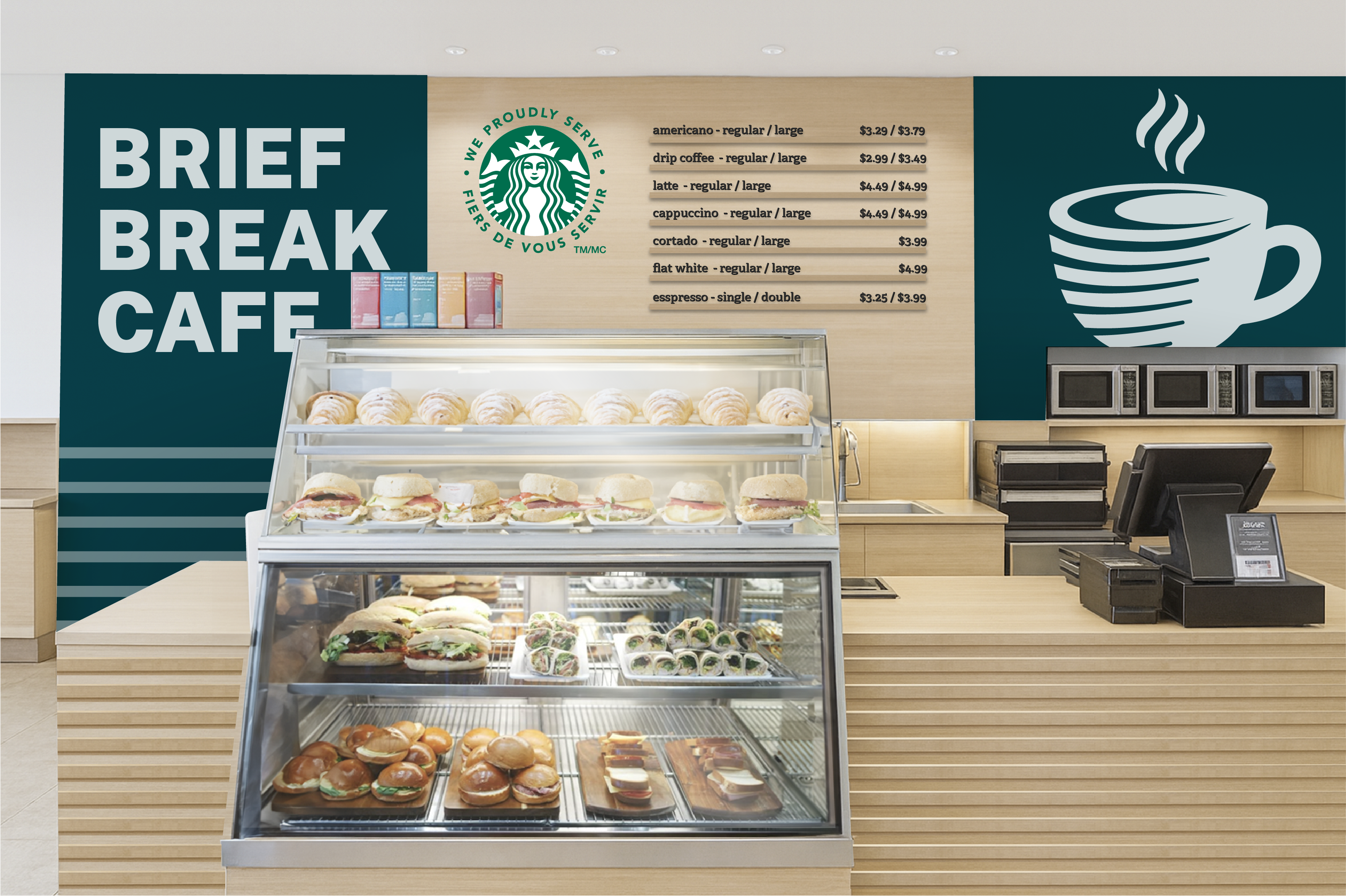
Brief Break Café — Starbucks partnership concept with premium coffee positioning
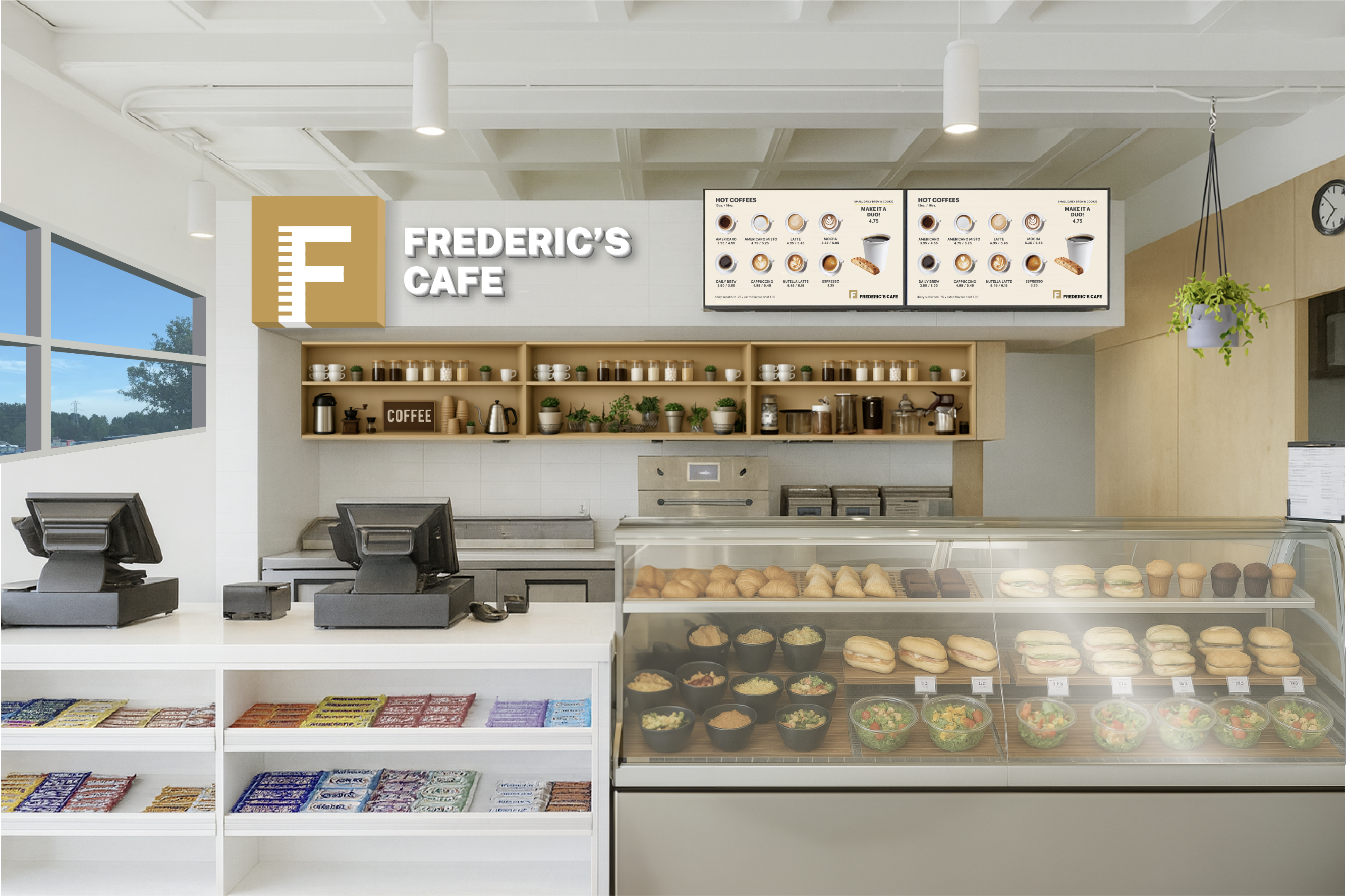
Frederic's Coffee & More — Artisanal café with sophisticated European feel
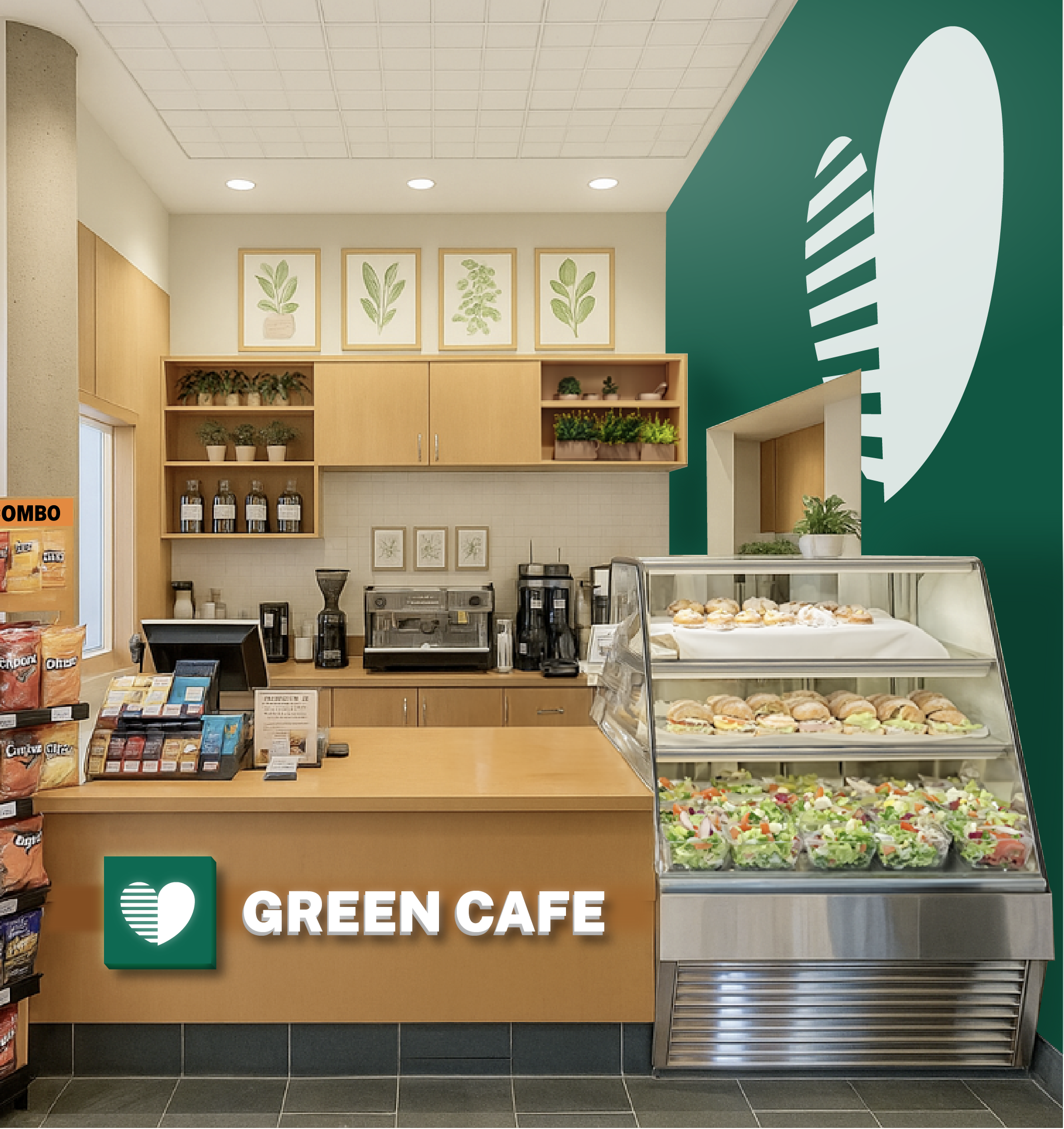
Green Café — Health-forward, sustainability-focused concept
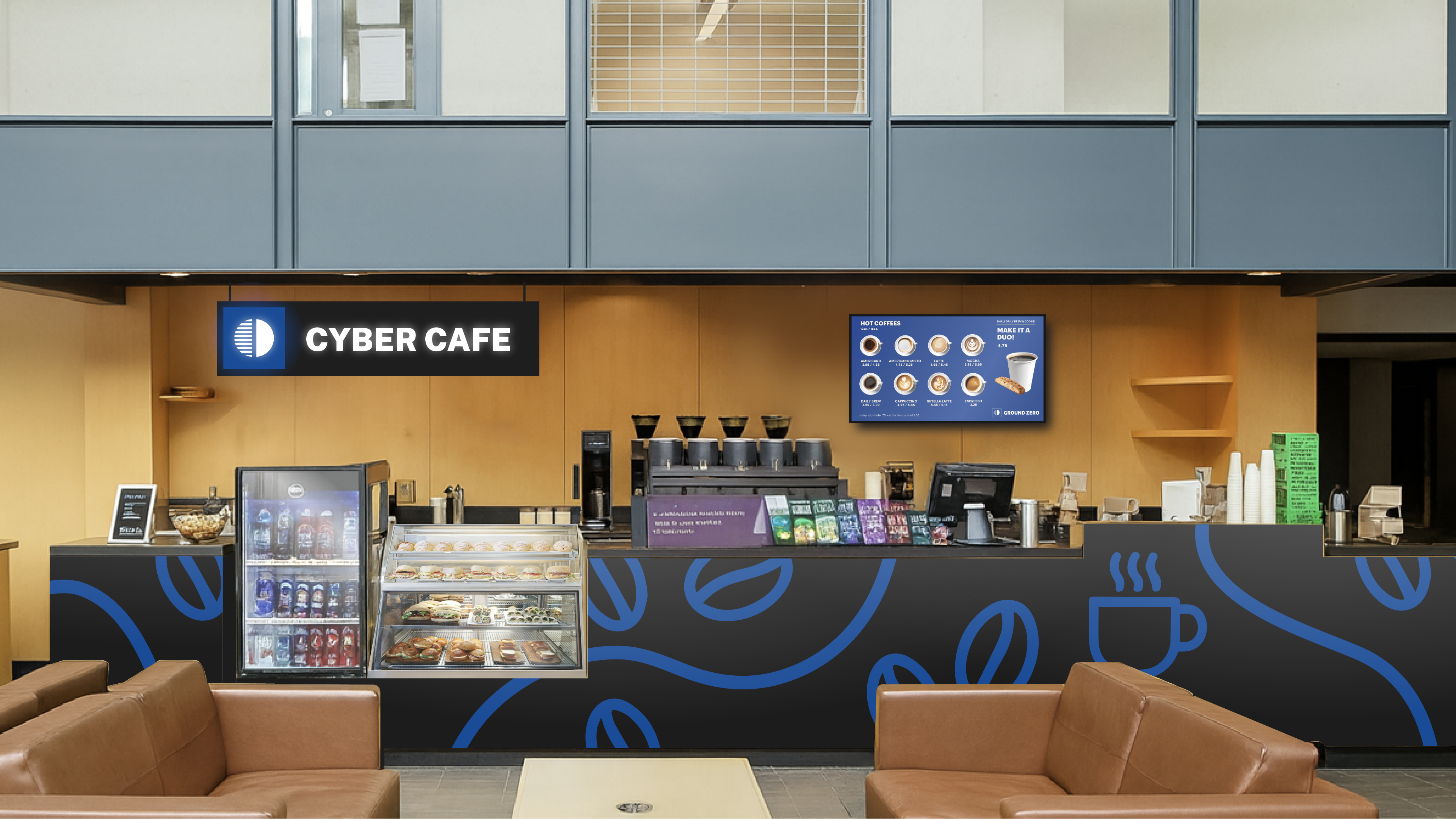
Cyber Café — Tech-forward coffee concept for the Computer Science building
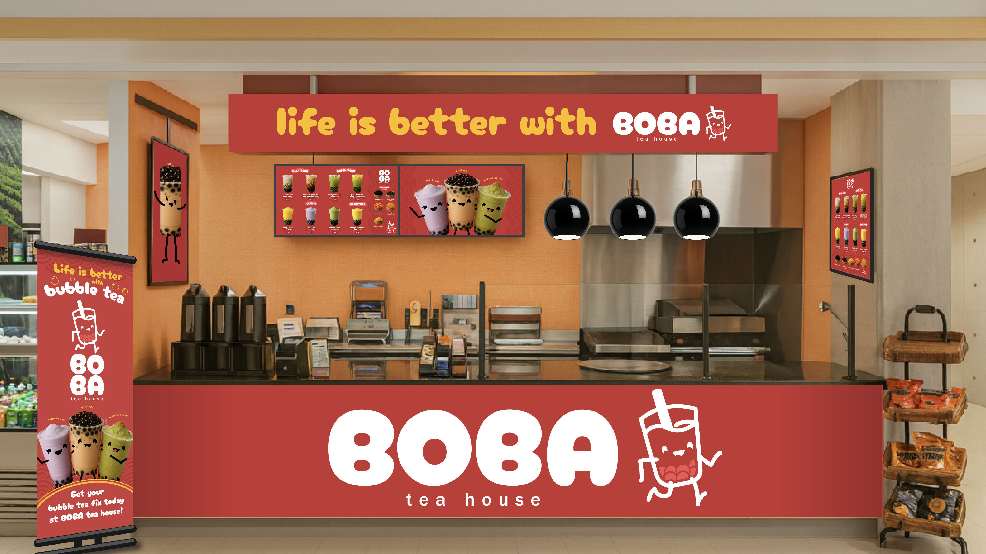
Boba Tea House: Specialty Retail Concept
A complete retail concept featuring custom character illustration, branded menu systems, signage, and promotional materials—transforming a food court kiosk into a destination.
The Details: Custom mascot character, illustrated menu items, branded roll-up banner, digital menu boards, and cohesive environmental graphics. The playful aesthetic differentiates this concept while the form language keeps it connected to the broader system.
This demonstrates the system's flexibility: it can accommodate everything from traditional dining halls to whimsical specialty concepts while maintaining brand integrity.
Concept 02: The Woodblock System
The second direction takes a bolder, more graphic approach—using the "DalU Eats" naming with shield-based architecture that connects every level of dining directly back to Dalhousie's main identity.
Concept 02: Shield-based system with stronger typographic presence and woodblock aesthetic
The "DalU Eats" mark combines an abstracted eagle head (derived from the Dalcon) with a shield frame, directly tying food to Dalhousie's crest identity. Dining halls receive squared icons with feather-like details. Cafés use rounded icons in brand colors. The system offers stronger environmental presence and a more bold, graphic approach.
This alternative demonstrates strategic versatility: presenting multiple directions allows stakeholders to choose the brand personality that best fits their vision—classic and refined (Concept 01) or bold and contemporary (Concept 02).
Complete Deliverables
This project required more than visual concepts—it demanded a production-ready, enterprise-scale brand system that could be implemented across 13+ locations.
What I Delivered:
- → Complete brand architecture strategy and positioning
- → 2 fully-developed concept directions with rationale
- → Master brand identity with multiple lockups and variations
- → 5 dining hall sub-brand identities with unique icons and color systems
- → 8+ café/retail brand identities with full environmental concepts
- → Environmental design mockups showing real-world application
- → Digital menu board templates and signage specifications
- → Typography system, color palettes, and usage guidelines
- → 24-page client presentation deck with strategic rationale
Timeline: Completed in 4 weeks as sole designer—from initial research and strategy through final deliverables and presentation.
Results & Impact
This comprehensive brand system was developed as part of Compass Group Canada's $180M RFP response to Dalhousie University. The work represents a complete, implementation-ready identity system designed for enterprise-scale deployment.
"The proposal demonstrates how a unified hospitality identity can transform campus dining—from wayfinding to student engagement to brand perception."
This project demonstrates:
- • Enterprise-scale brand architecture for complex, multi-location systems
- • Strategic thinking beyond aesthetics—creating hierarchies that guide implementation
- • Research-driven design rooted in existing brand DNA and institutional heritage
- • Versatility across contexts—traditional dining halls to specialty retail concepts
- • Complete visual systems ready for production and rollout
- • Rapid execution without sacrificing depth or quality
- • Presentation skills that communicate vision and strategy to stakeholders