
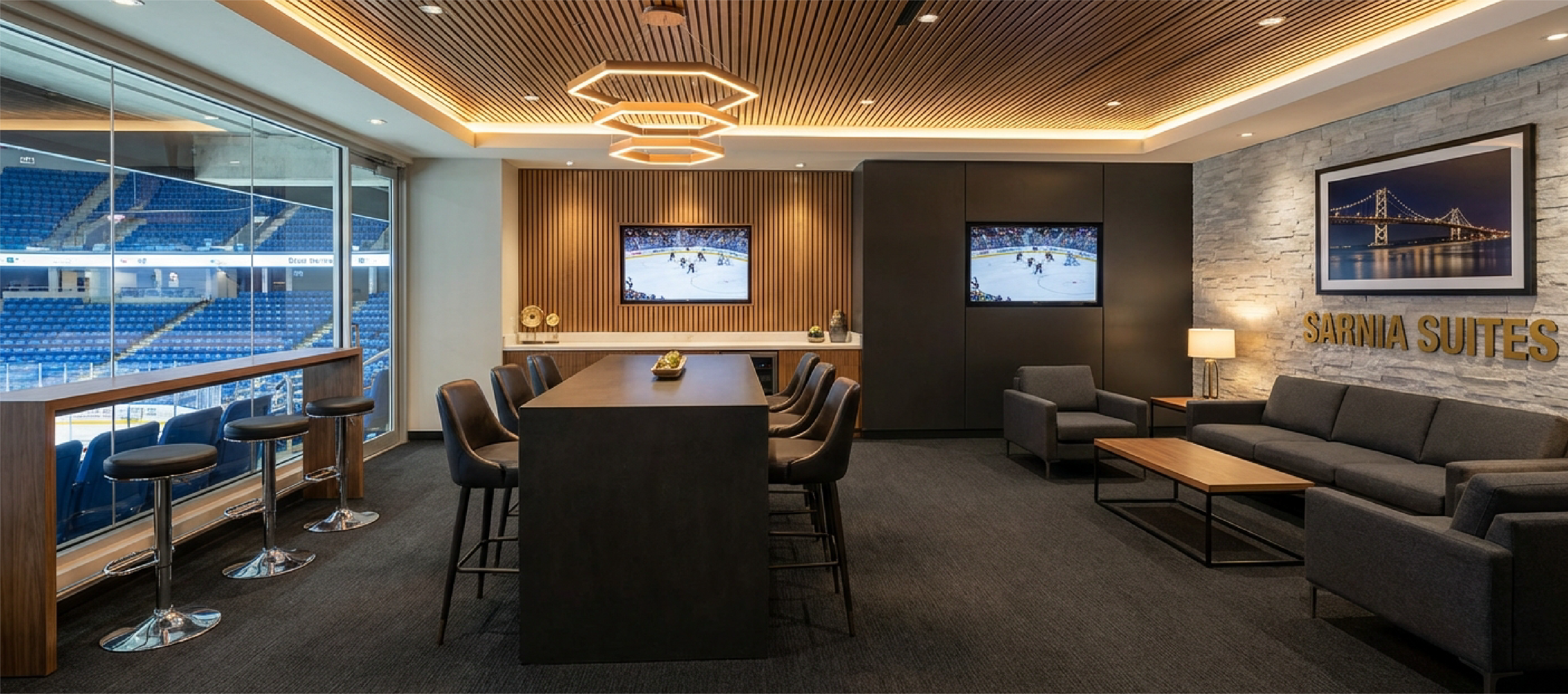
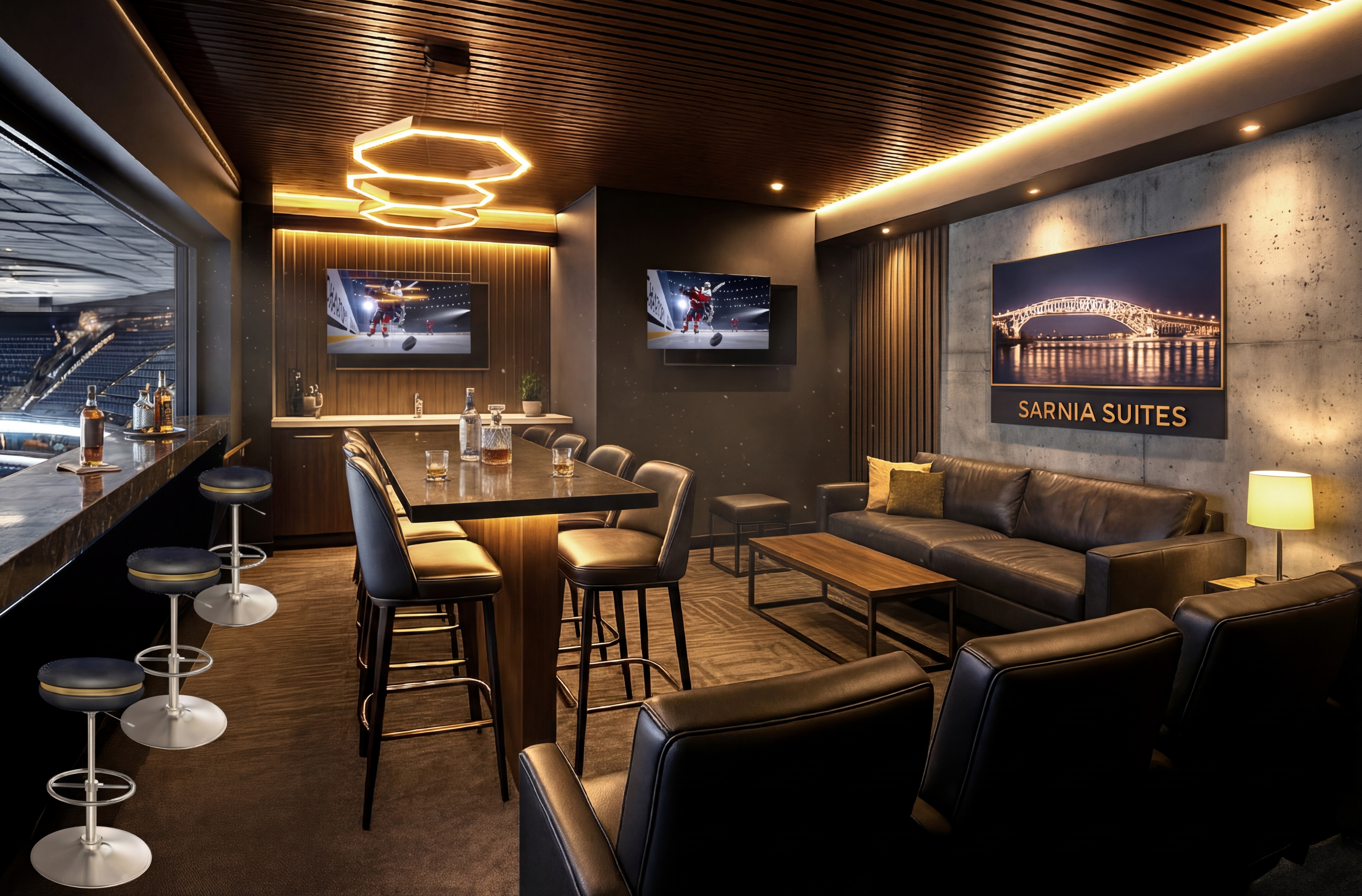
8 zones. One language. Two weeks.
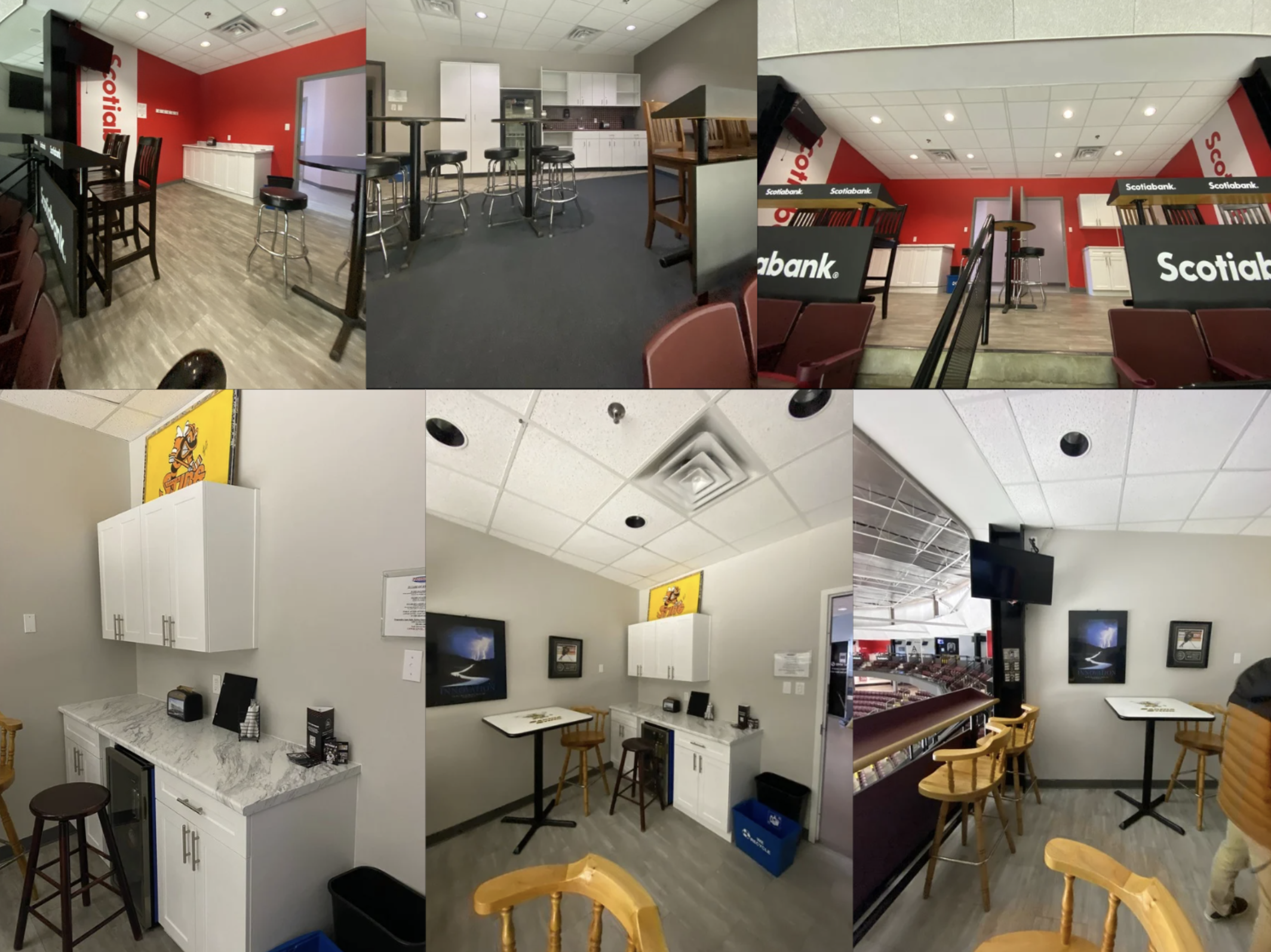
New ownership acquired the Sarnia Arena — home of the OHL's Sarnia Sting — and wanted a total transformation. Budget wasn't the constraint. Time was. Two weeks to concept, design, and present a comprehensive rebrand covering luxury suites, restaurants, concessions, a kids zone, and a complete wayfinding system.
The Sting's mascot is a bee. That gave me the hexagonal design language — honeycomb patterns, hex LED fixtures, a "Buzz" naming convention — that could unify eight completely different spaces into one cohesive experience.
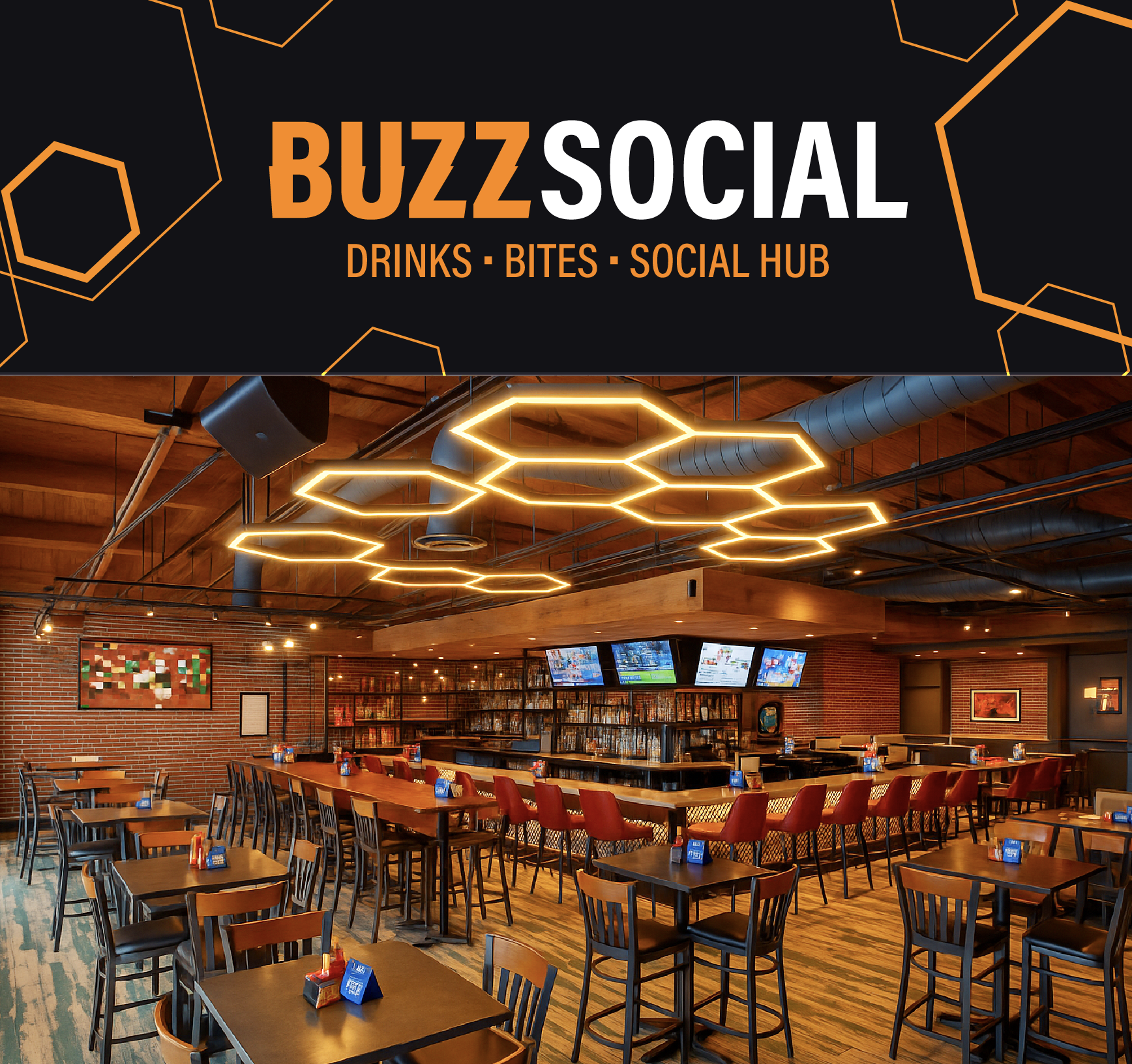
BuzzSocial.
The arena's flagship restaurant and social hub. Dramatic honeycomb LED ceiling installations serve as both lighting and architectural statement. Exposed brick, wood flooring, leather seating — a premium sports bar that elevates the typical arena concession into a destination.
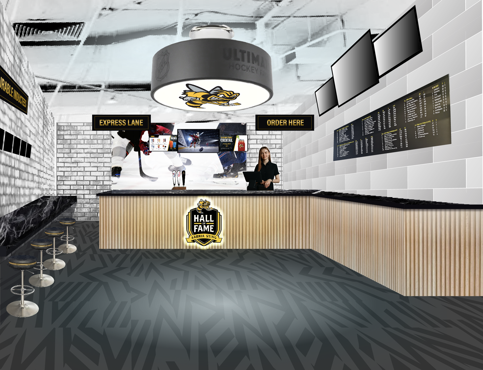
Hall of Fame
Celebrates Sarnia Sting legends with limewashed brick, black granite bar tops, and a hockey puck pendant light featuring the Sting mascot. The "Honourable Inductees" display turns team history into environmental storytelling. Heritage that feels contemporary.
BuzzSpot
Quick-service concessions with high-visibility branding. Bold orange and black graphics, hexagonal floor patterns, and clear wayfinding. The same design system that works in a luxury suite also works at a concession counter — that's the point of a cohesive language.
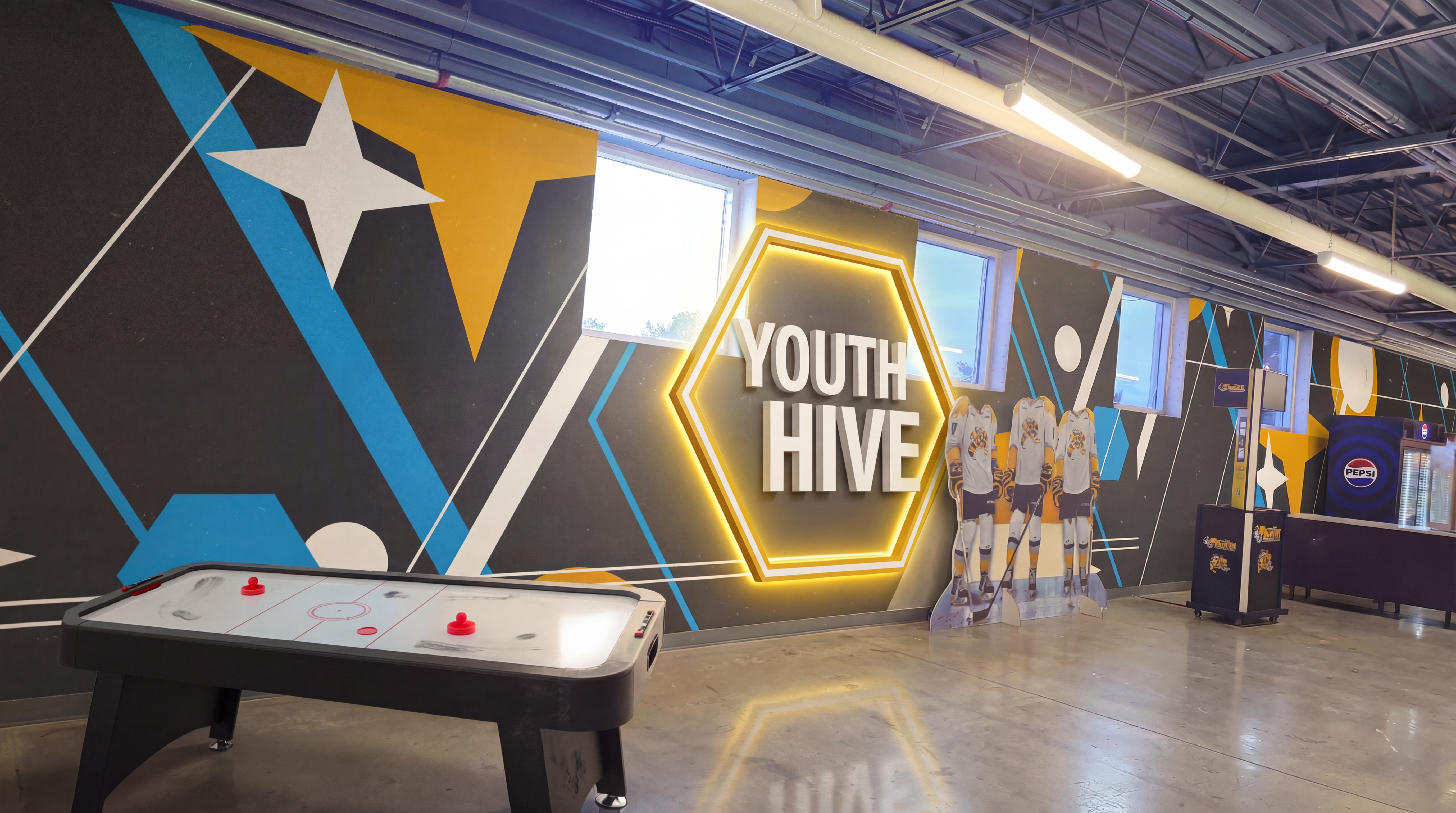
Youth Hive.
The hexagonal language adapts for families — brighter colors, playful scale, but still unmistakably part of the same system. Games, poster-making stations, hot chocolate. Large-scale environmental graphics that create moments worth photographing.
The Buzz Family
"The renderings, digital mock-ups, and visual boards really anchored the story — the client called out the attention to detail and how easy it was to imagine the future state of the building." — Client presentation feedback
One hexagonal system turned eight disconnected spaces into a venue that feels like it was always meant to be this way.