55,000 students. One brand.
York University needed a campus dining identity that could win a competitive RFP and then actually work at scale. 70+ locations, two campuses, the most diverse student body in Canada. The brand had to feel relevant to 18-year-olds without pandering to them.
Four weeks. Sole creative on the project. Brand identity, mobile app, environmental design, photography direction, and a sub-brand for good measure.
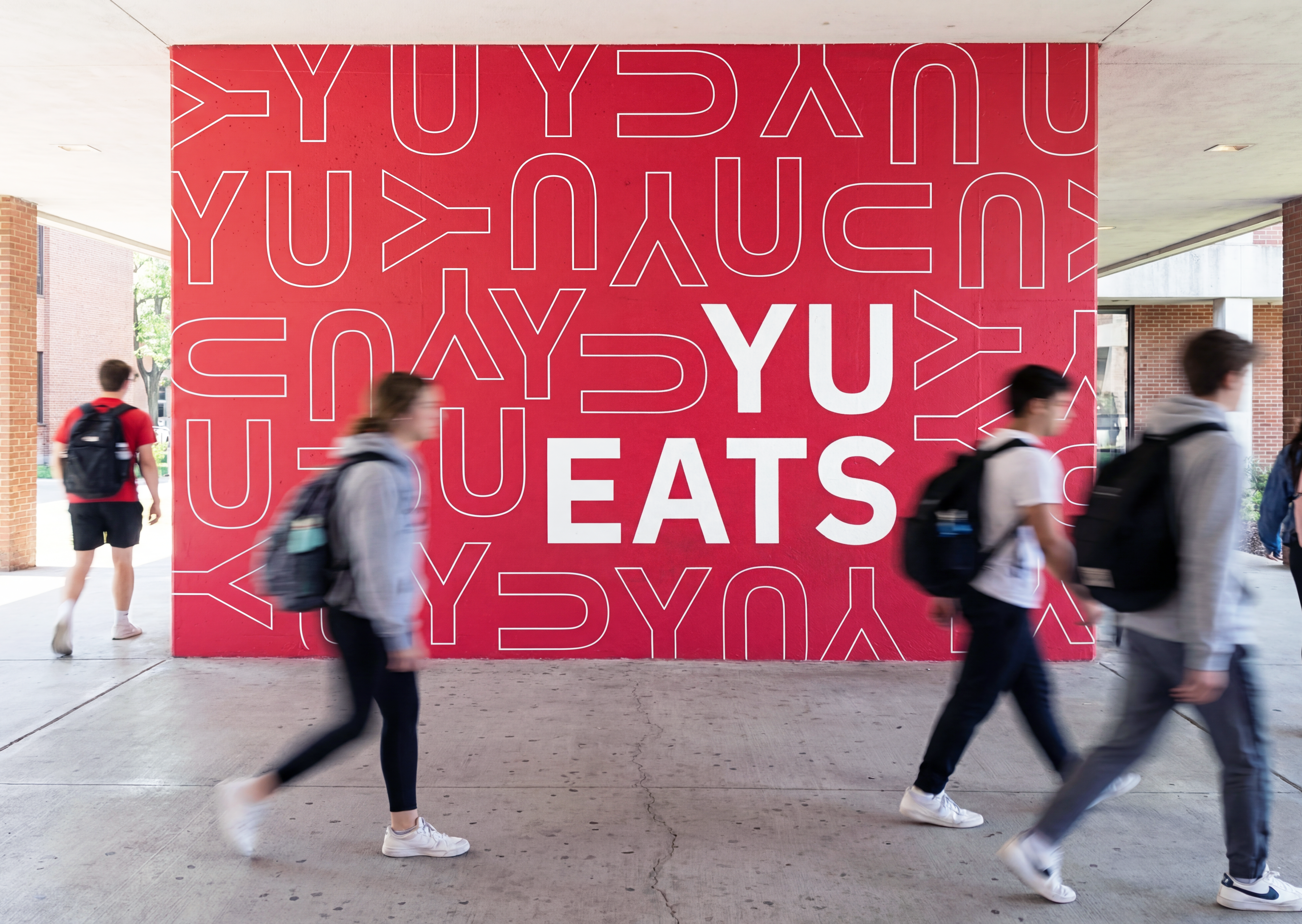
The Y and U do double duty.
The YU Eats wordmark plays on the natural connection between "York University" and the imperative "You Eat." The repeating YU pattern scales from app icons to building-sized murals, creating visual texture that reinforces brand recognition through repetition.
The palette anchors in York's existing equity. That bold red was already theirs. I didn't reinvent it. I gave it a system to live in.
Brand meets values.
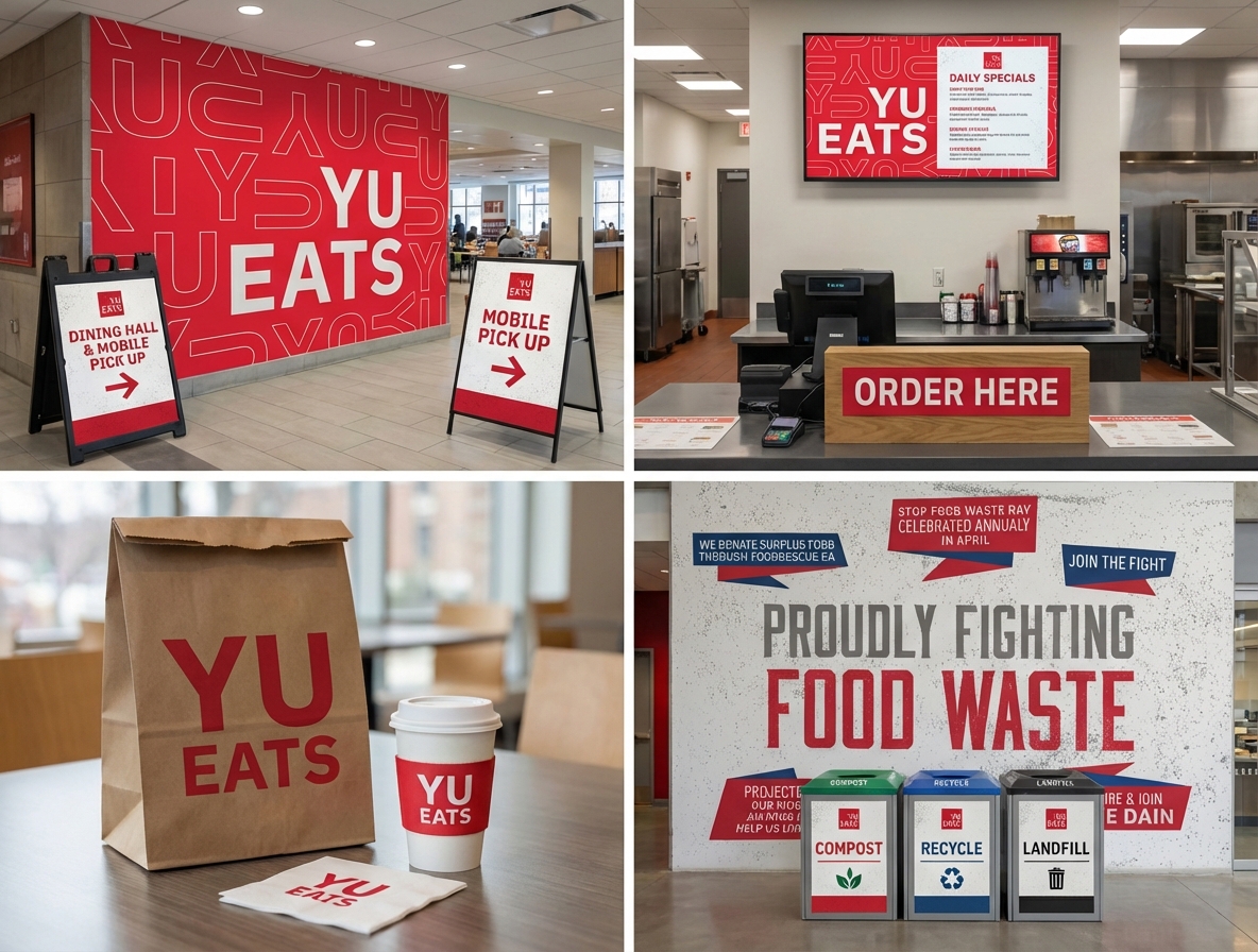
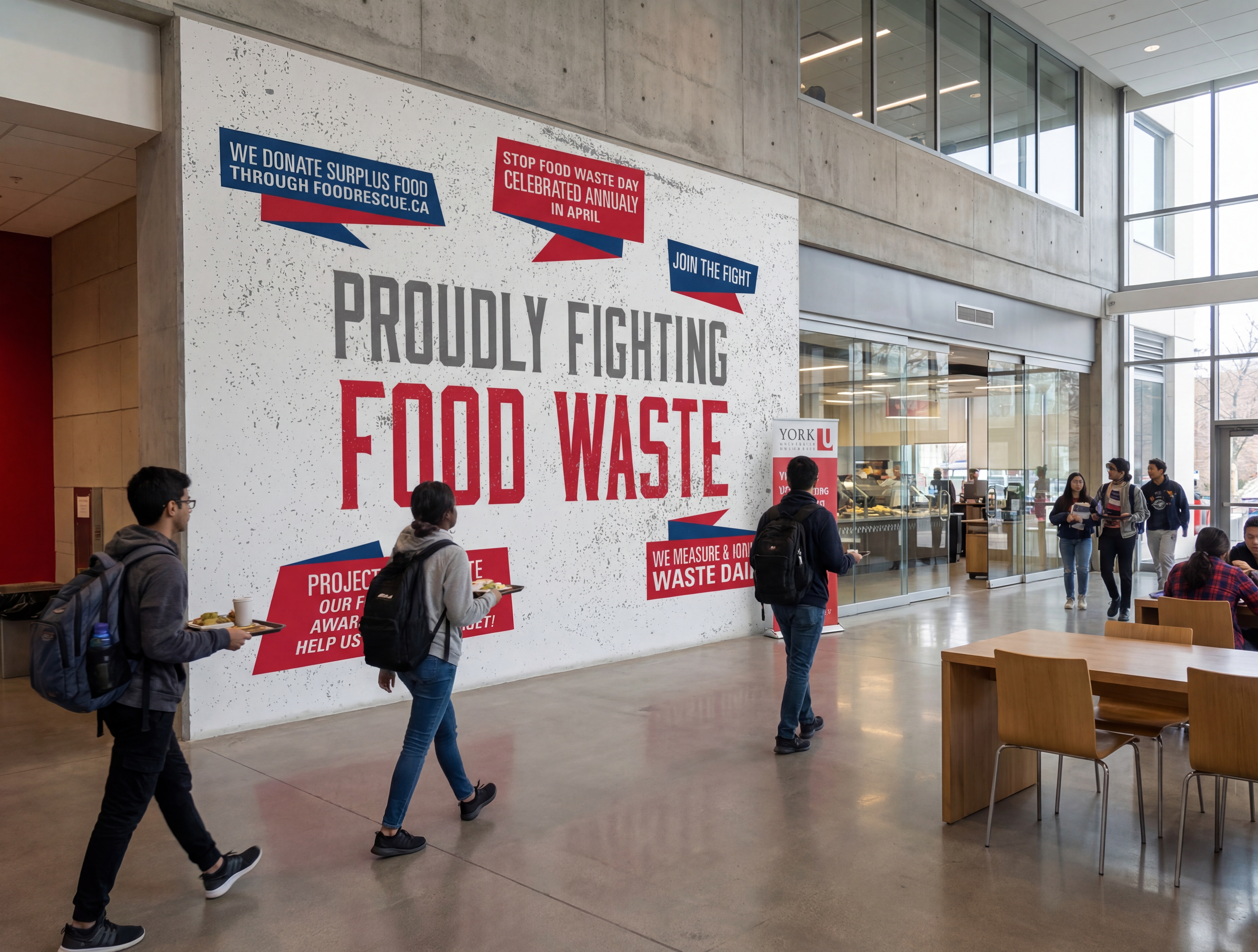
The system extended into campaign messaging that aligned with York's institutional priorities. Sustainability wasn't an afterthought bolted onto the brand. It was designed into the visual language from day one.
"Proudly Fighting Food Waste" reads as brand-native, not corporate-mandated. That's the difference between a logo and a system.
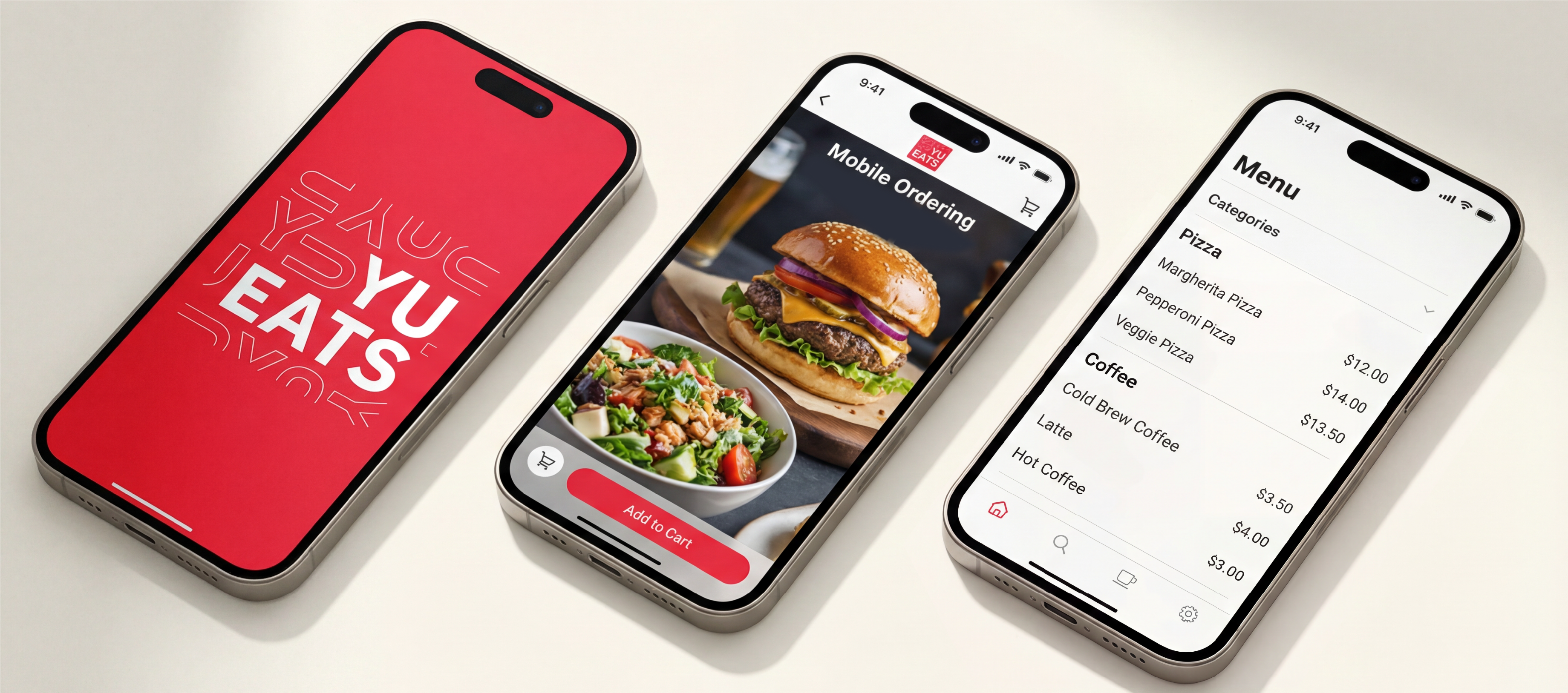
Ordering between classes.
The mobile app had to be fast above everything else. Students have 10 minutes between lectures. Browse, order, pay, pick up. Every screen was designed to reduce friction, not showcase the brand.
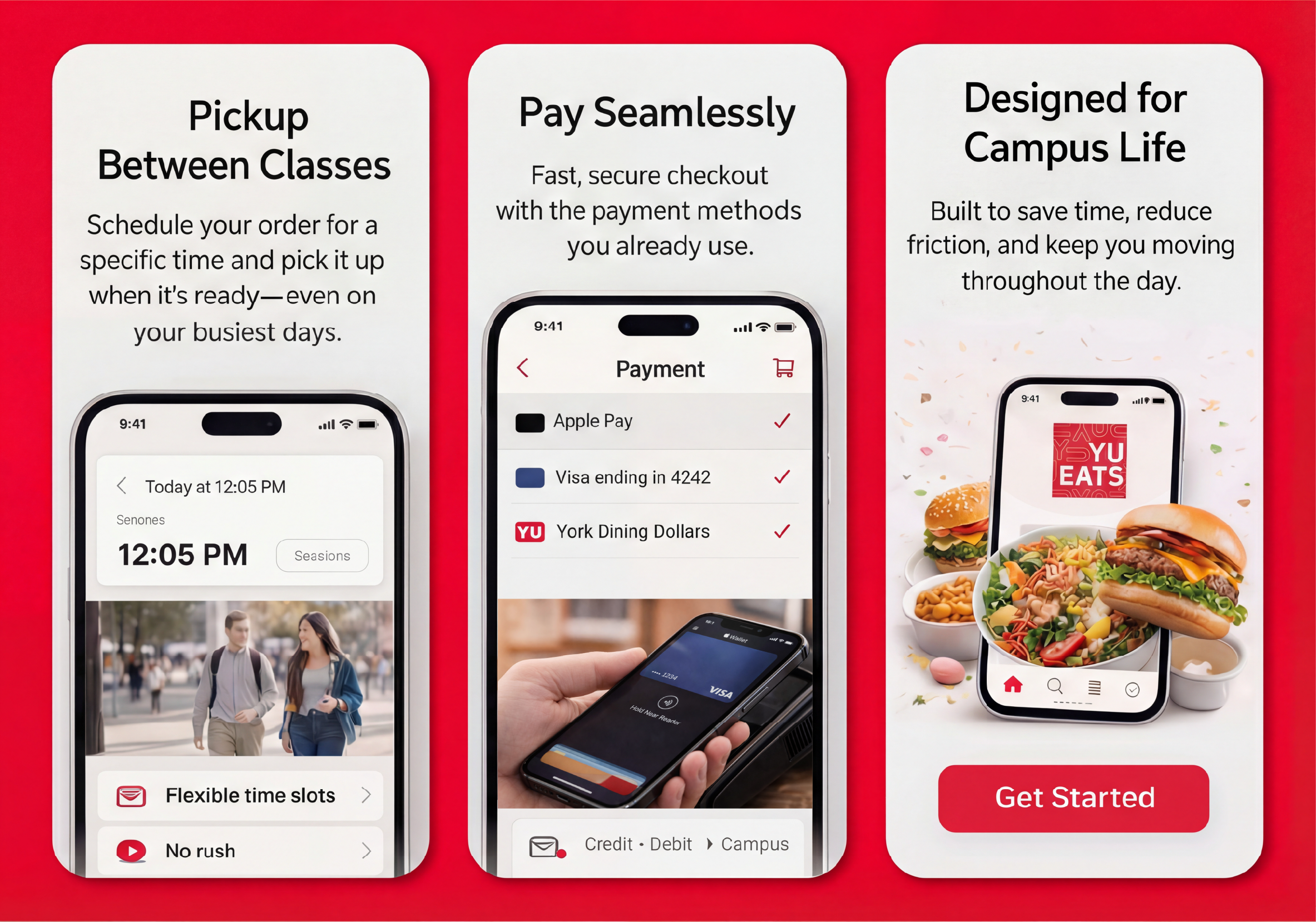
A system that sells itself.
Promotional materials, social content, campus signage, and launch collateral all built from the same components. Red, white, the YU pattern, and a voice that's confident without being loud.

416 Burger Co.
A sub-brand built for a different audience within the same system. Toronto's area code as instant local cred, self-aware humor for Gen Z, distinct personality without breaking the master brand.
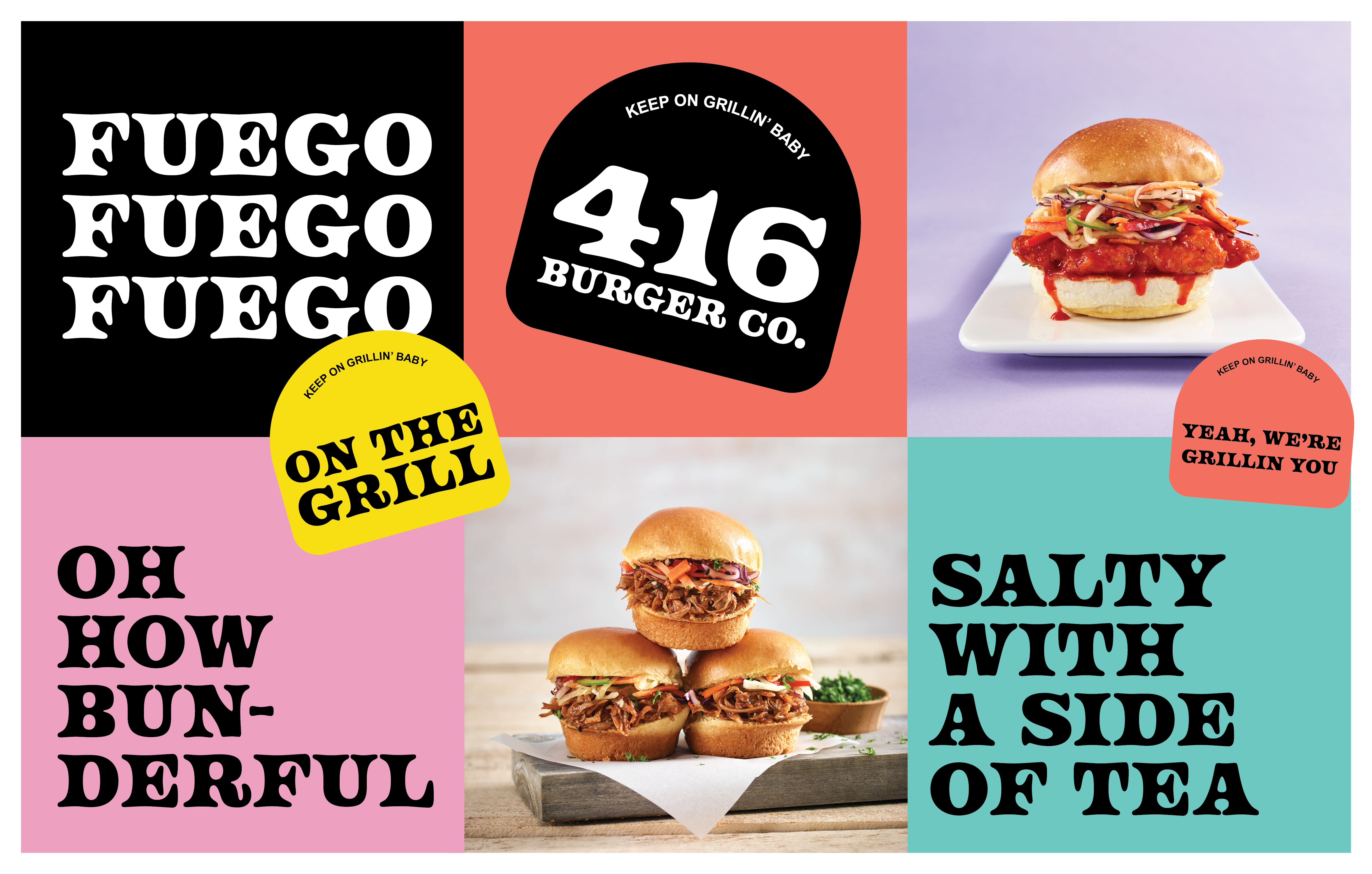
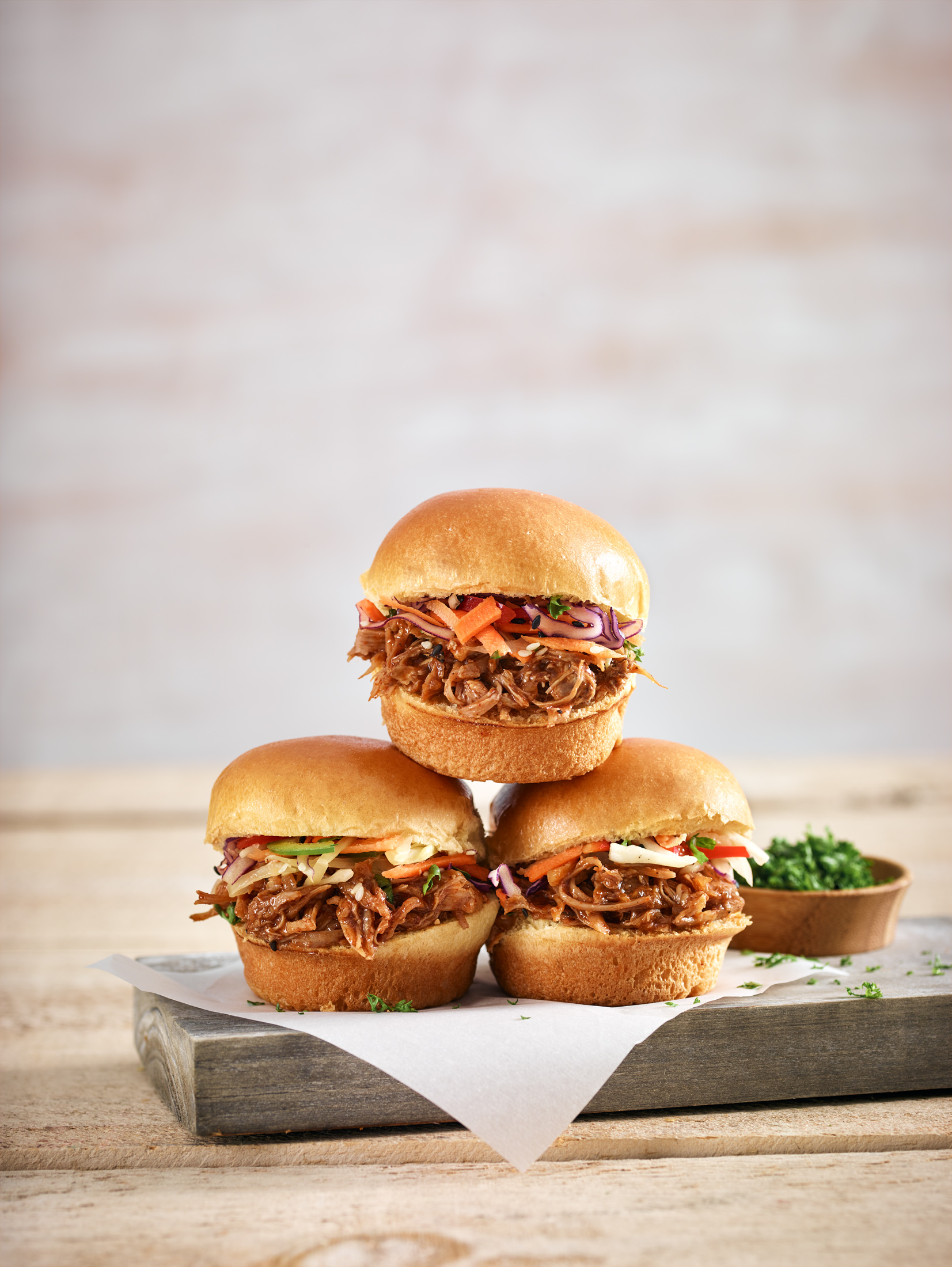
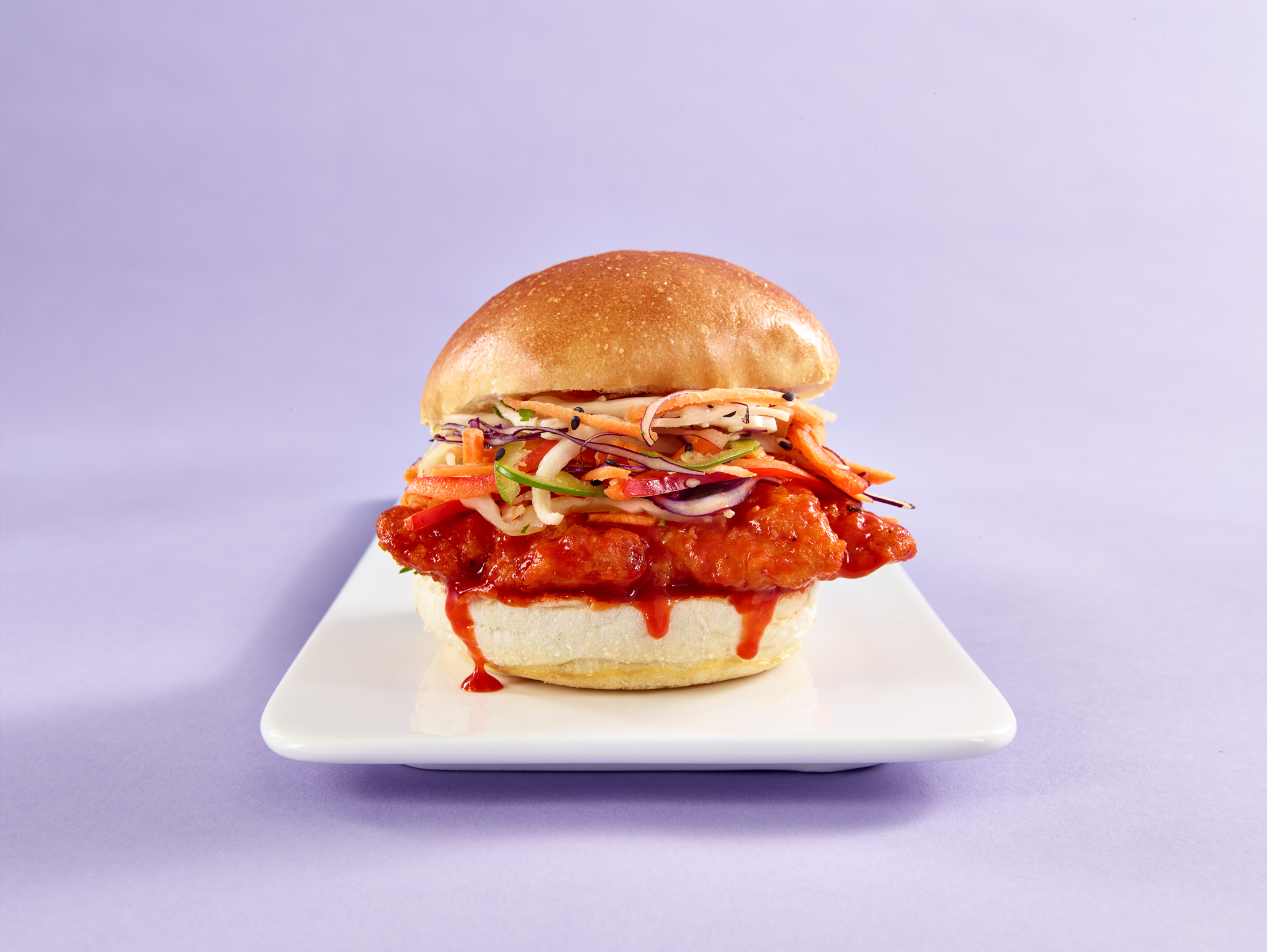
Photography direction is part of the job.
Art direction, styling guidance, shot selection, final selects. If the photography doesn't match the system, the system breaks. So I own it.
Brand strategy through final deliverable. No handoffs, no gaps.