
30 years of equity. One evolution.
Liberty Entertainment Group runs nine of Toronto's most recognizable venues — Casa Loma, Liberty Grand, BlueBlood Steakhouse. 1.75 million guests a year. Their logo had served them for three decades but felt dated against contemporary hospitality brands.
The brief was deceptively simple: modernize without destroying recognition. The torch icon was sacred to leadership. Every letterform in this project was hand-drawn — no adapted fonts.
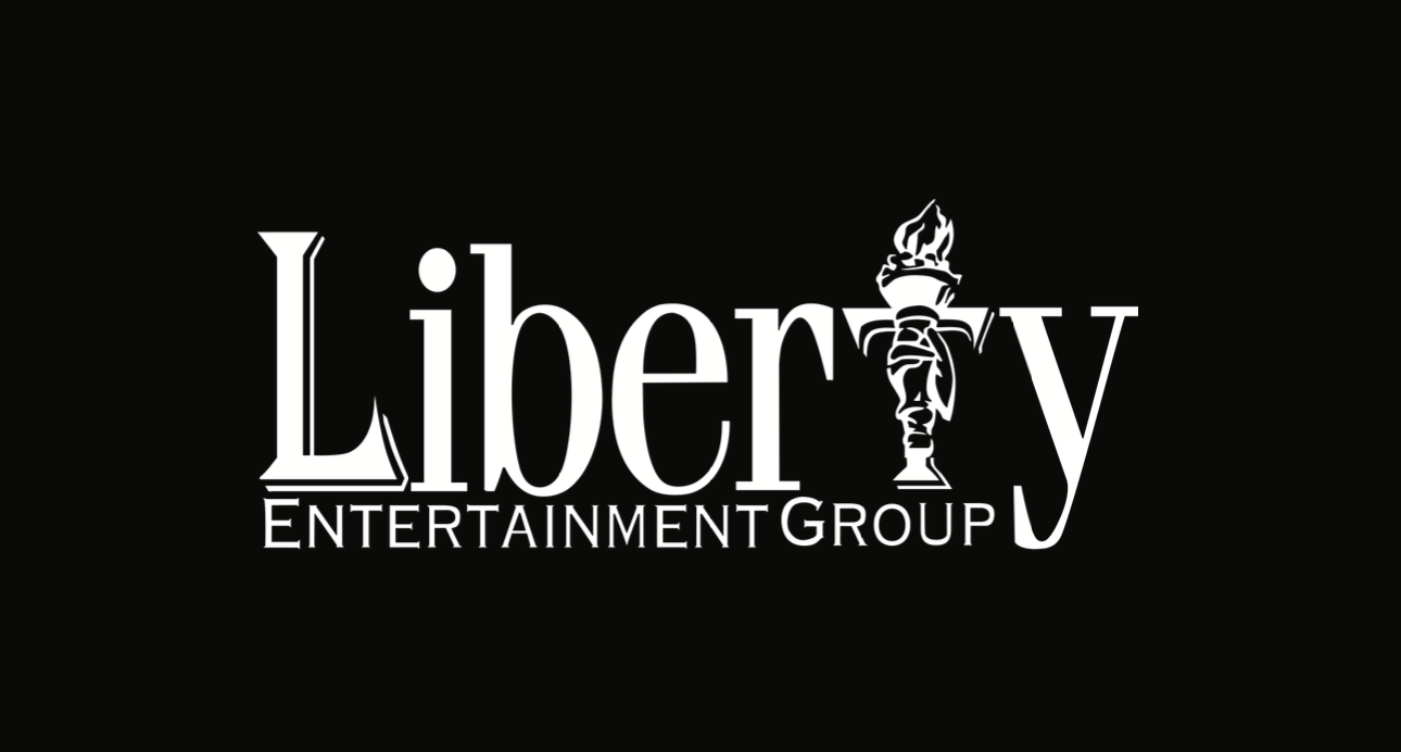
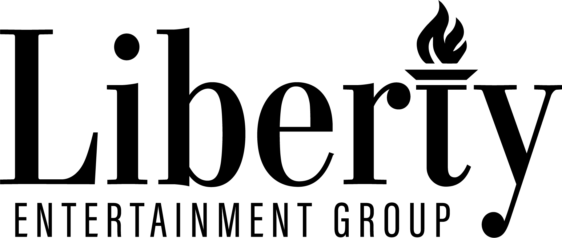
The original mark — 30 years in market
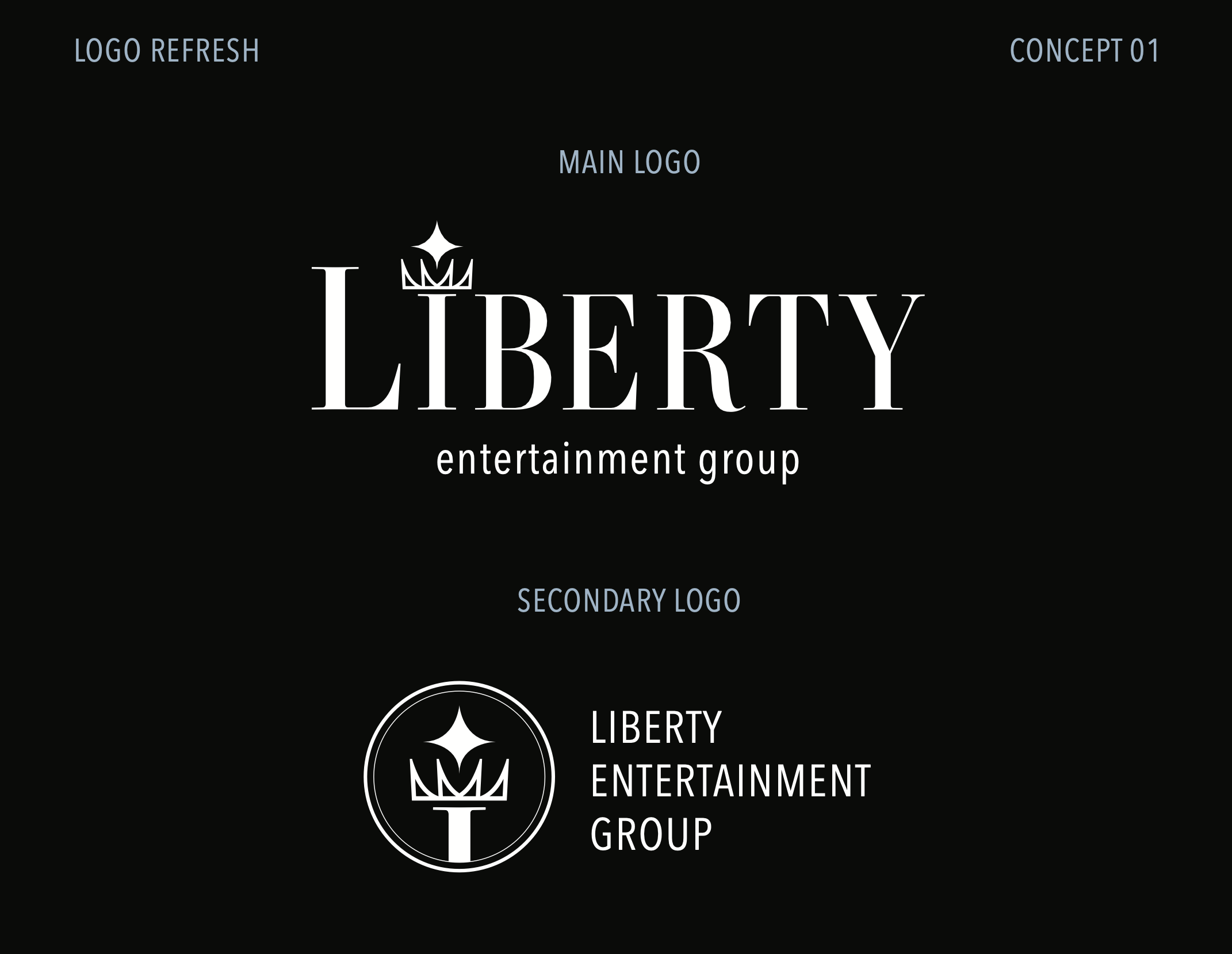
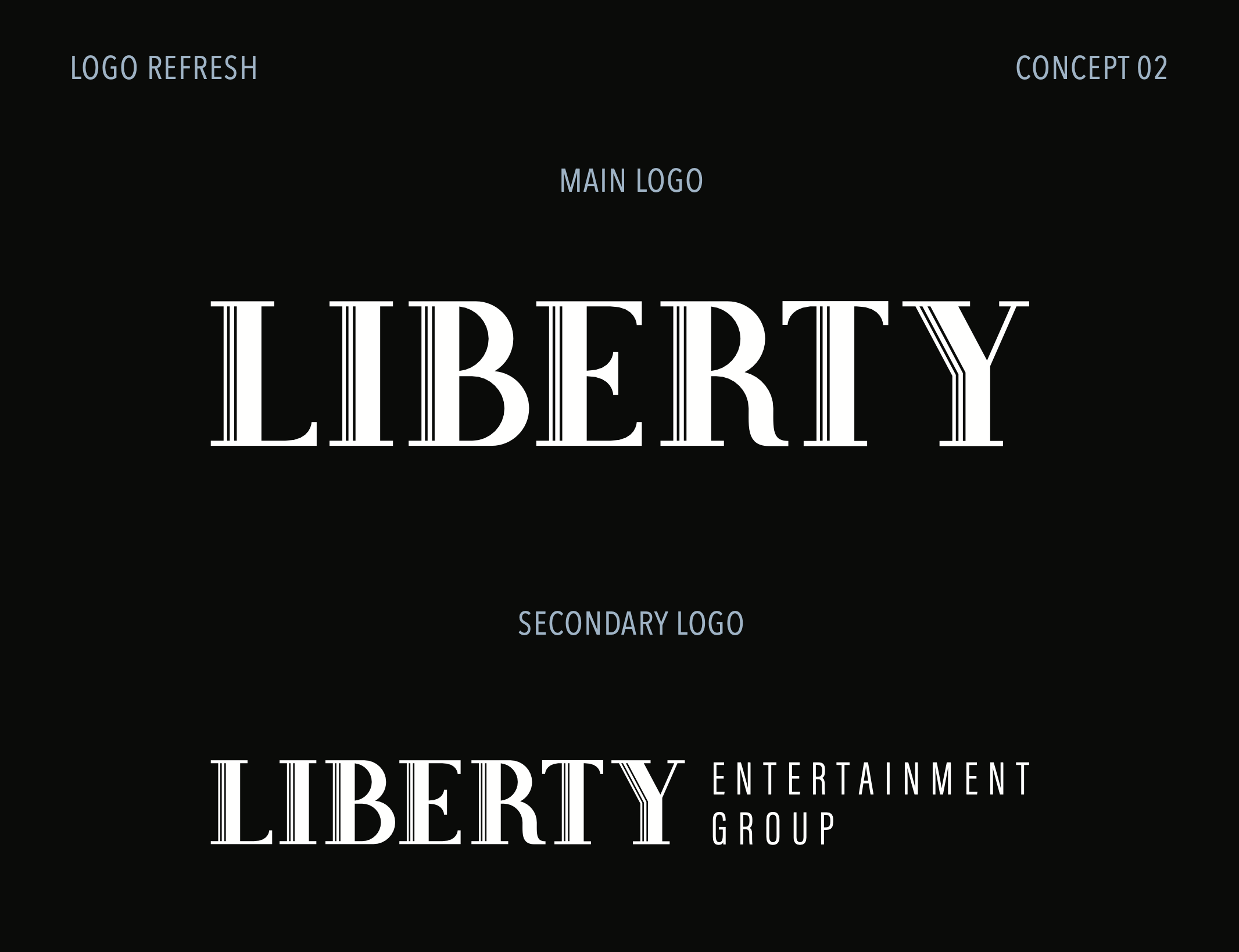
Round 01
Respect the heritage.
Three directions, each hand-drawn. Elegant serif refinement, bold sans-serif presence, and a hybrid that balanced both. All retained the torch.
Round 02
Test the boundaries.
Stakeholder feedback asked for "more contemporary." So I tested whether Liberty could move away from the torch entirely. Multiple directions — literal hospitality symbols, abstract geometry, clean wordmarks.
The insight: they valued the torch more than initial feedback suggested. Moving away from it felt wrong. They didn't want abandonment — they wanted thoughtful evolution.


Typographic craft
Hand-drawn letterforms.
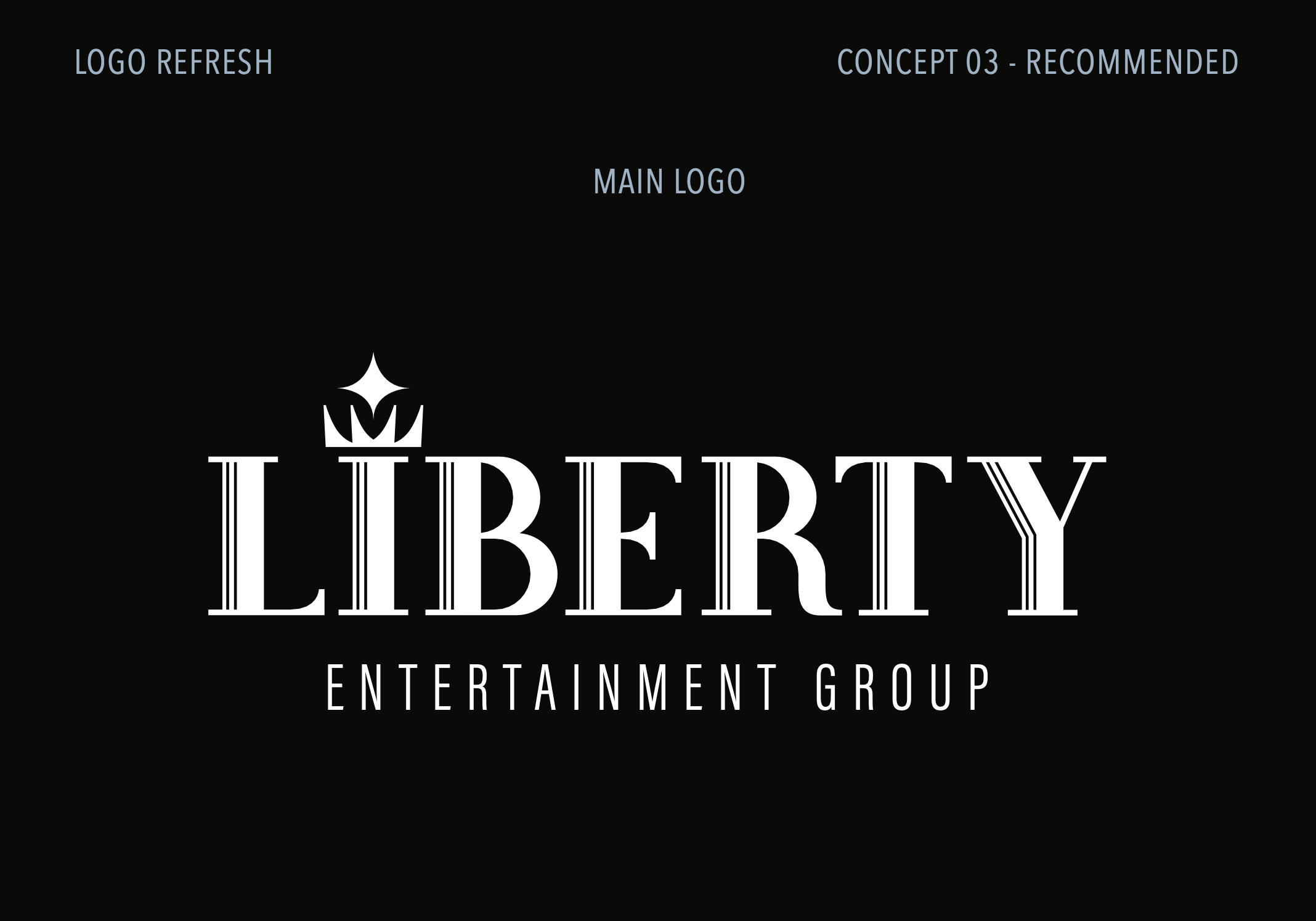
One exploration became a personal favorite — custom inline strokes creating art deco elegance. The vertical striations reference architectural grandeur. Columns, fluting, the historic details of Liberty's venues. Every character built from scratch.

Round 03
The resolution.
Armed with insights from the exploratory round, the final direction returned to the torch with renewed confidence. The approved system retained the icon while modernizing typography and proportions.
Three rounds to learn what mattered. One mark to carry it forward.