Mohawk College
An RFP response for Mohawk College in Hamilton. Every dining spot on campus had its own look: vendor brands, concept brands and one-off café names, with nothing tying them back to Mohawk. The brief asked for one dining brand across both campuses, with room underneath for each location to keep its own name. I took it through two rounds. The final system is built to the college logo's own measurements, so it looks like it came from the same place.
- Client
- Mohawk College, through Compass Group Canada
- Year
- 2025–2026
- Role
- Creative lead
- Scope
- Naming, masterbrand, location identities, signage, wayfinding, menu boards, uniforms, social
- Outcome
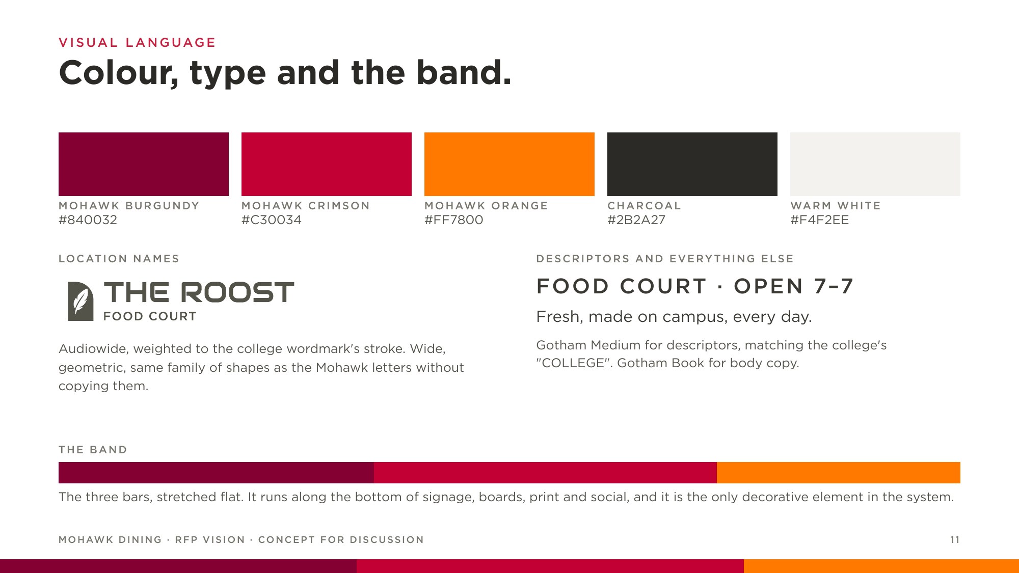
- RFP in progress

Six rules before any drawing
The college mark already had a lot of rules of its own: three bars for quality, innovation and sustainability, a custom wordmark the brand guide says can't be altered, and Mo the Hawk, the mascot, who already owns the hawk on campus.
The dining brand would hang next to that mark on every wall, so a second symbol language, typeface or colour story was out. I wrote the rules down first.
- Mohawk endorses. Places lead.Students go to the Nest, not to Mohawk Dining. The masterbrand is on everything, but the location name is what you read first.
- One idea per mark.Bowl, hawk, feather, flame. No mark tries to say two things at once.
- One construction.Every location mark is built the same way from the same part of the college logo. They look related because they share a structure, not a symbol.
- Type carries the family.Same typeface, spacing and descriptor rules everywhere. Only the icon and the colour change.
- Reduce first.Each mark has to work at 16 px and in one colour before it gets a colour version.
- Modern, not nostalgic.No badges, sunbursts or mascots on the signage. The college mark is clean and geometric, so the dining brand is too.
The bowl
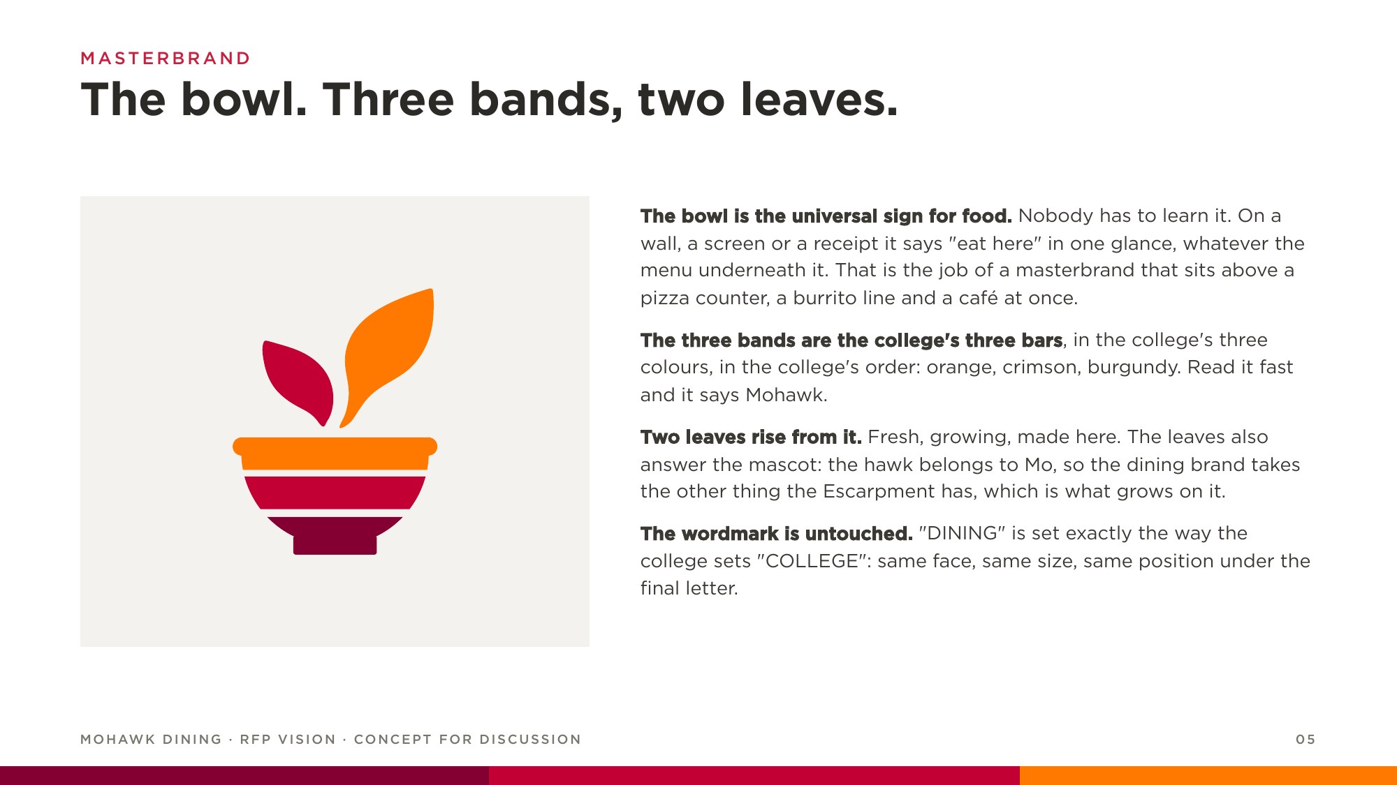
The bowl is the universal sign for food. Nobody has to learn it, and it says “eat here” above a pizza counter, a burrito line and a café at once.
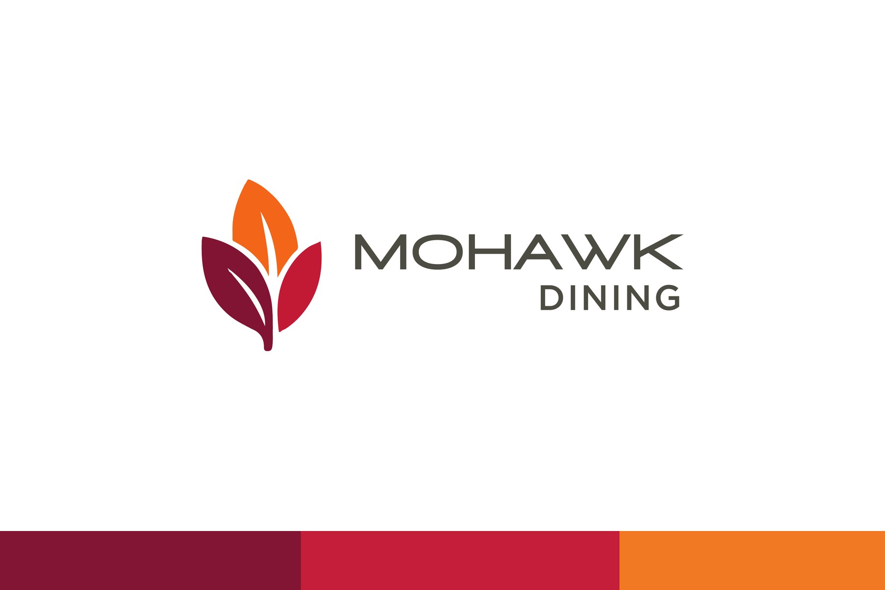
Its three bands are the college's three bars, in the college's colours and order. Two leaves rise out of it. The hawk belongs to Mo, so the dining brand takes the other thing the Escarpment has: what grows on it.
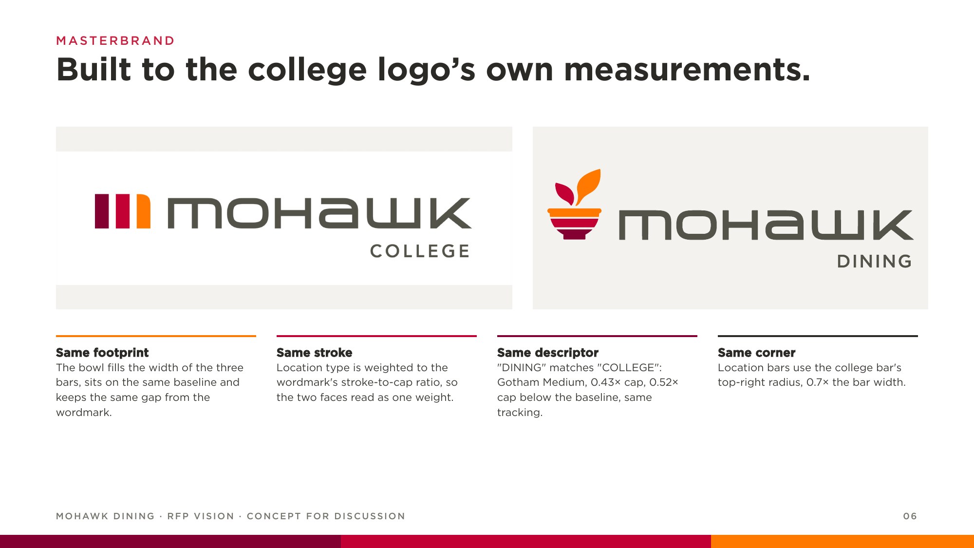
The wordmark is untouched. “DINING” sits exactly where the college sets “COLLEGE”: same face, same size, same position.
Every location is one bar
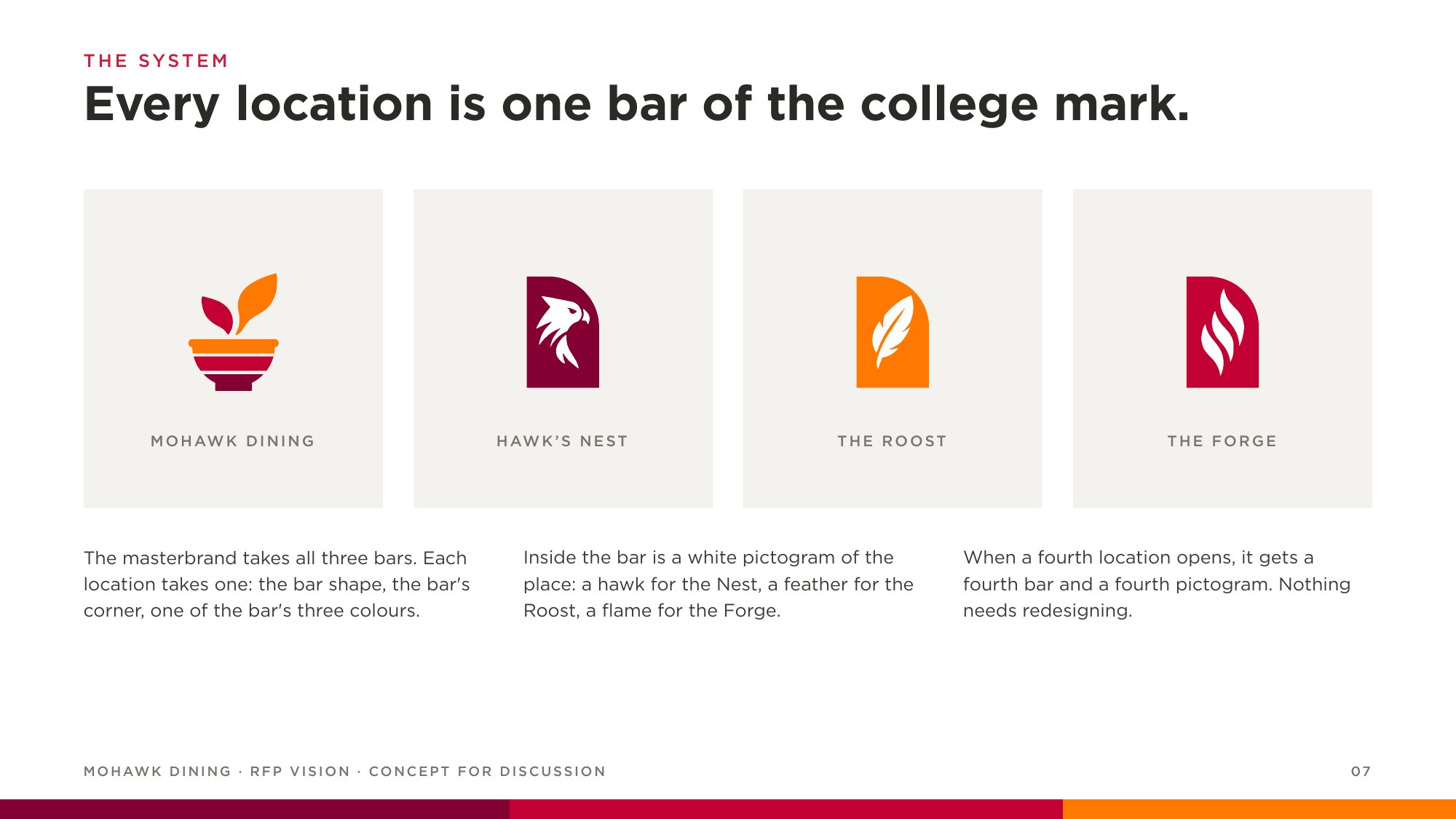
The masterbrand takes all three bars. Each location takes one: the bar's shape, its rounded corner and one of its colours, with a white pictogram of the place inside. When a fourth location opens, it gets a fourth bar. Nothing needs redesigning.
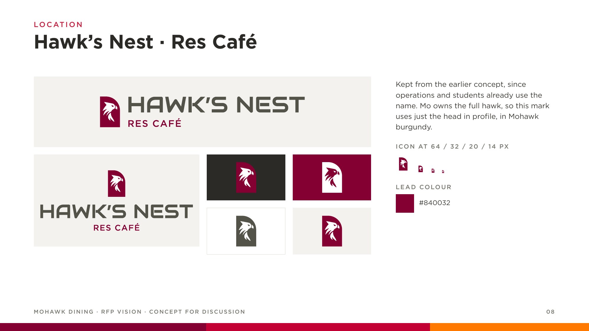
Hawk's Nest, res café. Students and operations already use the name, so it stayed. Mo owns the full hawk, so this is just the head in profile, in burgundy.
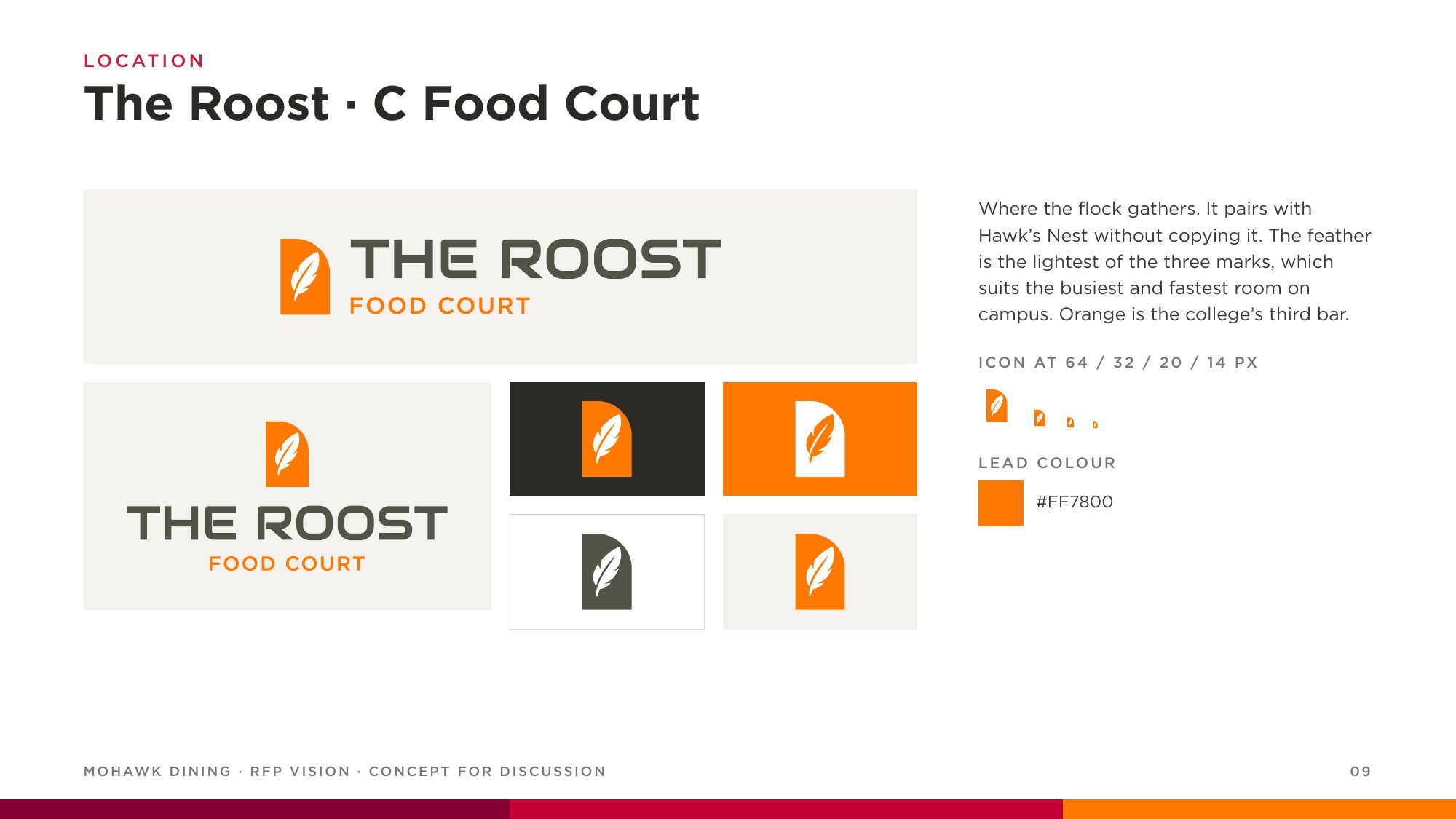
The Roost, C Food Court. Where the flock gathers. The feather is the lightest of the three marks, for the busiest, fastest room on campus.
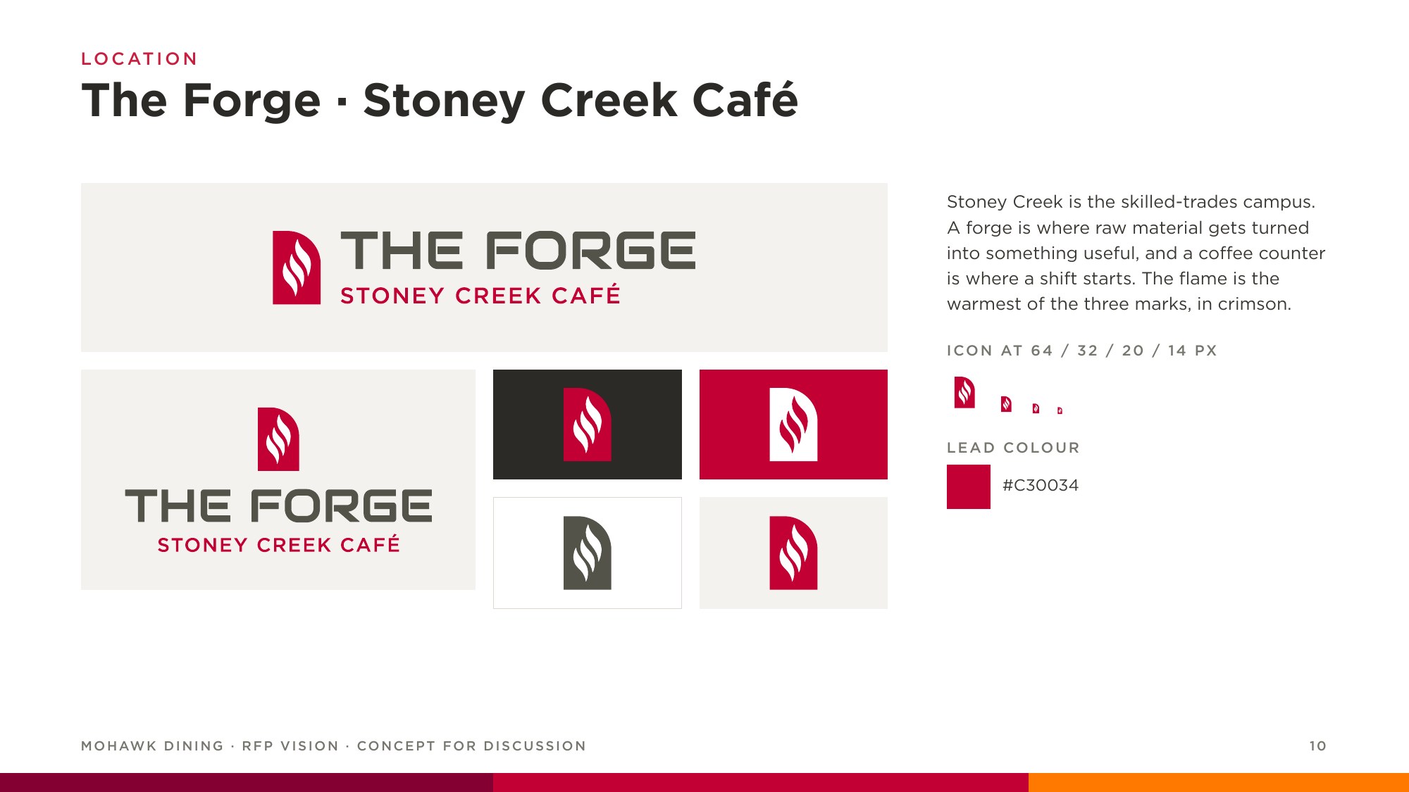
The Forge, Stoney Creek Café. Stoney Creek is the skilled-trades campus. A forge turns raw material into something useful, and a coffee counter is where a shift starts.
The names are proposals. On award, students and staff pick the final ones.
In the space
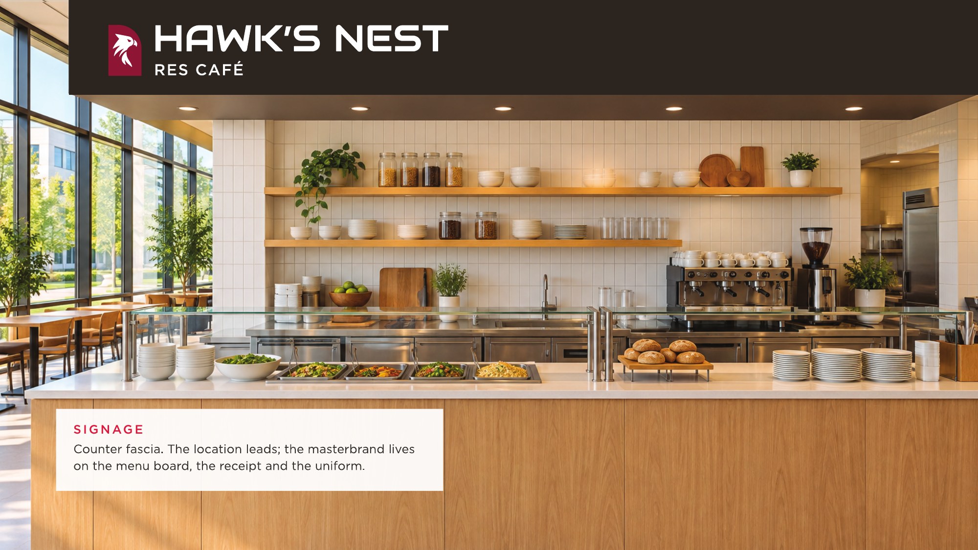
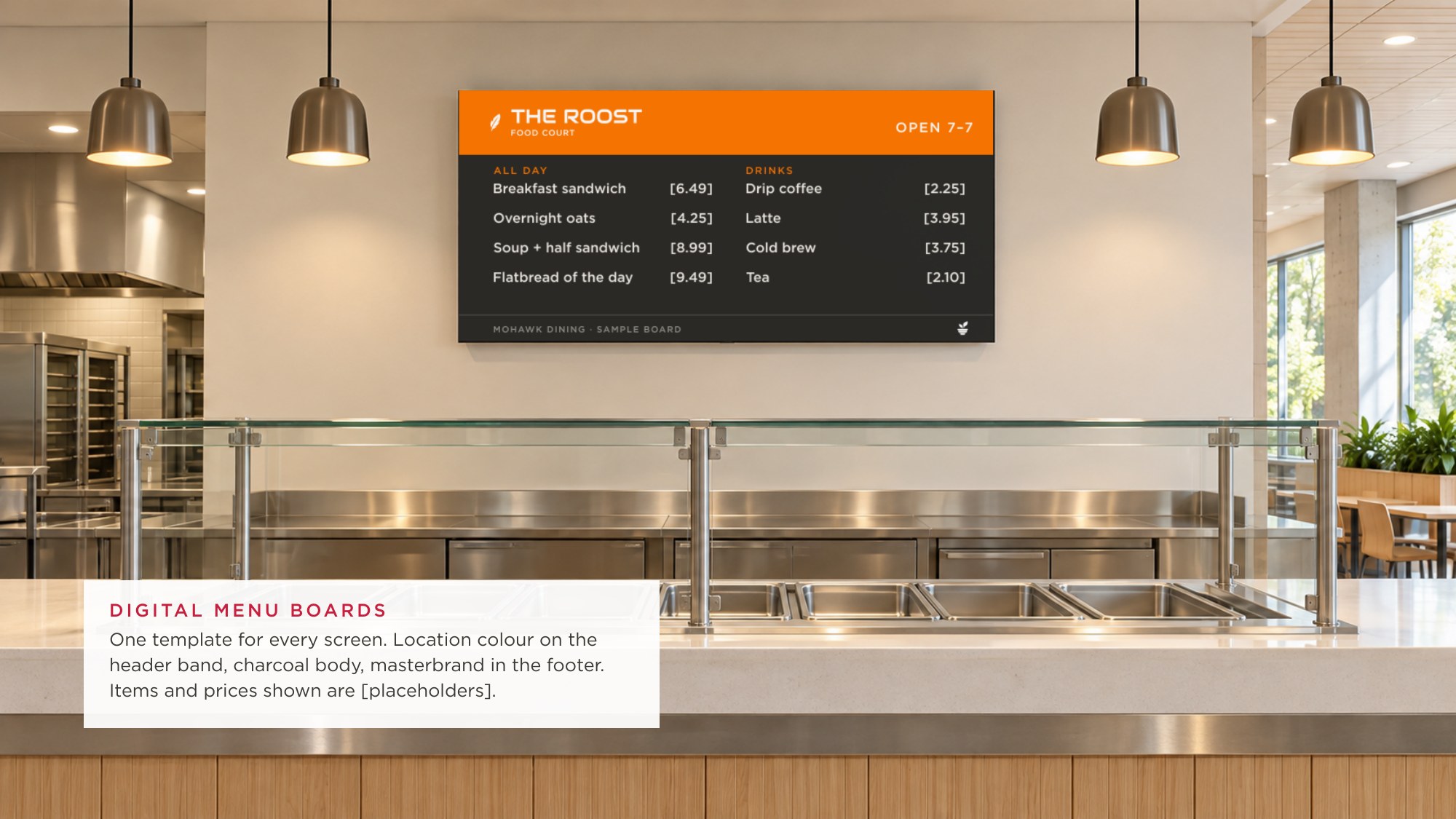
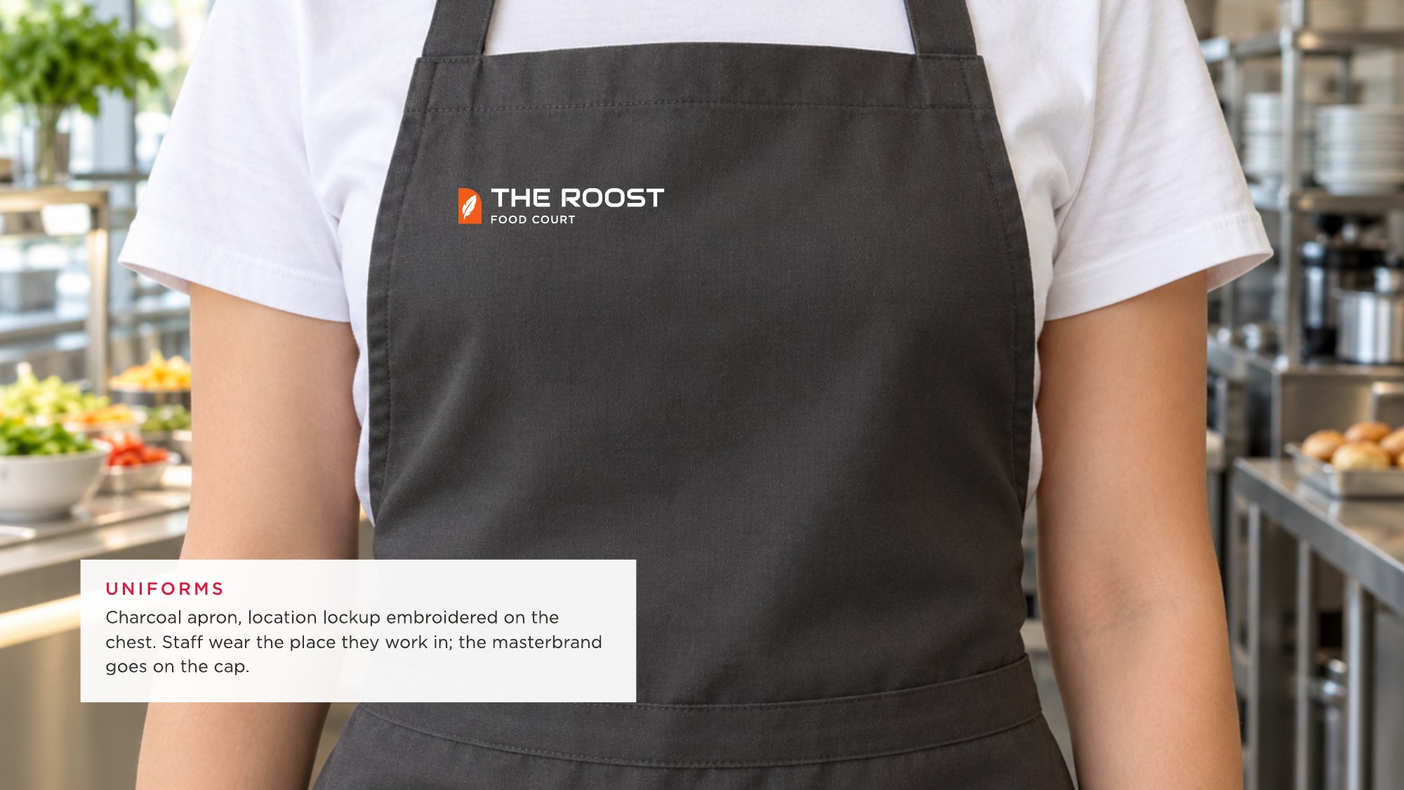
The location leads on the counter and the apron. The masterbrand lives on the menu board, the receipt and the cap. Staff wear the place they work in.
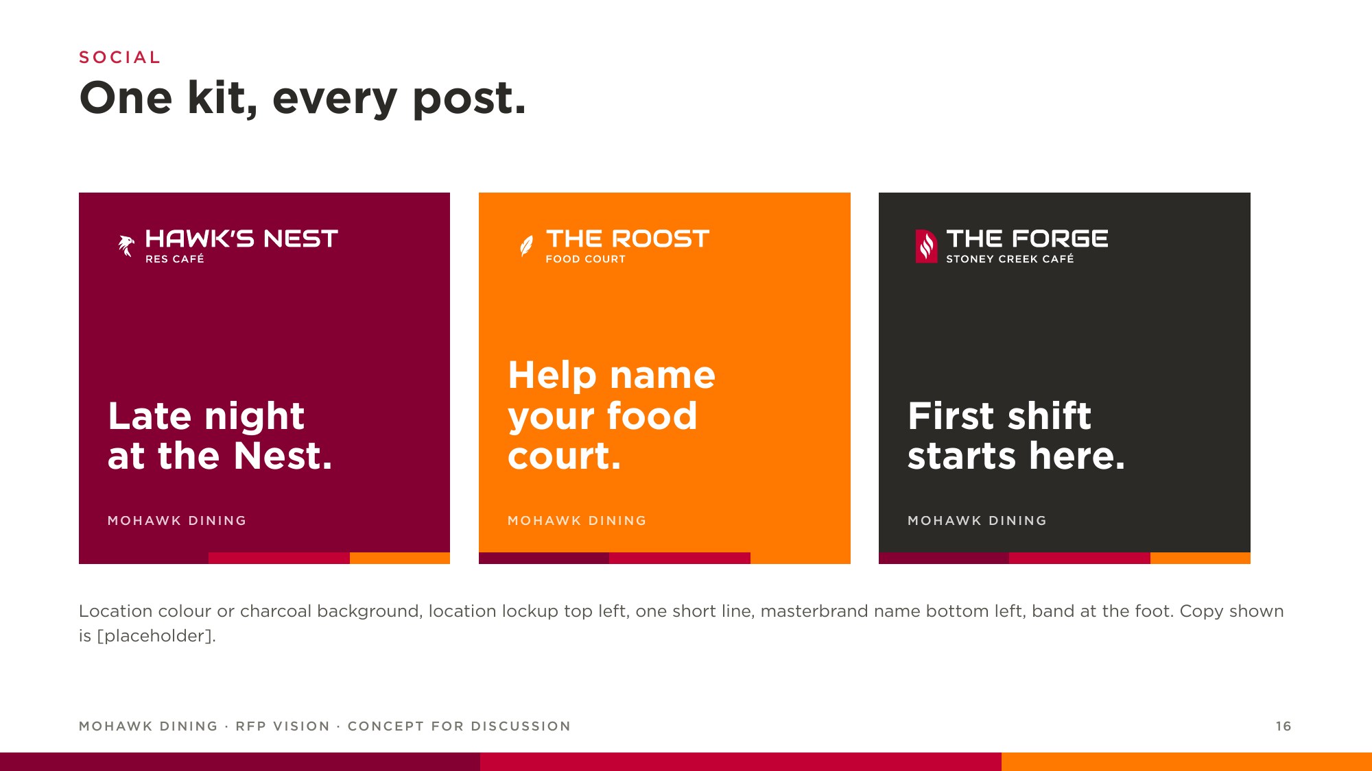
One template runs every screen and every post: location colour up top, charcoal body, masterbrand at the foot. The band, the three bars stretched flat, closes every sign, board and post. It's the only decoration in the system.
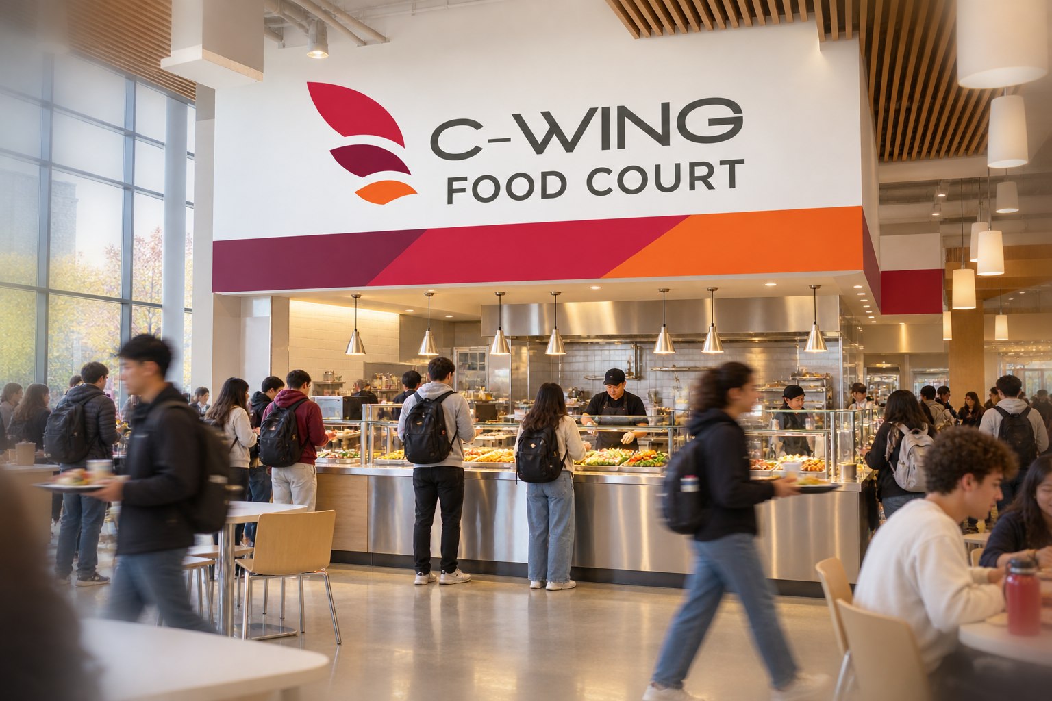
The rooms in these renders are AI-generated. Menu items, prices and post copy are placeholders.
Where it started
The first round used three leaves for the masterbrand and gave each food court its own icon in the same leaf language: wings for C-Wing, stones for Stoney Creek. The residence café, Mo's Diner, became Hawk's Nest.
Hawk's Nest made it through. For the final round I swapped a shared symbol for a shared construction, so the locations read as one family because they're built the same way.
On the walls
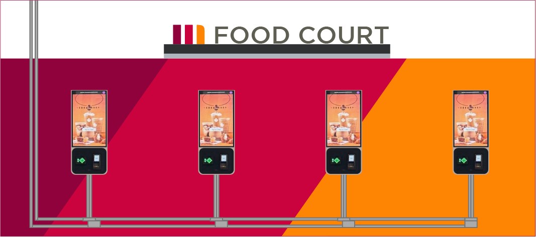
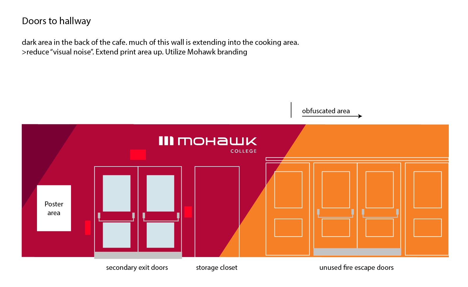
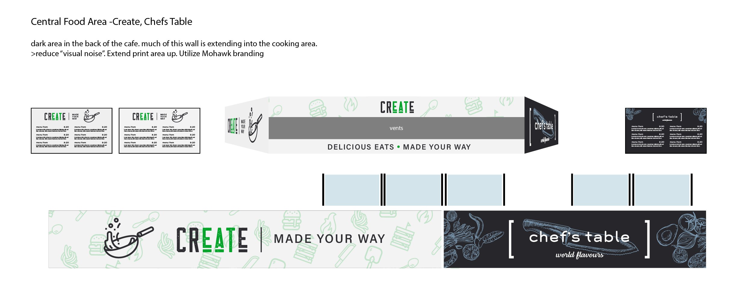
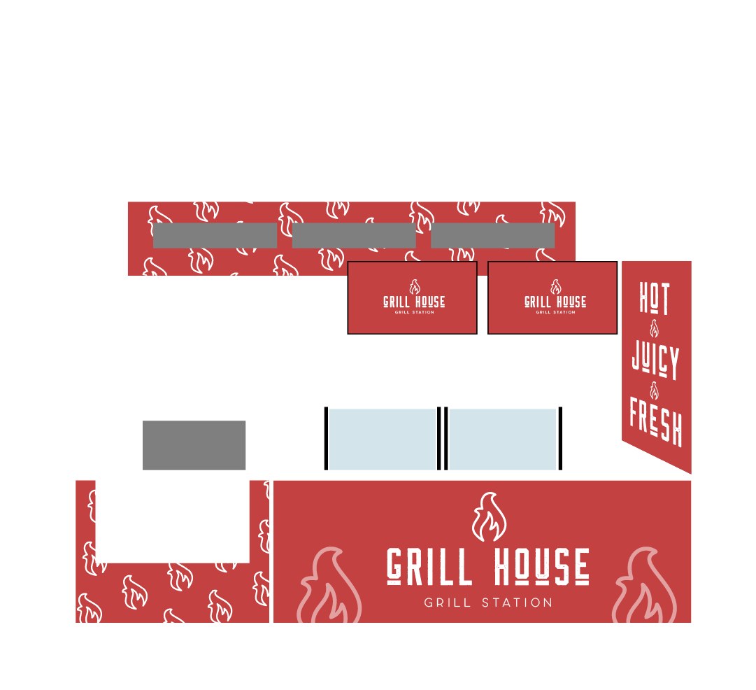
Round one also took the work onto the walls: elevations for the real spaces, drawn against the existing doors, vents and counters. The notes are the brief I wrote for each wall: cut the visual noise, run the print higher, and lean on Mohawk's colours to quiet a dark back corner.
Next project
Fort Edmonton Park